We all love a good Starting XI, so I’ve had a go at ranking all World Cup Nations based on the design of their starting XI graphics!
Football graphics are a crucial touchpoint for fans on matchday, acting as the visual bridge between a squad announcement and the pitch
To judge these fairly and objectively, I use a CLEAR scoring system, a comprehensive, weighted rubric designed to break down exactly what makes a graphic brilliant, functional, or flawed
Here is how the methodology breaks down:
The CLEAR Score Breakdown
C – Clarity & Readability (30%)
The golden rule: Can a supporter look at this on a small mobile screen and instantly discern the player names, shirt numbers and tactical layout? High contrast, accessible typography and legibility under real-world viewing conditions dictate this score
L – Layout & Information Hierarchy (25%)
The organisation: Is the information positioned intuitively? I look at the balance of visual elements, the clarity of the spacing, prominent display of match details [opponent, date, venue] and how cleanly the subs are integrated
E – Esthetics & Visual Design (20%)
The polish: Does the graphic look like a premium, professional tournament product? This looks at font choice harmony, sophisticated color palettes, clean image execution, lighting and overall artistic attention to detail. And I know, I’m British and it should be Aesthetics, but it had to start with E!
A – Authenticity & Brand Identity (15%)
The soul: Could you recognise which nation this graphic belongs to if the team badge was completely removed? I grade how effectively the design captures unique federation colours, cultural motifs, jersey textures and the wider personality of the national team
R – Rememberability & Creativity (10%)
The spark: Does the design break away from rigid, cookie-cutter templates to offer something genuinely innovative? This rewards unique artistic themes, clever imagery usage and memorable presentation concepts that stand out in a crowded social media feed
The Formula
Each category is graded on a scale from 0 to 10, and the final score is calculated using the precise weightings above:
Clarity x 0.30
Layout x 0.25
Esthetics x 0.20
Authenticity x 0.15
Rememberability x 0.10
This delivers a definitive, finely tuned rating out of 10.0, allowing us to definitively rank the world’s best (and worst) matchday art
Remember, I’m not a graphic designer and these are purely my opinions on what I think works well. Shout out to the people that have spent time not only building these graphics, but dedicating their time to build up an amazing skill that they’re getting to show off on a global scale.
So, let’s look at first half of the World Cup – Groups A through to F.
GROUP A
Mexico
Clarity & Readability | 7.0/10
The neon green text against the dark forest green background pops nicely and the names/numbers are highly readable. However, using a strict 3−3−3−2 grid layout focusses on player images before player names
Layout & Information Hierarchy | 7.5/10
The hierarchy is decent, but missing the substitutes on the primary graphic hurts it. It’s clean, but heavily padded
Esthetics / Visual Design | 8.5/10
Extremely polished. The moody studio portrait photography with the deep green backdrop gives it an elite, premium tournament feel. The text texture integration on the jerseys looks stellar
Authenticity / Brand Identity | 9.0/10
Phenomenal branding. The distinct Mexican green, the subtle jersey pattern textures, and the overall look feel entirely unique to El Tri. You don’t even need the badge to know who this is
Rememberability / Creativity | 6.5/10
While beautiful, the blocky player grid is a very standard formula used by many clubs and countries. It doesn’t take massive creative risks
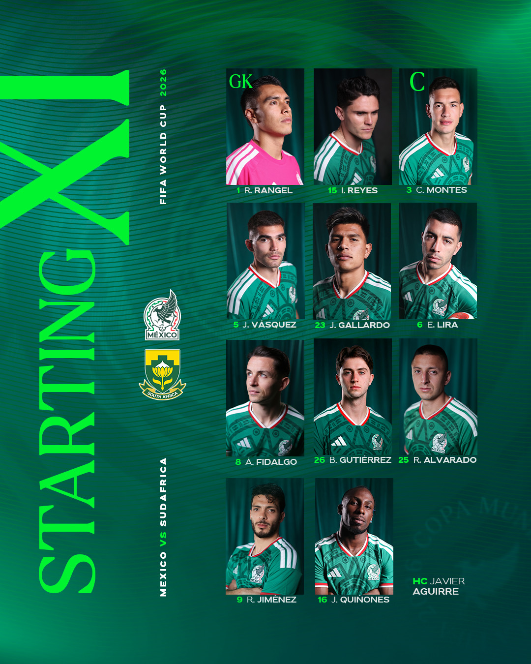
Final Score | 7.68
South Korea
Clarity & Readability | 8.5/10
Including both Korean characters and English text makes this globally accessible. The font is bold, the white text sits on dark pill shapes for contrast and the captain’s “C” is marked in red, but could be clearer
Layout & Information Hierarchy | 8.0/10
An efficiently stacked 4−4−3 player grid that manages to squeeze in comprehensive match details at the top and a full, highly legible list of substitutes at the bottom right
Esthetics / Visual Design | 8.0/10
Dynamic player photography featuring individual poses gives the graphic high energy. The deep crimson textured background works perfectly with the kits
Authenticity / Brand Identity | 8.5/10
The signature “Taegeuk Warriors” red dominates the piece. The typography choices and secondary branding elements are distinctly tied to the KFA’s modern aesthetic
Rememberability / Creativity | 6.0/10
It’s an excellent execution of a classic design, but it sticks strictly to a proven, safe template
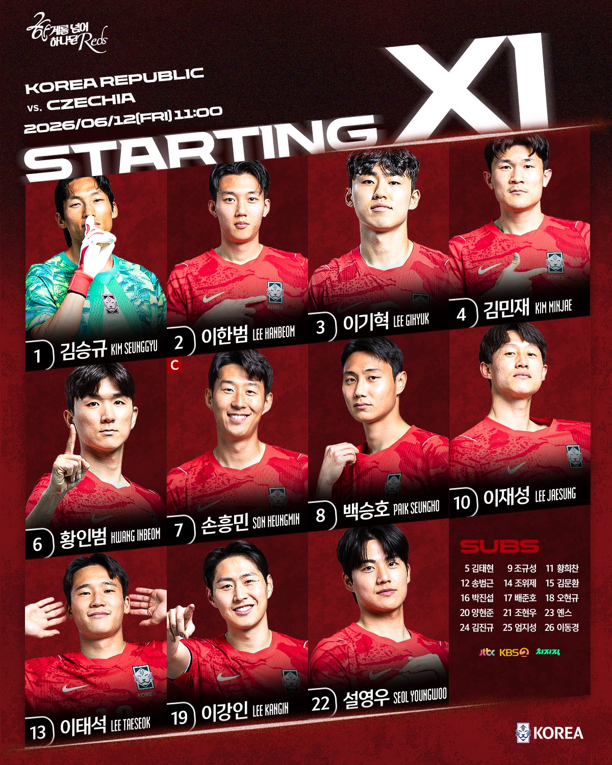
Final Score | 8.03
Czechia
This was a difficult one to judge as it was a video, not a traditional graphic, so I’m judging off a screenshot of the actual lineup reveal
Clarity & Readability | 6.0/10
The glowing neon outline font is creative, but it significantly compromises readability. The text blends a bit too much into the window background, which would make it tough to read on a mobile screen
Layout & Information Hierarchy | 9.0/10
Brilliant use of an actual pitch layout. You instantly know they are setting up in a 3−4−3 formation. Spacing is perfect, and the positioning leaves no room for confusion. No subs list visible though, which limits it slightly
Esthetics / Visual Design | 8.5/10
The rainy, late-night neon window aesthetic is incredibly atmospheric. It looks less like a sports graphic and more like a moody cyberpunk film still
Authenticity / Brand Identity | 5.5/10
While the color palette uses the Czech blue and red, the overall vibe feels more detached from traditional national team branding. If you remove the small match-up circles in the top right, it could belong to an esports team or a music venue
Rememberability / Creativity | 9.5/10
Full marks for trying something completely outside the box. Escaping the rigid grid of player photos to create a stylised tactical board in a real-world environment is incredibly memorable
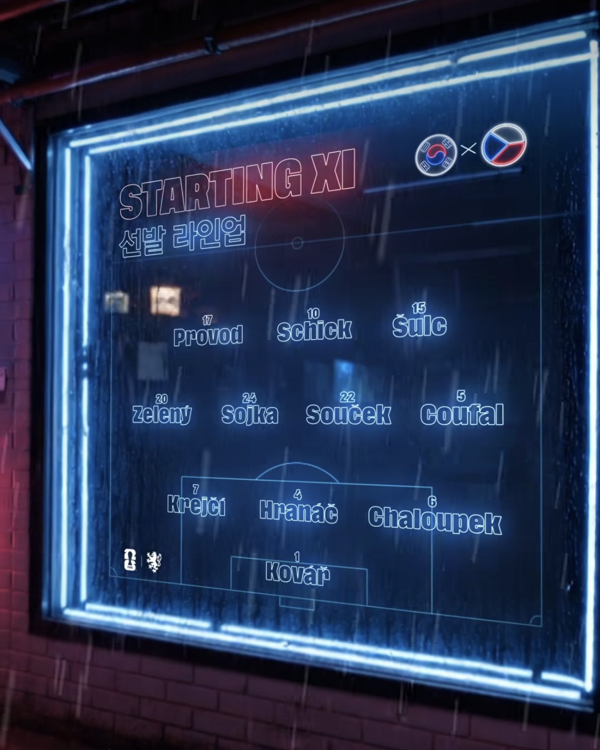
Final Score | 7.33
South Africa
Clarity & Readability | 7.5/10
The dark green text against a bright yellow background offers strong, punchy contrast. The font choice is clean and massive, and listing players positionally rather sequentially by number makes it easier to decipher the tactical lineup on the fly
Layout & Information Hierarchy | 7.5/10
The classic “One big player star on the right, list on the left” approach. The match details are neatly grouped at the top, and the substitutes list is packed tightly into the bottom corner
Esthetics / Visual Design | 7.0/10
Clean and highly professional, but the yellow-to-green gradient overlays and lighting flares feel a bit dated compared to the ultra-modern texture work seen in the Mexico or Czechia graphics
Authenticity / Brand Identity | 8.5/10
The bold yellow and green instantly represents Bafana Bafana. The subtle pattern running through the background mirrors the texture of their kit beautifully
Rememberability / Creativity | 5.5/10
This is the standard baseline template for football graphics over the last decade. It does its job perfectly, but it doesn’t push any creative boundaries
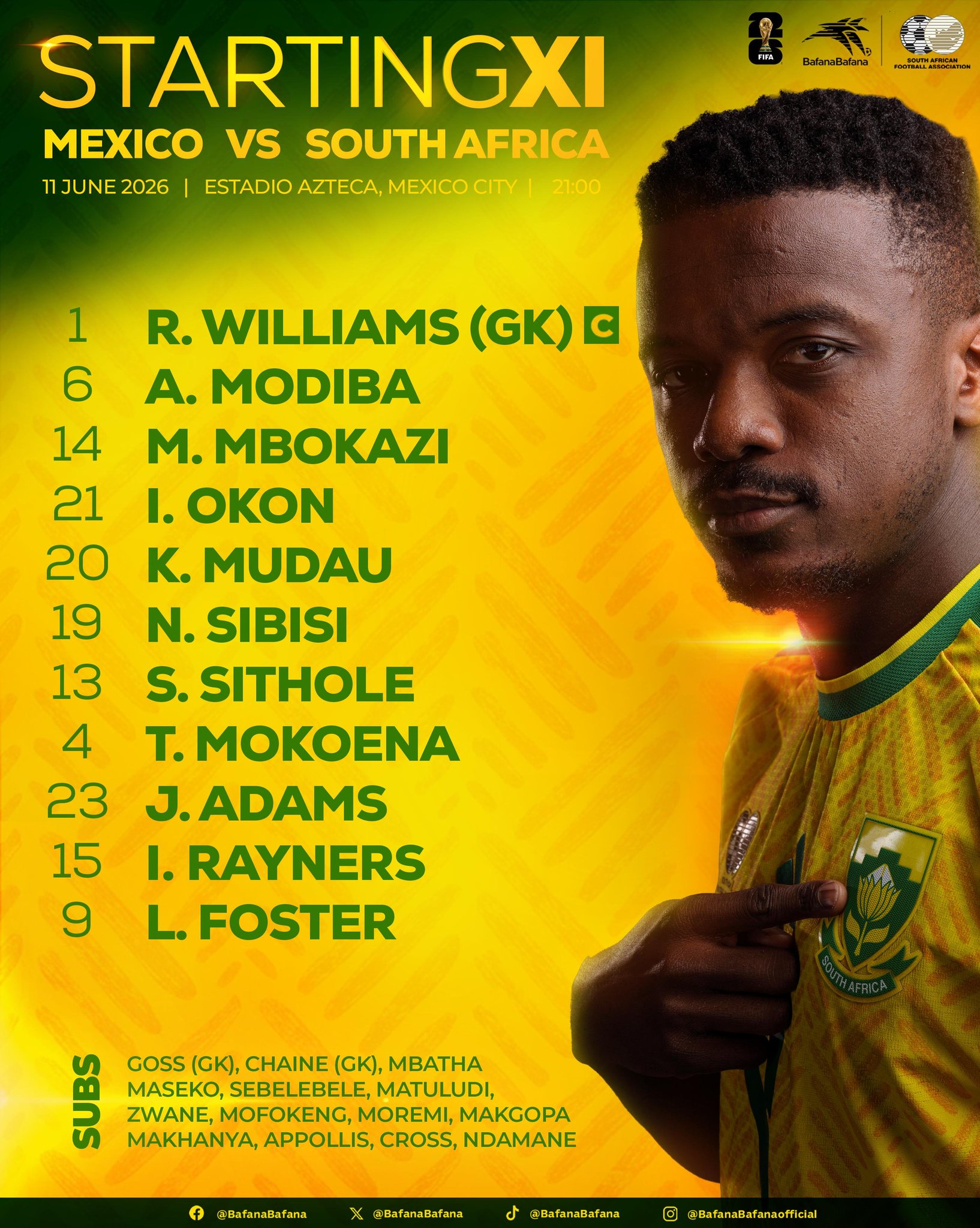
Final Score | 7.35
Group A Analysis |
South Korea takes the top spot by executing the fundamentals flawlessly balancing global readability, player imagery, and sub data without clutter. Mexico followed closely with stunning aesthetics but suffered a bit on formation clarity. South Africa put up a solid, fundamentally sound baseline score, while Czechia’s massive creative risks gave them a highly memorable design that just slightly missed out due to real-world readability and branding constraints
GROUP B
Canada
Clarity & Readability | 6.5/10
The stylised, blocky custom font choice is an absolute mixed bag and I think it would work better as a header font. While it is bold and contrasts heavily against the dark background, some letters are a bit difficult to read, impacting instant readability at a quick glance on mobile
Layout & Information Hierarchy | 7.0/10
It follows a number/list structure on the left side, which neatly hints to the tactical formation. The bottom footer cleanly integrates media broadcasters and kickoff times and the substitutes list is packed in, though a bit tightly
Esthetics / Visual Design | 8.5/10
Visually striking. The aggressive, textured red-and-black chevron background pairs perfectly with the studio player photography. It feels modern, edgy, and high-budget
Authenticity / Brand Identity | 9.5/10
Spectacular brand identity. The heavy use of Canada’s red and black, combined with the sharp geometric lines evoking the points of a maple leaf, means this couldn’t belong to any other nation on earth. It screams Canadian soccer
Rememberability / Creativity | 7.5/10
Using distinct background chevron patterning and bold typography elevates what is otherwise a standard vertical list format into something far more memorable
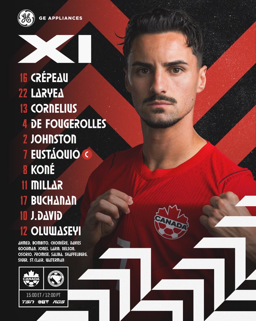
Final Score | 7.58
Bosnia
Clarity & Readability | 8.0/10
A highly pristine, classic presentation. Using a clean, sans-serif font in crisp white against a pitch-black background means you can read every single name flawlessly, even on a tiny device
Layout & Information Hierarchy | 7.5/10
Everything is exactly where you expect it to be. The header cleanly displays the national flags, the coach is highlighted and match details anchor the bottom. Like Canada, it relies on a standard vertical list format, sacrificing any real visual layout. Notably, a substitutes list is completely missing here
Esthetics / Visual Design | 7.5/10
It looks incredibly professional and moody, using a cinematic lighting effect on the player model. Gold accents provide a premium touch, though the vast black emptiness on the background makes it feel slightly sparse
Authenticity / Brand Identity | 7.0/10
The deep blue jersey with fine yellow pinstripes is instantly recognisable as Bosnia. However, the graphic itself leans so heavily on a plain black background that the canvas loses some unique cultural identity
Rememberability / Creativity | 5.0/10
This is as safe and traditional as a list graphic gets. It functions beautifully but doesn’t take any creative risks or offer anything new to the medium

Final Score | 7.28
Qatar
Clarity & Readability | 7.0/10
The typography is extremely clean and legible, and the contrast of white text against a maroon base works perfectly. I like the white numbers directly beside the player’s faces and neck, but I do wonder if they introduce unnecessary visual clutter
Layout & Information Hierarchy | 8.5/10
An incredibly dense but organised grid system. Managing to seamlessly map out a 6−5 player portrait split while giving the manager prime real estate, displaying a highly organised substitutes list and highlighting match branding is a masterclass in space optimisation
Esthetics / Visual Design | 8.0/10
Highly polished with clean lines, sharp angles and excellent lighting across the individual player graphics. The geometric shards in the background add depth without distracting
Authenticity / Brand Identity | 9.0/10
Exceptional nation branding. The exact shade of Qatar’s iconic maroon, combined with the signature serrated chevron detailing from the national flag cutting across the design, gives it immense cultural authority
Rememberability / Creativity | 6.5/10
While it sticks to a profile grid format similar to South Korea’s in Group A, the aggressive integration of flag shapes and unique number overlapping gives it its own distinct flavour
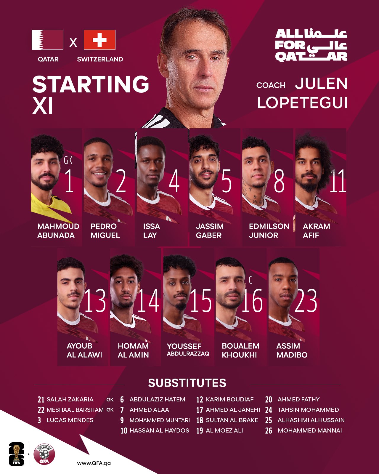
Final Score | 7.83
Switzerland
Clarity & Readability | 8.0/10
The stark white font over black blocks gives incredible name legibility. The massive, floating white “C” explicitly marks Xhaka as captain, leaving zero ambiguity
Layout & Information Hierarchy | 8.5/10
Unlike the list formats of Canada and Bosnia, Switzerland goes for a player image structure on the canvas, arranging their lines in a clear 3−4−3 shape. The substitutes are grouped cleanly at the bottom, though the “World Cup Group Stage” text takes up a lot of real estate at the top
Esthetics / Visual Design | 6.5/10
The player cutouts are clean, but placing brightly lit studio portraits onto a heavily blurred, monochrome action shot of a stadium creates a jarring visual disconnect. The players look like they are floating over a background that doesn’t quite match their lighting and Rodriguez is missing a shadow
Authenticity / Brand Identity | 7.0/10
The vibrant Swiss red and the prominent cross iconography are clear, but the generic gradient and stadium background feel like a standard template that could easily be swapped out for any other team wearing red
Rememberability / Creativity | 6.0/10
Using player images is a great operational touch, but visually, the graphic doesn’t explore any new creative horizons

Final Score | 7.47
Group B Analysis |
Qatar wins Group B by delivering a brilliant balance of information density and sharp national identity. Canada pushed hard with an elite, highly authentic aesthetic but was held back slightly by its experimental font legibility. Switzerland put up a great fight structurally by presenting a clear tactical shape on the field, but lacked the design polish to push higher. Bosnia anchor the group with a hyper-legible, classic design that simply lacked the creativity and features (like a subs bench) to challenge the top spots.
Group C
Scotland
Clarity & Readability | 7.5/10
The text contrast is excellent, using white lettering against a clean, solid background. The custom, Celtic-inspired font matches the kit’s retro theme, but it introduces a slight readability drag on smaller mobile screens due to its stylised serifs
Layout & Information Hierarchy | 7.5/10
This design utilises a clean, numerical, vertical list on the right side, meaning it is not in formation. The top corner cleanly presents the match details, kickoff times across time zones and competing badges. The substitutes list at the bottom is highly legible
Esthetics / Visual Design | 9.0/10
As a fellow Scot, it’s hard not to love this one, but looking at it completely objectively, it’s a stunning piece of design. The presentation leans heavily into a clean, minimalist retro look that perfectly complements the classic Adidas pinstripe kit. The studio photography of Andy Robertson is deeply cinematic and perfectly framed
Authenticity / Brand Identity | 9.5/10
Brilliant. The deep away shirt tone, the neon yellow accents reminiscent of historic away strips and the bespoke typography scream Scottish football heritage. You do not need the badge to recognise the identity here
Rememberability / Creativity | 7.5/10
While it sticks to a traditional vertical player list, the dedication to a fully realised, premium retro aesthetic makes it highly memorable compared to standard modern templates
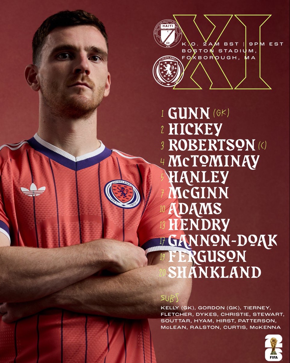
Final Score | 8.10
Brazil
Clarity & Readability | 8.0/10
The massive gold numbers provide an immediate focal point, paired with clean, bold sans-serif player names underneath. The contrast against the deep navy background is outstanding.
Layout & Information Hierarchy | 8.0/10
This graphic uses a massive, staggered photo grid of individual player portrait cutouts, which lists players by position. However, the layout handles data brilliantly: the substitutes list is cleanly organised at the top center, match details anchor the bottom left, and Carlo Ancelotti gets a dedicated, prominent coaching profile
Esthetics / Visual Design | 8.5/10
Extremely premium. The dark blue canvas paired with glowing gold geometric accents feels incredibly high-end. The lighting on the player portraits is remarkably uniform, creating a cohesive, professional look
Authenticity / Brand Identity | 8.5/10
The combination of the iconic yellow Canarinho kits, the royal blue background, and the sharp gold elements ties directly into the premium identity of the CBF
Rememberability / Creativity | 7.0/10
It is an exceptionally polished execution of a player photo grid, but it doesn’t break new conceptual ground
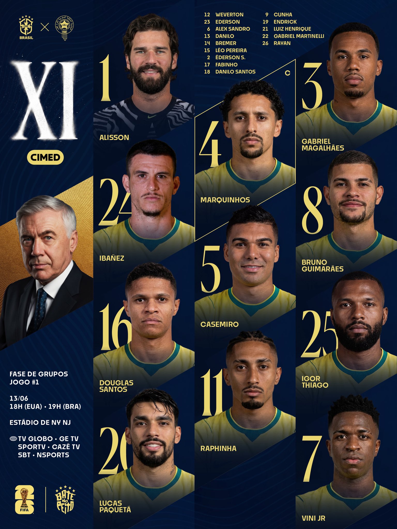
Final Score | 8.08
Morocco
Clarity & Readability | 7.0/10
The player names are written in a crisp white font over clean red cards, offering decent contrast. However, overlaying large, World Cup Logo directly underneath the player faces creates unnecessary visual noise
Layout & Information Hierarchy | 7.5/10
The layout places Walid Regragui in a massive profile on the left, but the match details at the bottom are pushed into a very small, thin font. The substitutes are cleanly listed at the bottom right
Esthetics / Visual Design | 8.0/10
The gold and deep red background gradients feel elegant and warm. The individual card borders for each player give it a polished, collectible trading card aesthetic
Authenticity / Brand Identity | 8.5/10
The deep Moroccan red, federation green accents, and subtle geometric patterns in the gold background align beautifully with the cultural branding of the Atlas Lions
Rememberability / Creativity | 6.5/10 The trading-card style grid format gives it a bit of an edge over a standard photo grid, but it remains a traditional grid concept at its core
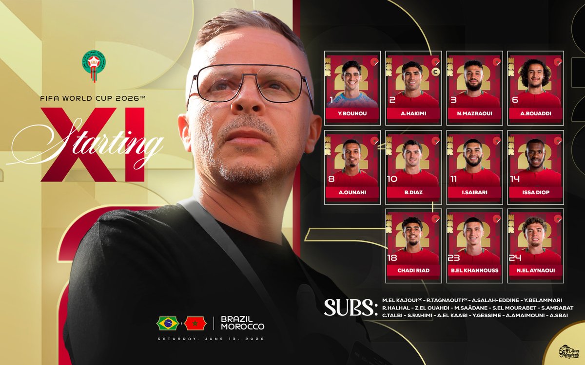
Final Score | 7.50
Haiti
Note | As there was no official tournament graphic available for this specific matchday, an older starting lineup graphic has been utilised as a placeholder, which naturally impacts its tournament-specific scoring metrics.
Clarity & Readability | 7.5/10
The player names are housed inside high-contrast blue blocks with clean white text, making them very easy to read
Layout & Information Hierarchy | 6.5/10
Because it is an older placeholder graphic, it lacks any of the current World Cup tournament details, groups, or venues. The substitutes list is squeezed tightly into the bottom left corner next to the final row of players, throwing off the overall visual balance
Esthetics / Visual Design | 6.0/10
The design feels a bit blocky and corporate, leaning on heavy solid color bars and basic commercial sponsor logos across the bottom footer. The lighting on the player portraits is clean, but the stadium background feels generic
Authenticity / Brand Identity | 7.5/10
The bright red, blue, and white accurately represent the colours of the Haitian flag, and the side borders add a nice patriotic pattern touch
Rememberability / Creativity | 5.0/10
A highly standard, operational grid layout that serves its basic purpose but does not push any creative boundaries
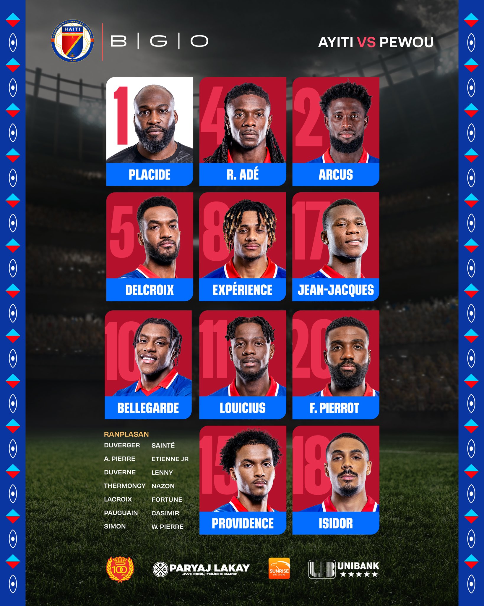
Final Score | 6.70
Group Analysis |
Scotland takes a narrow victory in a highly competitive group, using a masterfully executed retro aesthetic and stellar typography to edge past Brazil’s incredibly polished, star-studded navy and gold grid. Morocco lands a very solid baseline score with its elegant trading-card style layout, while Haiti anchors the group due to the natural layout and aesthetic limitations of using an older, non-tournament placeholder graphic.
GROUP D
USA
Clarity & Readability | 8.5/10
Excellent execution here. The white sans-serif typography contrasts perfectly against the deep blue canvas. Sizing is balanced, and using a clean font means it functions beautifully on a fast social media scroll or small mobile screen
Layout & Information Hierarchy | 7.5/10
The top section is brilliantly organised with tournament branding, specific match details and clear kickoff times. The massive studio portrait of explicit standout features gives it a great focal anchor. However, opting for a vertical text list pulls down the layout score slightly compared to more dynamic spatial arrangements. The subs are clean and easy to scan.
Esthetics / Visual Design | 8.0/10
Highly polished and vibrant. The rich red, white and blue grain texture in the background gives it a distinct energy. The lighting on the player is crisp and the commercial partner blocks at the bottom are integrated relatively cleanly without destroying the artistic vibe
Authenticity / Brand Identity | 9.0/10
The heavy usage of stars and stripes embedded into the textures, combined with the signature USSF typefaces, makes this instantly recognisable. It perfectly mirrors the design language of the host nation
Rememberability / Creativity | 6.5/10
It’s an incredibly high-standard execution of a classic player-and-list layout, but it follows a well-trodden design path rather than inventing a new concept
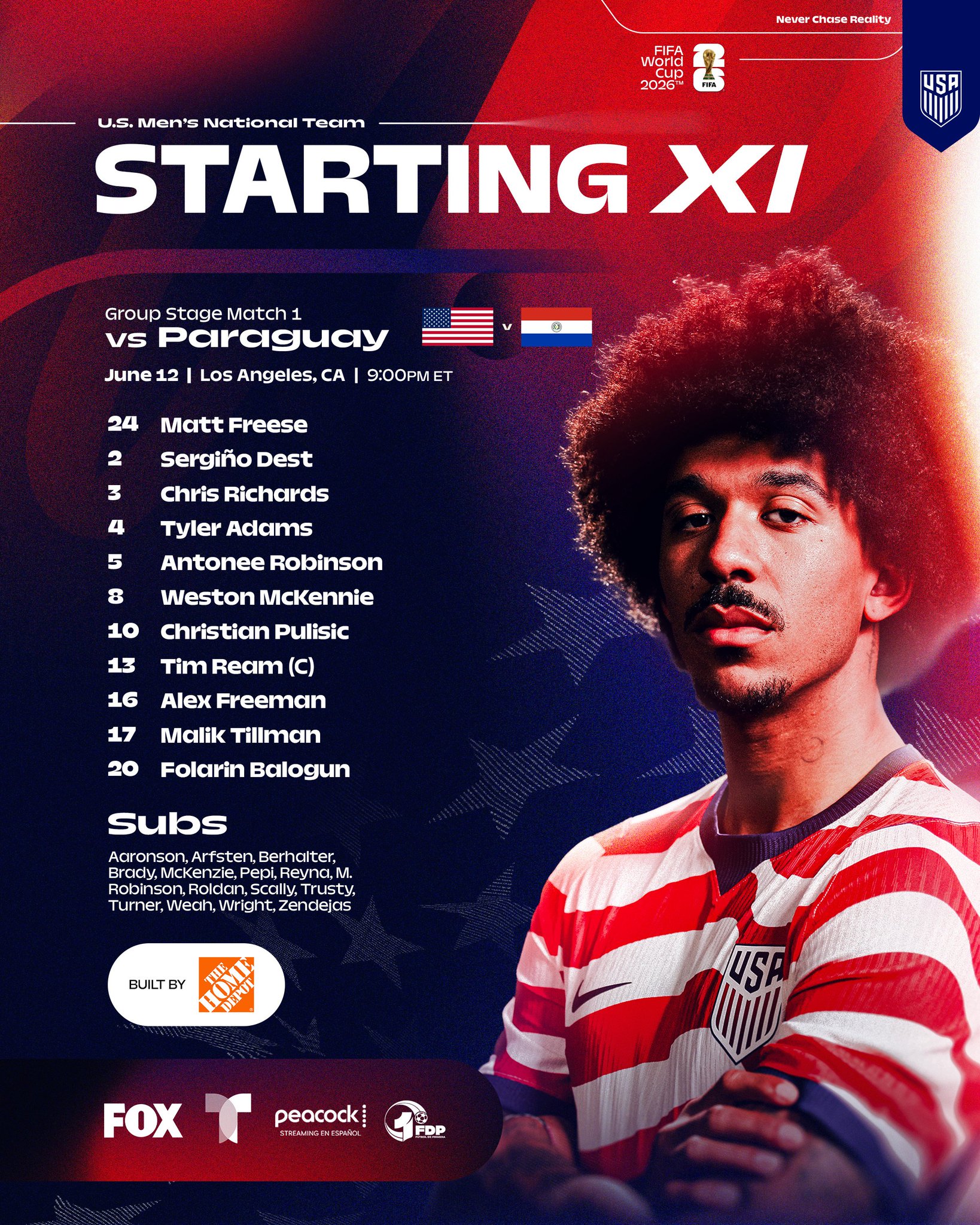
Final Score | 8.03
Australia
Clarity & Readability | 8.0/10
The clean white and gold condensed typography pops clearly against the textured forest green backdrop. The font choice is sharp, uniform, and keeps the text readable even with longer player names
Layout & Information Hierarchy | 7.5/10
The grid lines create distinct, structured zones. Badges sit proudly at the top left, the “Forever Golden” theme anchors the top right, and match specifics frame the bottom footer. The text-list delivery keeps things highly organised. The bench list is tucked neatly into the lower-left grid quadrant
Esthetics / Visual Design | 8.0/10
The subtle fabric-style texture running through the green background adds excellent depth. The gold accent lines feel premium rather than gaudy, and the player photography is clean, bright, and sharp.
Authenticity / Brand Identity | 9.0/10
The iconic green and gold colour scheme dominates the canvas seamlessly. The addition of the “Forever Golden” script asset brings an extra layer of national team identity that feels entirely bespoke to Australia
Rememberability / Creativity | 6.5/10
The asymmetrical grid framing gives it a slightly more architectural feel than a standard list graphic, though the core mechanism remains a traditional text lineup

Final Score | 7.80
Turkiye
Clarity & Readability | 7.5/10
The heavy, italicised sans-serif font is exceptionally bold and delivers an assertive look. Contrast is solid, though the tight kerning on the stylised italics makes a couple of the longer names blend together slightly more than a standard clean font
Layout & Information Hierarchy | 7.5/10
Hakan Çalhanoğlu is explicitly and cleanly marked with a bold captain’s badge asset. The coach, Vincenzo Montella, gets a distinct, high-contrast banner at the very bottom. The substitutes list is legible, but for some reason is central aligned and, like its group peers, the vertical list layout limits its ultimate structural score
Esthetics / Visual Design | 8.0/10
The swirling, smoky crimson background texture matches the intricate pattern design on the player’s jersey beautifully. It feels cohesive, moody, and full of motion. The lighting on the portrait is dramatic and fits the overall tone perfectly
Authenticity / Brand Identity | 8.5/10
The intense crescent-and-star red completely owns the graphic. Incorporating the exact jersey print swirling patterns directly into the background art creates an elite tie-in to the team’s physical kit identity
Rememberability / Creativity | 6.0/10
A beautiful, highly atmospheric iteration of the single-player list layout, though it stays safely within the boundaries of conventional design formulas
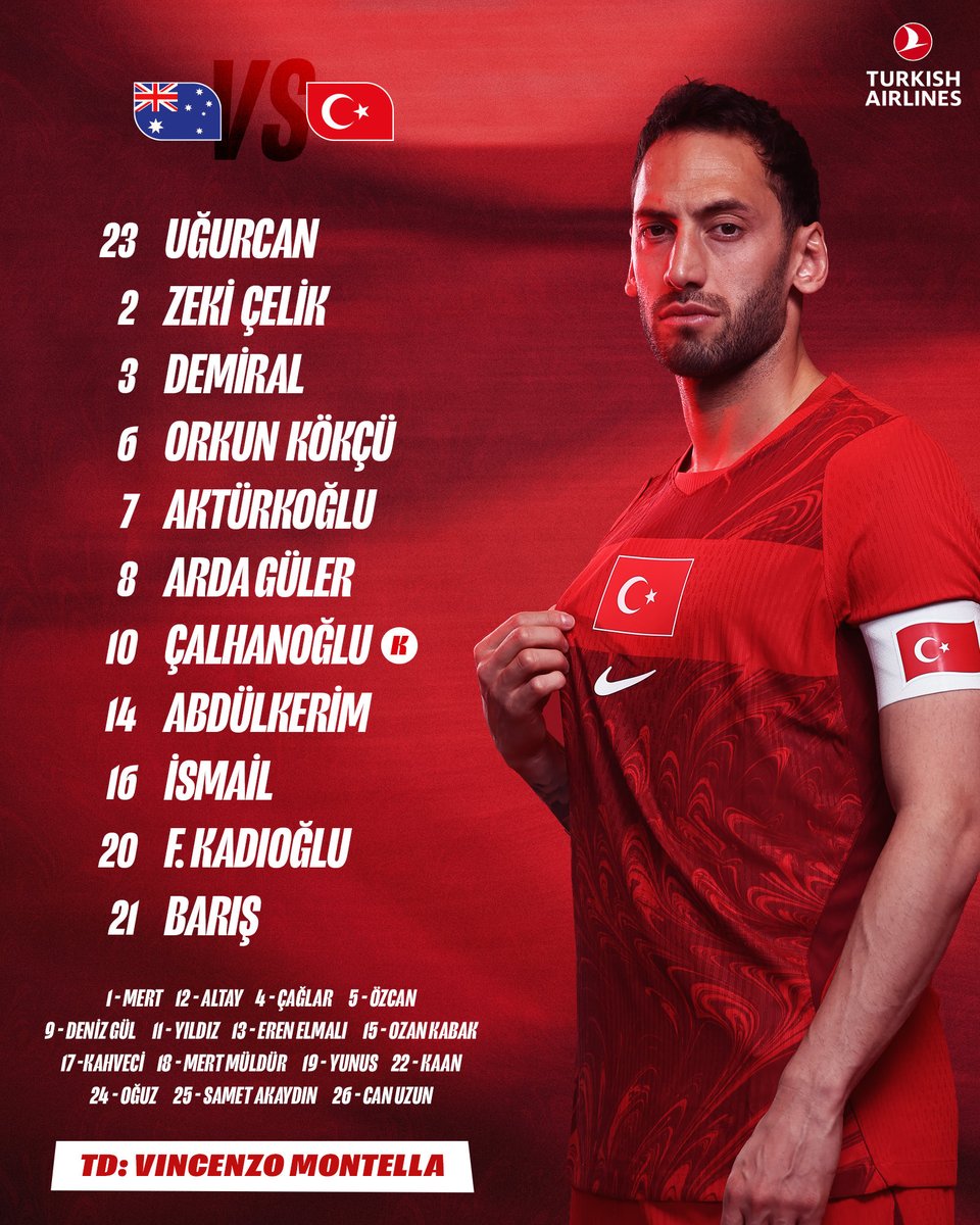
Final Score | 7.60
Paraguay
Clarity & Readability | 8.5/10
By avoiding tiny lists, the names and numbers are written in massive, bold white blocks inside each designated card. The contrast is spectacular, and it reads effortlessly on mobile
Layout & Information Hierarchy | 8.0/10
A flawless example of data layout density. Squeezing in a massive title header, match details, team matchups, 11 distinct player portrait panels, a full substitutes bench, and a dedicated head coach signature slot without looking chaotic is an exceptional feat of grid organisation
Esthetics / Visual Design | 7.5/10
The individual panels look sharp, and the smoky white aura surrounding each player cutout creates a clean separation from the dark background. The rounded red border frames the entire graphic nicely, though the overall design leans a bit more into a traditional, busy sports-card style rather than an ultra-modern minimalist look
Authenticity / Brand Identity | 9.0/10
The Albirroja identity is front and centre. The relentless red-and-white stripes flashing across every single panel, paired with the proud lion motif at the footer, gives it immense patriotic consistency
Rememberability / Creativity | 7.0/10
While it utilises a grid of images, the decision to give every single player an identical, highly stylised portrait cutout card elevates this well above standard, generic templates
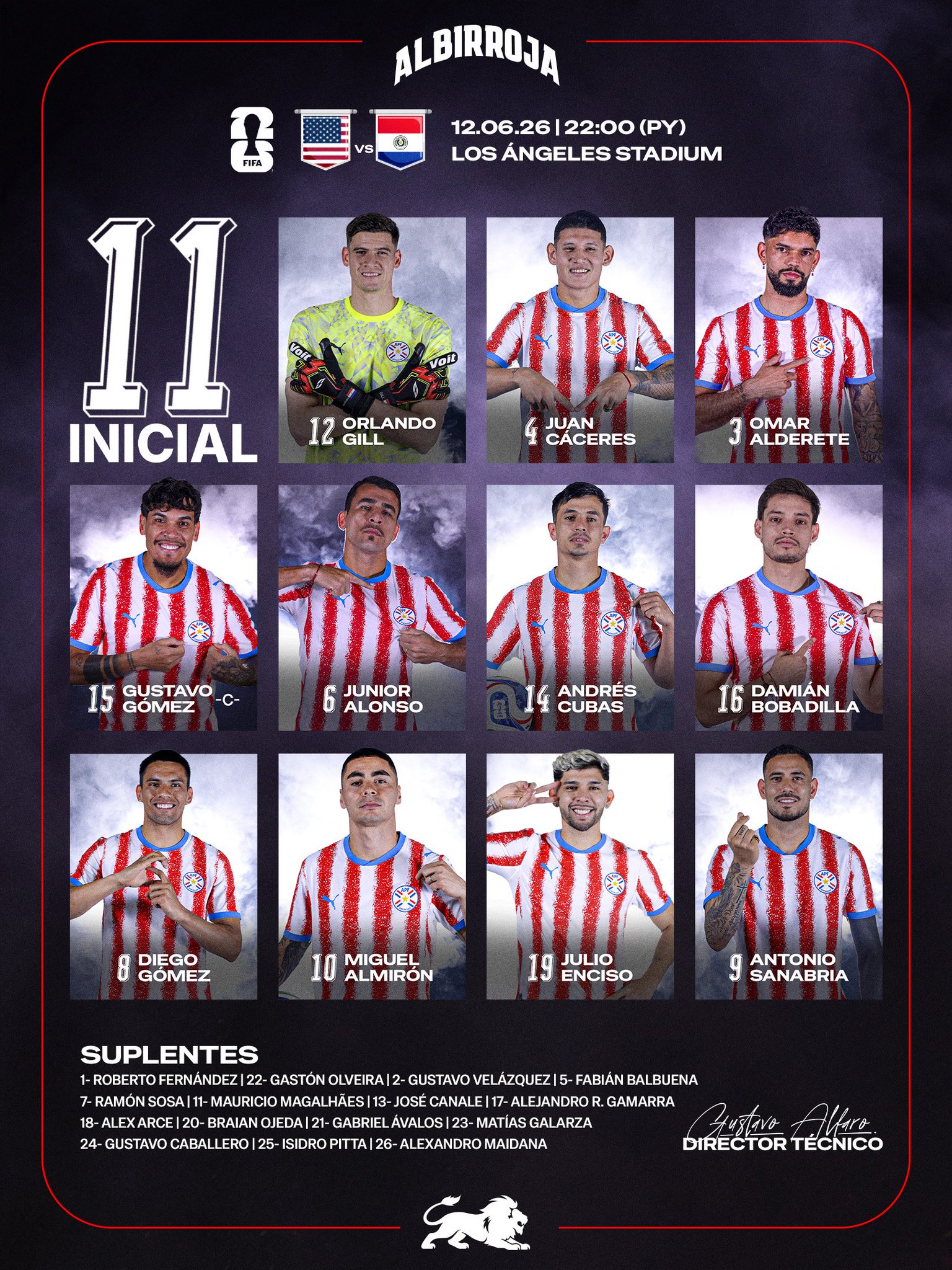
Final Score | 8.10
Group Analysis |
An incredibly high-scoring, competitive group where execution separated the spots by fractions of a point. Paraguay claims the group crown, utilising their high-contrast, perfectly organised player panel system and excellent backdrop numbering to edge the field. The USA finishes in a stellar second place with a flawless, broadcast-ready commercial design, while Australia and Turkiye follow closely behind with beautiful, atmospheric list graphics that executed their federation branding brilliantly.
GROUP E
Germany
Clarity & Readability | 9.0/10
Flawless stark black text against a pure white backdrop makes this incredibly sharp on mobile screens. The individual player cutout blocks on the right are highly readable, featuring bold names beneath high-contrast white squad numbers
Layout & Information Hierarchy | 8.5/10
The split-screen dynamic works beautifully. It leaves plenty of breathing room for tournament data, kickoff times and television broadcasters on the left, while organising the squad neatly on the right. Joshua Kimmich is cleanly designated as captain with a small flag icon and the bench is perfectly scannable at the bottom
Esthetics / Visual Design | 8.0/10
It feels highly editorial and premium, resembling a high-end sports magazine spread. The uniform lighting on the player portraits gives the right-hand block a very polished feel, grounded by a subtle halftone pattern texture along the footer
Authenticity / Brand Identity | 8.5/10
The traditional German home kit colours dominate the player grid, while the ghosted federation crest anchoring the centre ensures the graphic feels entirely authentic to the DFB
Rememberability / Creativity | 6.5/10
It’s an exceptionally executed asymmetrical media layout, though it relies on standard structural blocks rather than breaking outside the box conceptually

Final Score | 8.35
Curaçao
Clarity & Readability | 7.0/10
The electric blue background provides stellar overall contrast. However, the decision to stretch the player names into massive, vertically elongated yellow text creates a slight reading hurdle, requiring a bit of extra visual effort to parse quickly
Layout & Information Hierarchy | 8.0/10
An excellent presentation of data. A colossal, translucent gold “XI” framing a ghostly player face dominates the left third of the graphic, keeping the primary focus on the team announcement. The player cutout selection on the right is arranged cleanly and Leandro Bacuna is clearly marked with a bold captain asset
Esthetics / Visual Design | 8.5/10
Visually interesting. The deep royal blue background combined with neon yellow accent sweeps gives the entire graphic a modern, glowing energy. Using full-body player cutouts instead of basic headshots gives it a very dynamic, athletic presence, however, with the players being in a blue kit, and the background being blue, it does lose some of the effect
Authenticity / Brand Identity | 9.0/10
The colour palette pulls directly from the vibrant spirit of the national flag, and the addition of “THE BLUE WAVE” branding asset at the base heavily reinforces their identity
Rememberability / Creativity | 8.5/10
Easily one of the most creative concepts in the tournament. Elongating typography into textured pillars for full-body cutouts to stand next to is a brilliant departure from generic templates
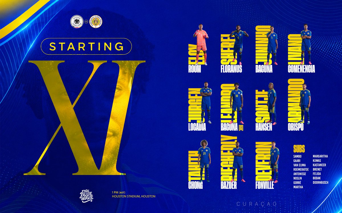
Final Score | 8.0
Ivory Coast
Clarity & Readability | 8.0/10
The massive, high-contrast white “XI DE DEPART” lettering stacked along the right sidebar is instantly legible. Within the grid, white vertical text paired with distinct squad numbers stands out perfectly over the orange backdrop cards
Layout & Information Hierarchy | 8.0/10
The data layout here handles high density brilliantly. It builds a structured grid that seamlessly accounts for a dedicated head coach profile (Emerse Faé), explicit captain markers (Franck Kessié) and a highly legible subs list tucked neatly along the bottom footer next to the match flags
Esthetics / Visual Design | 7.5/10
The uniform orange-brown gradient wash across the player boxes gives the entire graphic a cohesive warmth. The subtle canvas grain texture adds great depth, though the rigid blocks lean a bit closer to a dense trading-card template
Authenticity / Brand Identity | 9.0/10
The iconic orange, white and green identity is woven perfectly throughout. Incorporating the distinct national map outline directly into the federation crest at the top right is a stellar touch of homeland pride
Rememberability / Creativity | 7.0/10
Including a prominent, dedicated card space for the manager within the primary starting eleven grid is a refreshing structural twist that sets it apart from standard player loops and also means there’s 12 cards, which just sit neater on a graphic
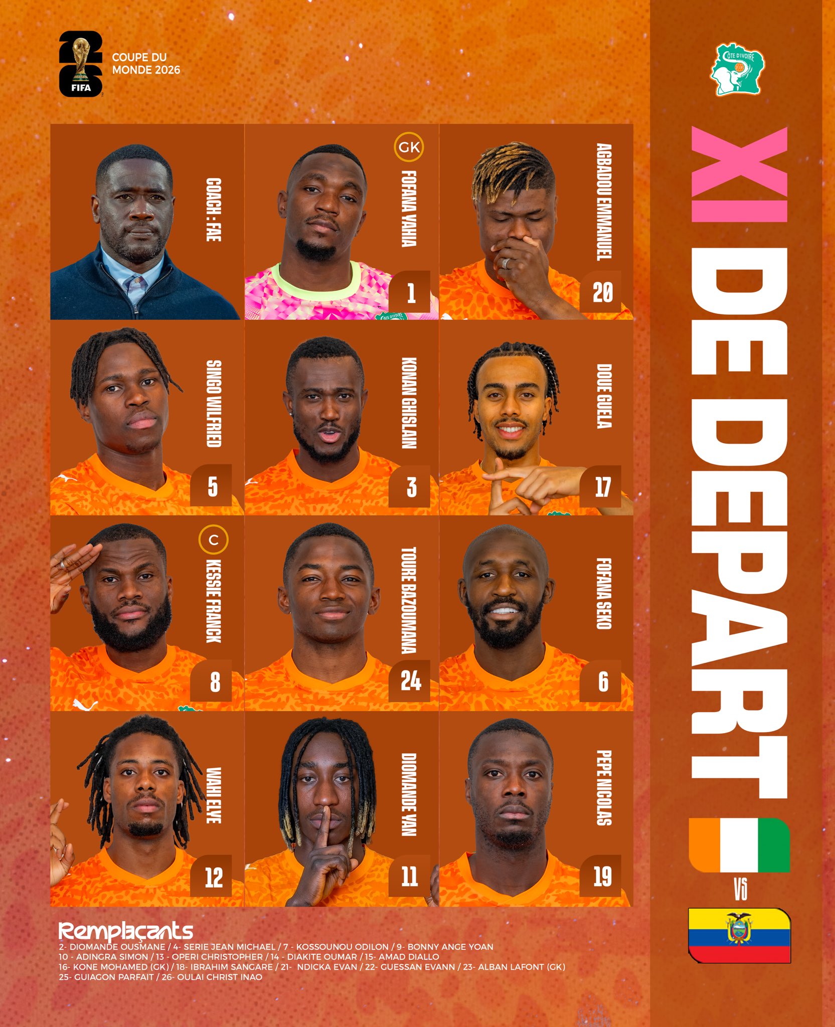
Final Score | 7.95
Ecuador
Clarity & Readability | 8.5/10
The contrast is exceptional. Utilising an elegant, elongated gold serif font directly against a pitch-black canvas makes the starting lineup staggeringly easy to read
Layout & Information Hierarchy | 7.0/10
The vertical stack keeps the core list highly organised, anchored nicely by competing federation crests at the top and the manager’s name below. Enner Valencia is highlighted cleanly with a bright red captain’s asset. And the subs list at the bottom looks clean and compliments the elegant structure of the main list
Esthetics / Visual Design | 7.5/10
It feels incredibly sleek, dark and sophisticated. Cropping a single player’s shirt [as this is a carousel we’re only looking at the right hand side of the image] texture heavily into the left edge provides a clever pop of colour without interrupting the minimalist theme
Authenticity / Brand Identity | 7.0/10
While the gold font hints at the team’s traditional yellow kit color, the overwhelming use of solid black means it loses a bit of the vibrant national energy typically associated with La Tri
Rememberability / Creativity | 6.0/10
An incredibly classy, clean execution of a luxury minimalist aesthetic, though structurally it remains a traditional vertical text list
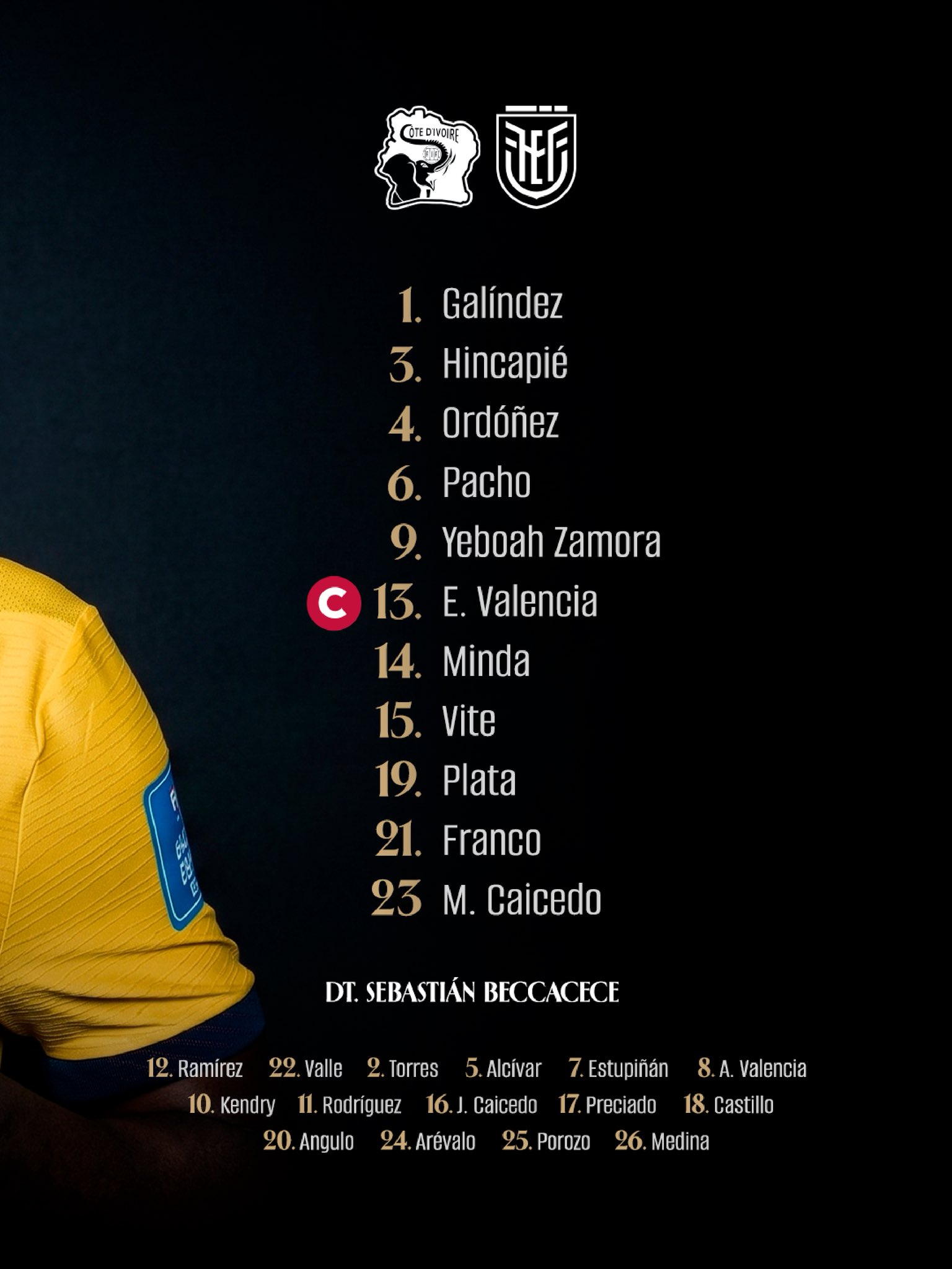
Final Score | 7.45
Group Analysis
Germany takes the top spot in Group E, using pristine clarity, editorial layout balance, and crisp information delivery to set the pace. Curaçao secures an impressive second-place finish, rewarded heavily for a bold, highly memorable design concept that pushed artistic boundaries. Ivory Coast sits just a fraction behind with an excellent, identity-rich managerial grid, while Ecuador grounds the group with a sleek, classy, but ultimately safe minimalist list.
GROUP F
Japan
Clarity & Readability | 9.5/10
The graphic is a triumph of absolute legibility. The squad numbers are massive, pure white and high-contrast, paired with flawlessly sharp, capitalised sans-serif player names beneath each portrait
Layout & Information Hierarchy | 9.0/10
The 3×4 grid alignment is structurally seamless. Suzuki Zion is distinctly isolated at the top left in his vibrant orange goalkeeper kit, immediately signaling his position. The inclusion of the FIFA World Cup 2026 asset, Group F classification and team flags are organised into a tidy vertical stack that stays completely out of the players’ way. However, they are missing a subs list
Esthetics / Visual Design | 8.0/10
While it leans into a traditional corporate layout, the visual execution is pristine. The studio lighting across the player portraits is remarkably uniform, and the subtle, stylised white vector lines cutting across the Samurai Blue kits add fine-grain texture to a very polished canvas. There’s zero wasted space
Authenticity / Brand Identity | 8.5/10
Drenched in the signature national navy blue and featuring official JFA crests on every jersey, the graphic is unmistakable. The footer clearly brands the squad as the “SAMURAI BLUE,” anchoring national pride
Rememberability / Creativity | 6.5/10
It priorities flawless data distribution over creative risk-taking. It is a brilliant execution of a standard template, though it doesn’t break new ground conceptually
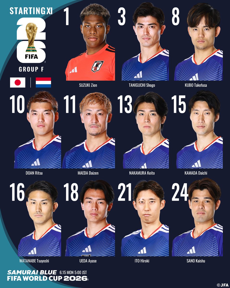
Final Score | 8.63
Netherlands
Clarity & Readability | 7.5/10
The sheer intensity of the design causes minor visibility sacrifices. The vertical, translucent gray player names are rotated 90 degrees and pushed to the edges of each box; while stylised, they require a bit of head-tilting to read quickly
Layout & Information Hierarchy | 8.5/10
Despite the chaos of the background, the grid works wonderfully. The vertical numbering is huge and Captain Virgil van Dijk is clearly designated with a miniature Dutch flag armband asset beneath his name. The substitution bench is intelligently corralled into a dark, textured gray card in the bottom right corner, keeping the main sheet uncluttered
Esthetics / Visual Design | 9.5/10
Visually breathtaking. The dramatic, fiery orange backlighting cuts heavily against the players’ faces, casting sharp, high-contrast shadows. The colossal, distressed “STARTING XI” typography layered in the background with abstract neon-orange scribbles creates an unmatched raw energy
Authenticity / Brand Identity | 9.0/10
The graphic screams Oranje. It leans heavily into the nation’s historic color and incorporates a stylised, aggressive lion sketch asset over the typography, matching the fierce energy of the Dutch identity
Rememberability / Creativity | 9.5/10
Easily one of the most memorable visual concepts of the tournament. The use of dramatic chiaroscuro portrait lighting transforms a standard lineup announcement into a genuine piece of digital art
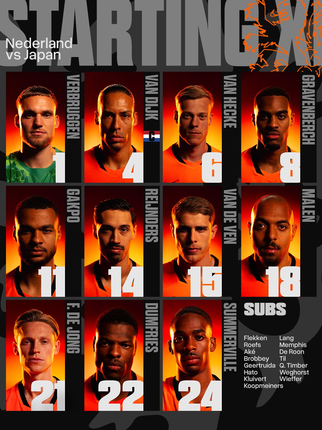
Final Score | 8.58
Sweden
Clarity & Readability | 8.5/10
The bold, white, blocky sans-serif typography is highly legible against the muted teal backdrop. However, because the text is stacked completely to the right side of the canvas, the smaller jersey numbers can occasionally blend together at a fast glance. However, there’s only a small % of the graphic that actually has the lineup information
Layout & Information Hierarchy | 7.5/10
The layout uses an intentional design choice where the names are listed in their actual tactical formation, utilising larger vertical gaps to separate the defence, the midfield and the strikers. While brilliant for tacticians, a standard user might find the uneven spacing slightly disjointed compared to a traditional list. Victor Lindelöf is neatly identified as captain with a simple “(K)” asset
Esthetics / Visual Design | 8.0/10
The design is elegant and deeply intimate. Rather than a series of tiny headshots, the graphic hands the entire left half of the frame to a single, high-quality portrait of Alexander Isak wrapped in the national flag. The subtle canvas texture in the backdrop adds a rich, studio-portrait depth
Authenticity / Brand Identity | 8.5/10
The iconic yellow and blue jersey stands out vibrantly against the moody background and placing the official Sverige crest in the bottom-right anchors the team identity
Rememberability / Creativity | 8.0/10
Breaking up the text tracking to mimic a physical pitch formation is a highly creative touch that elevates what would otherwise be a basic text list layout
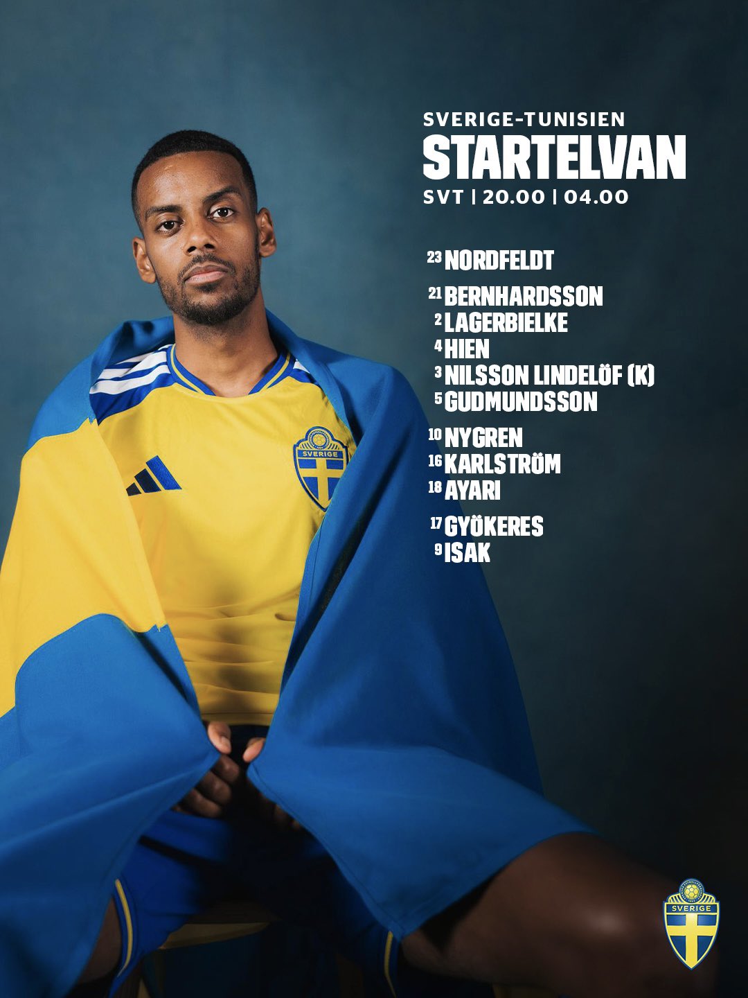
Final Score | 8.10
Tunisia
Unfortunately, I couldn’t find any starting lineups anywhere for Tunisia
Final Score | 0.0
Group Analysis
This was an incredibly tight battle at the top of the table. Japan edges out the group victory by a razor-thin margin, riding on the back of its flawless, hyper-legible data structure and pristine information hierarchy. The Netherlands takes a highly respectable second place, earning near-perfect marks for its stunning, fiery creativity and sheer visual memory-making. Sweden secures a strong third-place finish with a deeply artistic and clever formation-based typographic layout, while Tunisia rounds out the group at the bottom of the table.
GROUP G
Belgium
The Royal Belgian FA has completely shattered the traditional blueprint, delivering a breathtaking piece of environmental graphic design that leans directly into the host nation’s iconic Americana travel themes.
Clarity & Readability | 7.5/10
By prioritising an intense artistic concept, quick scannability takes a minor hit. The names and numbers are embedded onto heavily weathered, rusted road signs. While the fonts match their respective highway sign archetypes perfectly, the variation in background shapes, text sizes and directions requires the viewer’s eye to wander to piece the team together
Layout & Information Hierarchy | 9.0/10
An absolute masterpiece of data architecture. Without a traditional field schematic, the designers cleverly used a physical signpost to organise the team. Courtois sits atop the stop sign as the goalkeeper; the center backs are paired tightly below him; Meunier and Castagne feature directional arrows indicating their wing-back roles; Tielemans and Onana sit as a central midfield block; and the dynamic trio of Trossard, De Bruyne, and Doku branch out as the attacking engine. The subs bench is tucked neatly along the road at the base
Esthetics / Visual Design | 10.0/10
Flawless. The hazy, sun-drenched Mojave desert background, the cinematic grain, and the realistic textures on the metallic signpost create an immersive visual narrative. A blurred silhouette on the right edge frames the entire composition beautifully
Authenticity / Brand Identity | 8.5/10
While the setting is heavily Americanised to celebrate the World Cup’s geographic location, the inclusion of the “We Are Belgium” script watermark at the top provides a strong connection back to the core federation brand
Rememberability / Creativity | 10.0/10
Off the charts. This is arguably one of the most creatively daring and conceptually memorable lineup sheets ever created for a major tournament

Final Score | 8.78
New Zealand
The All Whites go all-in on an elegant, stone-cold aesthetic that leverages heavy editorial framing and a beautiful, custom typographic profile.
Clarity & Readability | 8.5/10
The crisp white text layered over a mottled, slate-gray concrete wall texture provides immense contrast. The stylised, elongated serif typography gives the text a very high-end, premium feel that is highly legible.
Layout & Information Hierarchy | 8.0/10
The text layout on the left is exceptionally tidy, framed cleanly within a subtle white border box. Chris Wood is explicitly called out with a clean, clear “(C)” captain marker. Chris Wood himself anchors the right side of the canvas in a striking portrait pose, proudly displaying the tournament’s “Unite For Peace” armband asset. The substitutions are well-organised at the lower left
Esthetics / Visual Design | 8.0/10
The cool, desaturated blue-gray tone of the graphic feels incredibly smooth and modern. The high-contrast lighting on the studio photography matches the textured background perfectly, giving it a sharp, cohesive look
Authenticity / Brand Identity | 9.0/10
The inclusion of the iconic silver fern emblem as a delicate footer element is excellent. The entire layout embraces a clean, sophisticated, and unified design language that perfectly aligns with New Zealand’s modern sporting identity
Rememberability / Creativity | 6.5/10
It is an incredibly elegant and sophisticated iteration of a player-portrait list template, but it chooses elite refinement over conceptual risk-taking
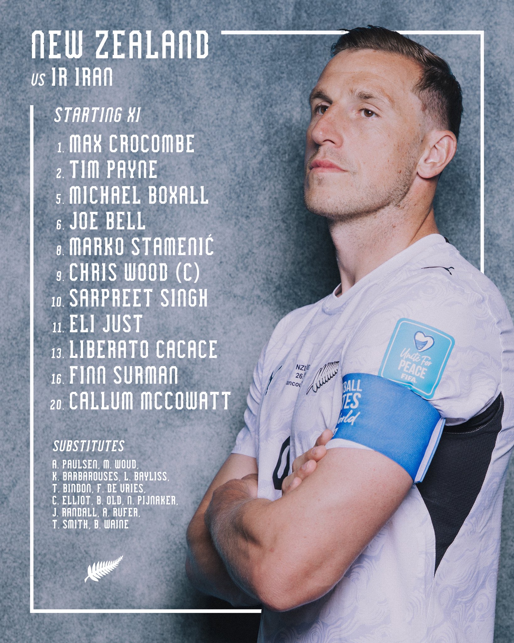
Final Score | 8.15
Egypt
The Pharaohs opt for a deeply intimate, high-contrast chiaroscuro design that focuses heavily on individual grit and focus
Clarity & Readability | 7.5/10
The clean white sans-serif player names are easily scannable against the pure black negative space. However, placing the gold squad numbers down the far right side, separated entirely from the start of the names, creates a minor tracking lag for the eyes
Layout & Information Hierarchy | 7.0/10
The information cluster at the top right is elegantly grouped with gold metallic typography and the official federation crest. A massive, tight-cropped portrait of Salah anchors the left side with a fierce, intense expression. The subs bench along the bottom is readable, though its text tracking is pushed tightly into the footer
Esthetics / Visual Design | 7.5/10
The intense, low-key lighting casting sharp shadows across the player’s face looks cinematic and powerful. The faint, dark geometric patterned jersey adds subtle texture to the lower frame, though the overall canvas leans heavily on a vast expanse of black space
Authenticity / Brand Identity | 8.0/10
The gold lettering hints beautifully at Egypt’s historic royal heritage, and the prominent red, white and black federation badge ensures national pride is well represented
Rememberability / Creativity | 6.0/10
A sleek, classy and highly dramatic portrait list that delivers excellent intensity but sticks to a familiar structural path

Final Score | 7.30
Iran
Unfortunately, I couldn’t find a lineup graphic for Iran
Final Score | 0
Group G Analysis
Belgium storm to the top of Group G, unleashing an elite level of conceptual creativity with their desert road signpost design that sets a massive benchmark for the tournament. New Zealand takes a highly comfortable second place, showcasing beautiful editorial poise, pristine typography, and smooth layout execution. Egypt delivers a respectable third-place baseline powered by dramatic, moody portraiture, while Iran completes the group at the bottom of the standings.
Group H
Group H brings a captivating clash of visual styles to the tournament table. We see Uruguay breaking out a beautifully structured tactical layout, Saudi Arabia blending cultural elegance with high-contrast split-space design, Spain channeling pure high-octane player emotion, and Cape Verde delivering a clean, geographically inspired corporate roster.
Uruguay |
The Asociación Uruguaya de Fútbol delivers a stunningly methodical design that feels like a futuristic tactical blueprint, trading the standard flat canvas for organised, structural depth.
Clarity & Readability | 8.5/10
By utilising a sharp sky-blue font over a dark, textured charcoal background, the names and numbers pop with incredible contrast. The typeface is clean, modern, and easily legible, ensuring it translates effortlessly to a quick scroll on a mobile screen
Layout & Information Hierarchy | 9.0/10
This is an absolute masterclass in on-pitch organisation. Uruguay arranges their starting lineup in actual tactical tiers, using sleek, bordered glass panels to separate the goalkeeper, defence, midfield and the striking partnership of Darwin Núñez and Federico Viñas. The match details are neatly centered at the top, and the substitutes bench sits cleanly along the bottom footer, maintaining perfect spatial harmony
Esthetics / Visual Design | 8.5/10
The visual polish is outstanding. Framing the player cutouts inside these translucent, glowing boxes creates a high-end editorial feel. The subtle lighting on the player portraits is remarkably cohesive, making the entire squad feel unified rather than like a collection of disjointed headshots
Authenticity / Brand Identity | 8.5/10
The legendary Celeste sky blue completely defines the typography and borders, matching the players’ jerseys perfectly. The design looks premium, elegant, and fits the classic, proud football heritage of Uruguay
Rememberability / Creativity | 8.0/10
Using physical, geometric panels to map out a clear tactical formation on the field is a brilliant, highly creative departure from standard roster formats that stays incredibly clean
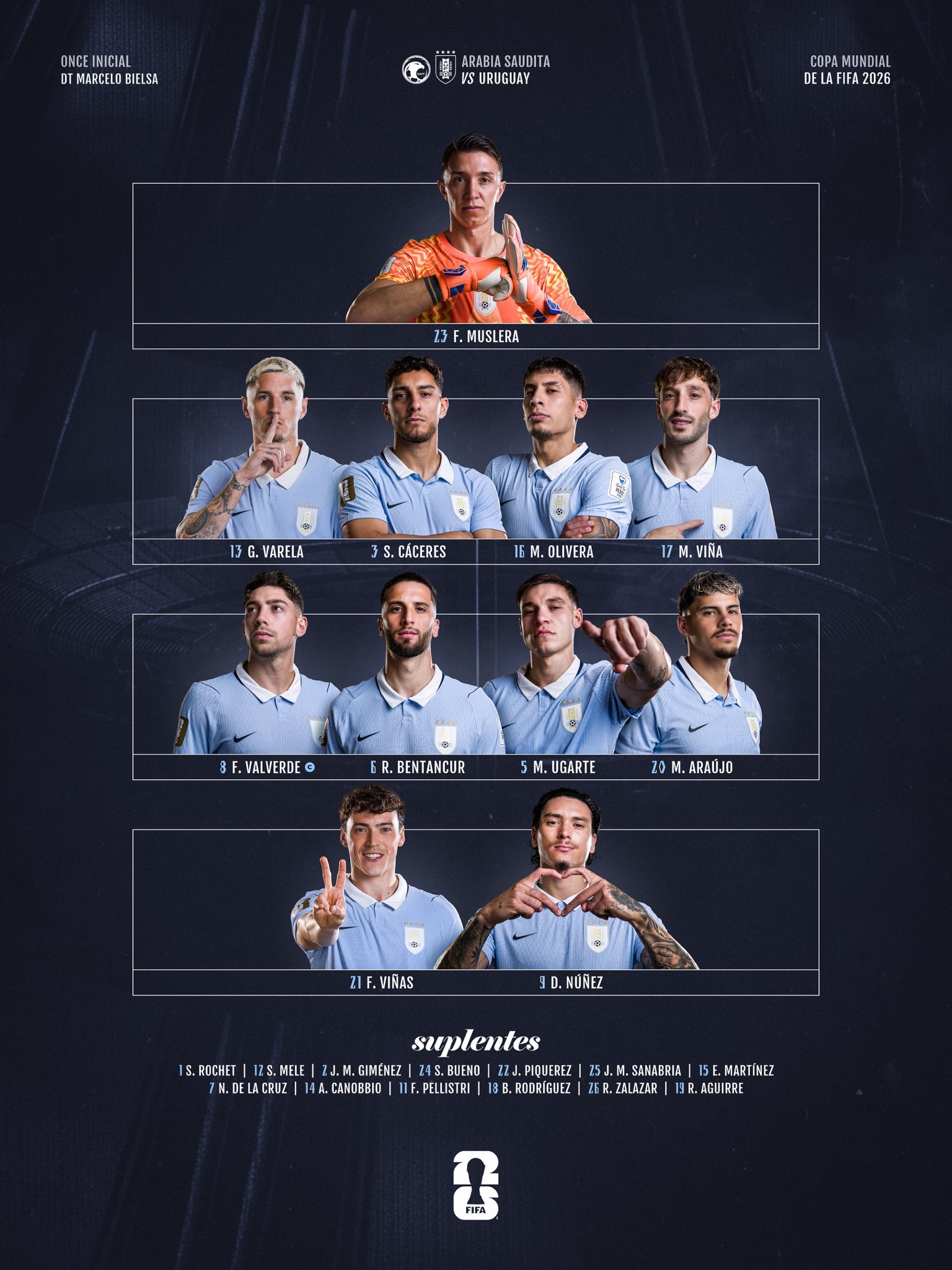
Final Score | 8.58
Saudi Arabia
The Saudi Arabian Football Federation brings a clean, split-screen aesthetic to Group H, utilising gorgeous Arabic typography and a sophisticated gold-and-green palette.
Clarity & Readability | 8.5/10
The contrast is stellar, matching dark forest green and deep black text against a crisp, solid white backdrop. For Arabic-reading supporters, the fluid, calligraphic font is incredibly sharp and readable. While the graphic is entirely non-English, it represents its home audience beautifully and is judged on its intrinsic typographic quality, which is exceptional
Layout & Information Hierarchy | 7.5/10
An incredibly structured split layout. The left side is dominated by a bright, high-quality portrait of Saud Abdulhamid, while the right houses the starting lineup. Important details like the goalkeeper (GK) and captain (C) are highlighted in elegant, matching gold plaques. The subs list is neatly organised at the bottom right
Esthetics / Visual Design | 8.0/10
Highly polished. The rich, gold chevron block anchoring the top-right corner adds a luxury feel to the white space. The lighting on the portrait is bright, clear and perfectly integrated into the white canvas
Authenticity / Brand Identity | 9.0/10
Excellent national identity representation. The signature green and gold colours of the Green Falcons are used beautifully, and the intricate pattern running through the player’s shirt is subtly mirrored in the green geometric corner graphics
Rememberability / Creativity | 7.0/10
While it relies on a standard vertical text list, the integration of fluid cultural calligraphy and the premium gold-accented header blocks gives this design its own distinct personality
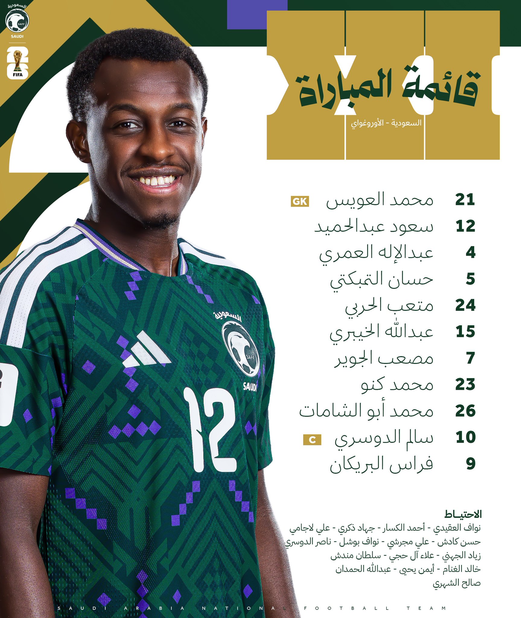
Final Score | 8.08
Spain
Spain steps away from traditional, stoic portraits to deliver a high-energy, aggressive composition built entirely around raw athletic passion.
Clarity & Readability | 8.5/10
The bold white and gold sans-serif typography contrasts flawlessly against the solid, neutral gray backdrop. The wide, clean font is exceptionally legible and can be parsed instantly from a distance
Layout & Information Hierarchy | 6.0/10
The graphic organises its text on the left while handing the right side of the canvas over to a colossal, high-impact photo of Unai Simón. However, the decision to completely omit the substitutes list from this primary matchday sheet significantly hurts its completeness and functional layout score
Esthetics / Visual Design | 8.0/10
The grit, intensity, and muscle detail captured in the player’s celebration is incredibly striking. The lighting is cinematic and clean, giving the entire piece a premium, high-budget commercial appeal
Authenticity / Brand Identity | 7.5/10
While the classic RFEF badge and gold lettering represent the federation’s identity, opting for a bright sky-blue goalkeeper kit over a plain gray background misses out on the iconic, La Roja heritage we traditionally associate with Spanish football
Rememberability / Creativity | 7.0/10
Using a screaming, raw action shot instead of a standard static pose injects a brilliant, memorable layer of drama and emotion into the graphic
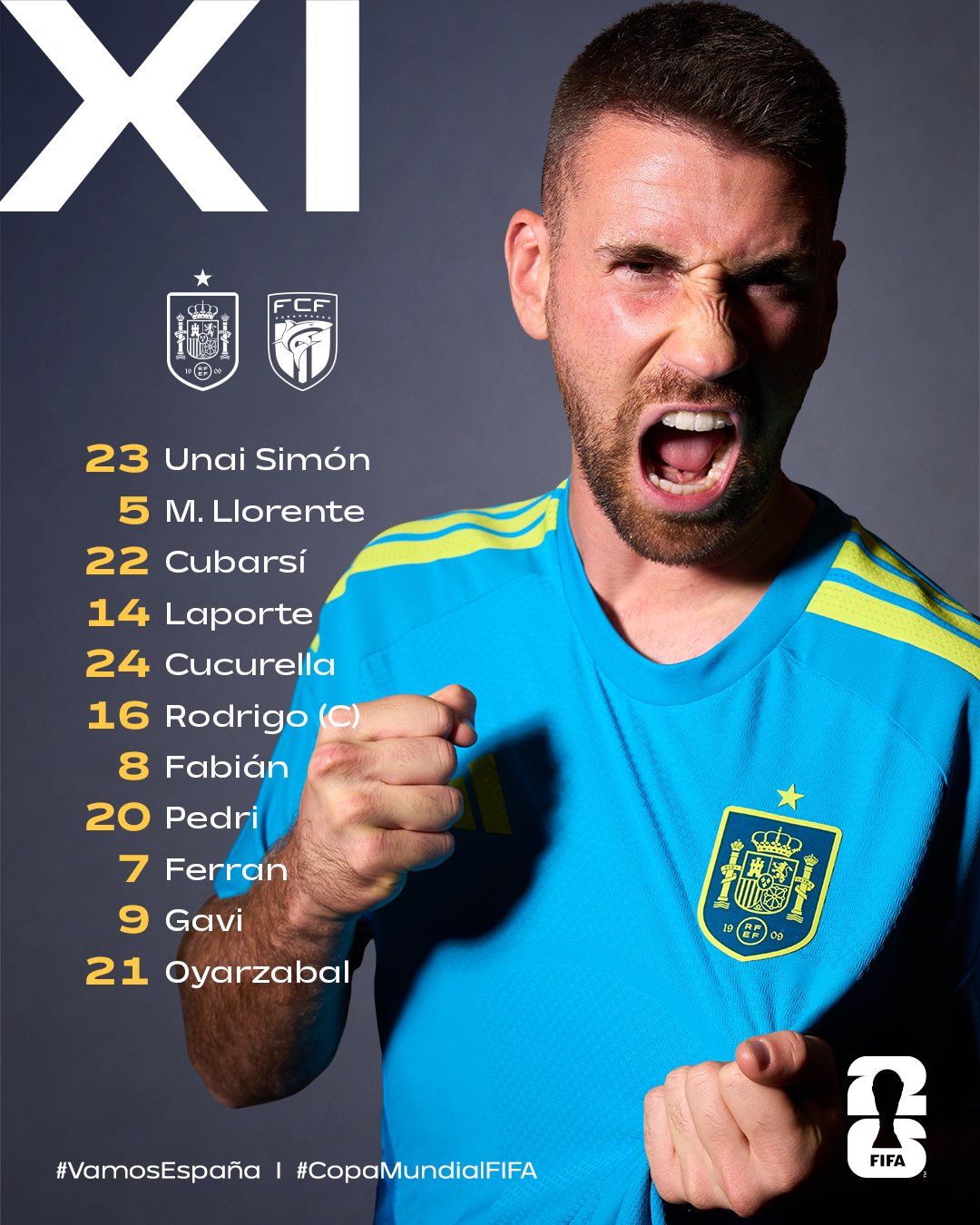
Final Score | 7.48
Cape Verde
Cape Verde brings a highly structured, tidy corporate design that relies on strong national colours and a clever, patriotic nod hidden in the background textures.
Clarity & Readability | 8.0/10
The high-contrast pairing of bold white text and bright red squad numbers against a deep navy blue background makes the roster very easy to read. The vertical, textured “11 INICIAL” title on the right is a bit thin and harder to read quickly, but the core starting lineup is solid
Layout & Information Hierarchy | 7.5/10
The matchup is clearly announced at the top with clean, stylised flags for Spain and Cabo Verde. The squad is centred and orderly and the substitutes list is cleanly organised at the bottom, though the sheer volume of text in the lower third makes the canvas feel slightly bottom-heavy
Esthetics / Visual Design | 6.5/10
The design is very neat and highly professional, but it lacks the premium editorial polish or atmospheric lighting depth seen in the top-tier competitors of this group. The solid colour blocks and vector flag shapes feel slightly more basic
Authenticity / Brand Identity | 8.5/10
A wonderful touch of national pride is integrated here | the subtle, ghosted island silhouettes of the Cabo Verde archipelago running through the dark blue background are incredibly authentic and specific to the nation
Rememberability / Creativity | 6.0/10
It follows a very traditional, centred text-list template. The geographical watermarks are a lovely addition, but the concept remains highly conventional
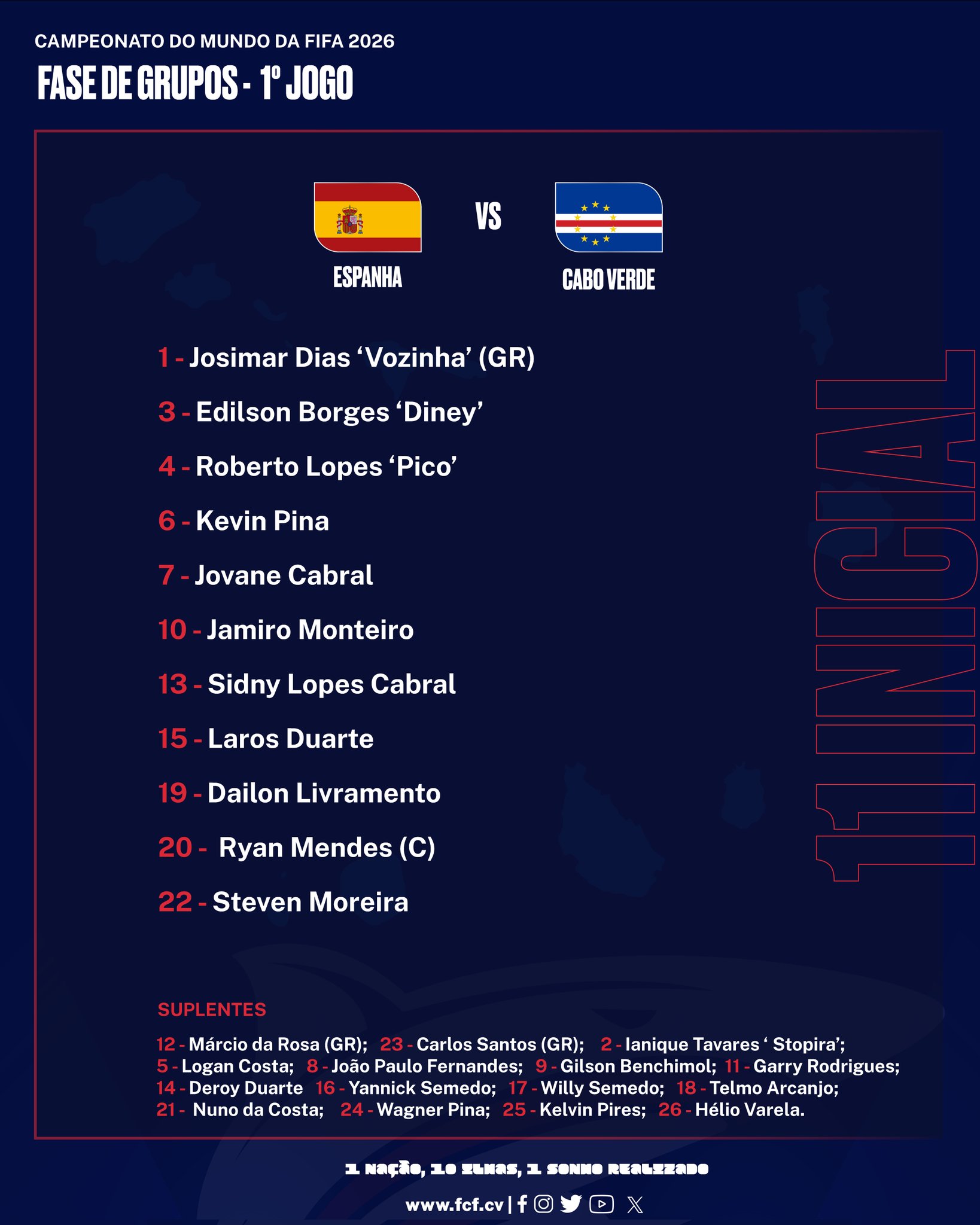
Final Score | 7.45
Group H Analysis
Group Analysis | Uruguay claims a well-deserved victory in Group H, utilizing a highly structured, visually stunning tactical glass-panel layout that masterfully displays their formation. Saudi Arabia lands a strong second place, utilizing premium gold details and elegant, culturally authentic calligraphy. Spain captures third place, showing off high-octane player emotion but dropping points due to a missing bench list, while Cape Verde anchors a highly competitive group despite a neat, island-patterned design.
GROUP I
Group I brings an absolute powerhouse lineup of footballing nations to the design table, showcasing everything from hyper-clean national grids to majestic, place-based editorial storytelling.
Norway
Norway brings a highly refined, professional player-and-list graphic that focuses heavily on clean typography and sharp focus.
Clarity & Readability | 8.5/10
The text legibility is top-tier. Scurrying clean, high-contrast white sans-serif text over the dark background ensures that every player’s name is easy to read. Bolding the last names creates an excellent visual anchor
Layout & Information Hierarchy | 7.5/10
The classic split layout works beautifully. Alexander Sørloth anchors the left-hand side in a sharp action cutout, while the starting lineup is stacked cleanly down the centre-right. The subs bench is organised neatly along the bottom footer, though the classic single-player list layout keeps its structural score within standard limits
Esthetics / Visual Design | 8.0/10
Very sleek and polished. The desaturated tones of the background crowd make the vibrant red, white, and blue of the Norwegian kit pop dramatically. The elegant, serif “XI” header adds a sophisticated, high-end editorial touch
Authenticity / Brand Identity | 8.5/10
The iconic chest cross on Norway’s kit is highly prominent, and the colours are beautifully matched. The overall aesthetic is clean, cool, and perfectly matches the modern identity of the national team
Rememberability / Creativity | 6.0/10
A highly refined and beautifully executed lineup graphic, but placing a single player cutout over a blurred matchday crowd photo is a very traditional sports design formula that plays it relatively safe
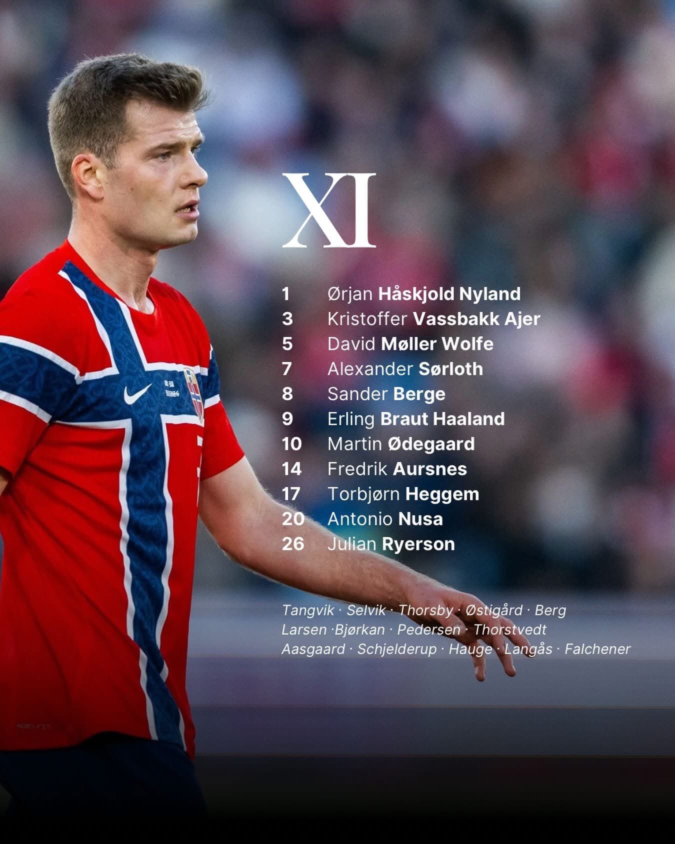
FInal Score | 7.83
Senegal
Senegal delivers an absolute visual triumph, discarding the typical moody, dark sports templates for a bright, high-contrast, minimalist editorial aesthetic.
Clarity & Readability | 9.0/10
Instantaneous legibility. Setting crisp red player name banners and bright yellow number tags against a solid white background provides spectacular mobile contrast. The typography is clean, bold, and can be read effortlessly from any distance
Layout & Information Hierarchy | 8.5/10
An incredibly structured grid layout. The top section clearly communicates the matchup, the historic venue, and kickoff times. Kalidou Koulibaly is clearly identified as captain with a sharp “3 CAP” tag, and the substitutes bench is grouped cleanly into a dedicated block at the bottom right
Esthetics / Visual Design | 8.0/10
This design feels like a modern, lifestyle-focused sports magazine cover. The bold green, yellow and red colours are handled with great restraint and the bright, uniform studio lighting on the player portraits gives the entire canvas a premium feel
Authenticity / Brand Identity | 9.0/10
The vibrant colours of the national flag completely own the space. Combining the clean, crisp kit details with the bold, sunny energy of the graphic creates a look that is unmistakably and proudly Senegalese
Rememberability / Creativity | 7.5/10
Using a bright, clean white canvas to present a starting lineup stands out massively in a sea of dark, textured digital templates, making this design incredibly memorable
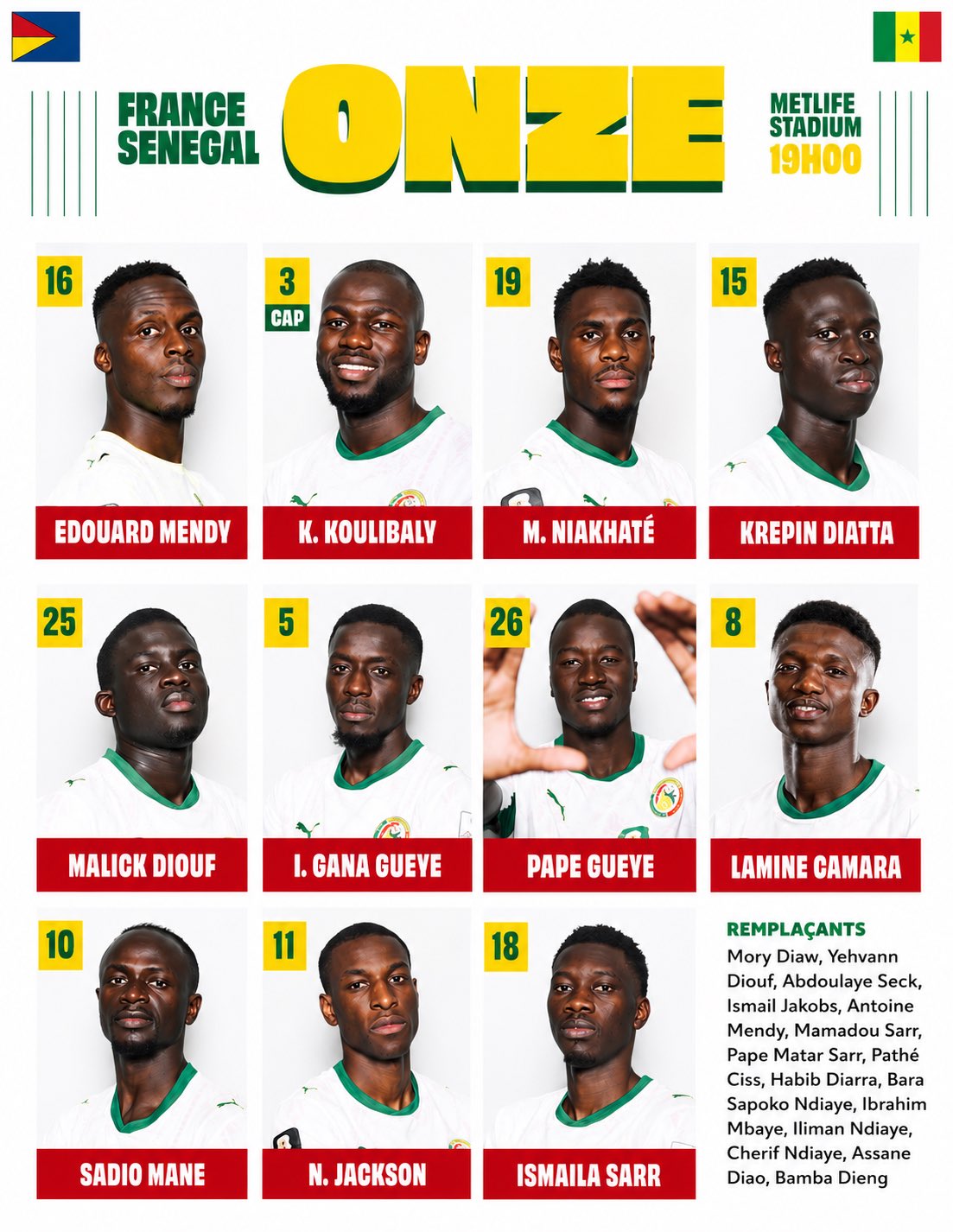
Final Score | 8.53
France
Les Bleus deliver a highly polished, modern digital card grid.
Clarity & Readability | 6.0/10
While the white condensed typography in the italic banners is sleek, the graphic suffers a massive clarity hit by completely omitting squad numbers from the starting eleven player cards. For fans wanting to quickly identify shirt numbers on matchday, this is a significant functional miss
Layout & Information Hierarchy | 8.0/10
The visual grid structure is exceptionally tidy, organizing the 11 players into clean rows. The bold “COMPOSITION” header and national crests sit proudly at the top, and the substitutes are clearly listed in a single, legible row at the bottom
Esthetics / Visual Design | 8.5/10
Visually, this is stunning. The rich navy blue canvas features sharp, diagonal dark-blue textured stripes that create a sense of movement. The player portrait photography is razor-sharp, uniform, and benefits from beautiful, high-end studio lighting
Authenticity / Brand Identity | 8.0/10
The classic French blue dominates the entire frame, giving it a strong connection to the national team’s primary colour palette. However, the background textures feel slightly more like a generic corporate or broadcast template
Rememberability / Creativity | 6.5/10
It is a beautifully polished, premium iteration of a digital card template, prioritising modern execution and consistency over unique conceptual risks
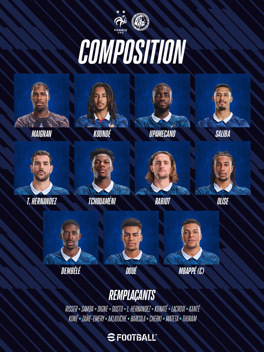
Final Score | 7.35
Iraq
Unfortunately, I couldn’t find a starting lineup graphic for Iraq
Final Score | 0.00
Group I Analysis
Senegal takes a brilliant, well-deserved group victory, utilizing an incredibly clean, high-contrast white lifestyle grid that completely redefines modern matchday art. Norway lands a strong second place with an elegant, highly legible, and atmospheric player-and-list layout, while France drops to third, looking absolutely spectacular but taking a major clarity hit due to the complete lack of shirt numbers on their starting cards. Iraq anchors the group in fourth.
GROUP J
Algeria
Algeria delivers a dazzling, high-energy masterpiece that feels incredibly premium, regal, and modern.
Clarity & Readability | 8.5/10
The high-contrast pairing of deep green typography against glowing gold background panels makes the text highly readable. In line with our design benchmark, the massive, dark green outline numbers layered dynamically behind the players’ heads look fantastic, adding rich layers of depth to each portrait frame
Layout & Information Hierarchy | 8.5/10
Despite carrying an immense amount of visual data, the spatial planning is superb. The dynamic player portraits occupy slanted geometric cards on the left, leaving the right side perfectly clear for clean matchup flags, a highly organised, easily scannable vertical substitutes column, and dedicated manager billing. Very similar to Brazil’s graphic
Esthetics & Visual Design | 9.0/10
Visually spectacular. The metallic gold angular gradients catch the eye instantly, creating a sense of luxury. The stylised player cutouts are sharp and uniform, resulting in a cohesive, top-tier aesthetic
Authenticity & Brand Identity | 9.0/10
The iconic green and gold of the Fennec Foxes completely owns this graphic. The custom font styling brings a localised, authentic flavor that feels entirely unique to Algerian football culture
Rememberability & Creativity | 8.5/10
Using slanted, sharp-angled geometric card slots completely transforms what could have been a standard portrait grid into a highly energetic, unforgettable design

Final Score | 8.68
Jordan
Jordan brings a highly practical, culturally rich dual-language layout that handles the complexity of international tournament data with absolute poise.
Clarity & Readability | 8.0/10
By mirroring English and Arabic text columns, the design is brilliantly accessible to both global and domestic audiences. The clean sans-serif and calligraphic Arabic scripts are easy to read, though the dark red-on-black background texture can slightly challenge the contrast of smaller text details on lower-brightness screens
Layout & Information Hierarchy | 8.0/10
An incredibly neat, symmetrical presentation. The starting lineups are split evenly on either side of central matchup flags, and the substitutes are organised into tidy, independent columns along the bottom footer
Esthetics & Visual Design | 7.5/10
The moody, deep crimson background texture is incredibly clean and fits the gravity of a World Cup fixture. The graphic elements are sharp and professional, though the overall structure leans on a more traditional split-list design
Authenticity & Brand Identity | 8.5/10
Drenched in Jordan’s iconic deep red, this graphic showcases immense national pride. Emphasising the Al-Nashama identity through the dual-language calligraphic header is a beautiful touch
Rememberability & Creativity | 7.0/10
While it remains a text-based list, the elegant, mirrored dual-language layout is a clever and functional concept that sets it apart from typical template formulas
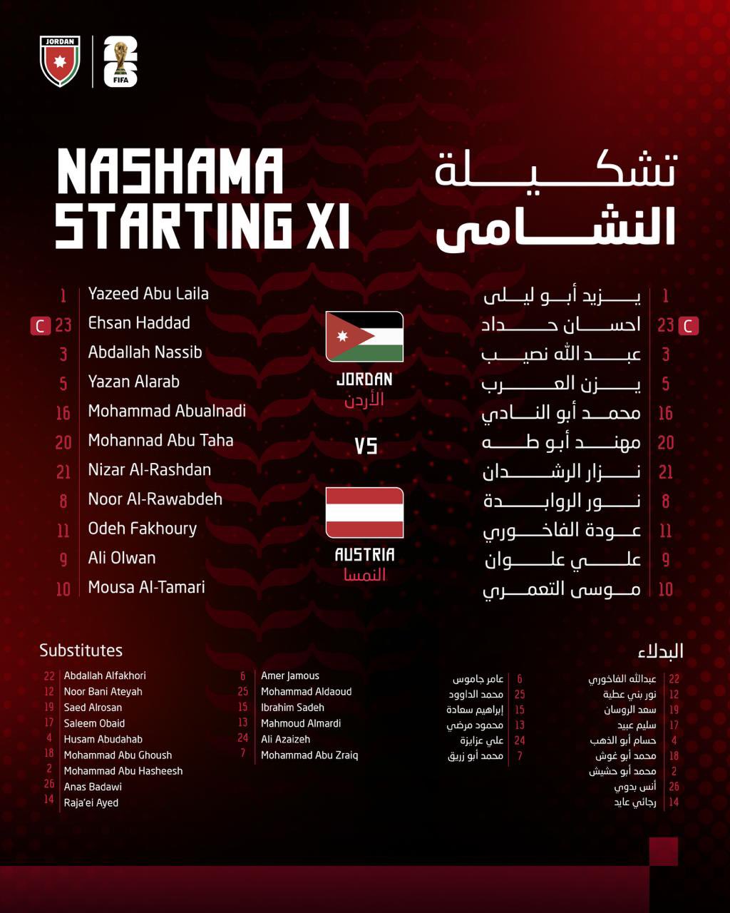
Final Score | 7.88
Argentina
The reigning world champions opt for an epic, high-impact aerial view, banking on real-world stadium grandeur to build matchday hype.
Clarity & Readability | 7.5/10
The stark white sans-serif text is highly legible, but laying smaller names directly over the dense, textured seating patterns of a packed stadium makes the lower half of the lineup slightly busy to scan
Layout & Information Hierarchy | 7.0/10
The centred vertical lineup is incredibly simple and clean, framed perfectly by the massive Arrowhead Stadium. Lionel Scaloni gets clear billing at the bottom, and the bench is legible. However, the sheer size of the background photo pushes the text elements into a smaller, tighter space
Esthetics & Visual Design | 8.0/10
The dramatic, night-time drone photography of the glowing stadium is breathtaking. It feels grand, cinematic, and professional, though overlaying text directly onto an unmodified photo is a simpler graphic design approach compared to custom-crafted digital canvases
Authenticity & Brand Identity | 7.5/10
The proud three-starred AFA crest anchors the top of the list, but because the canvas is entirely occupied by a red-and-white stadium bowl, the graphic misses out on the iconic sky-blue stripes we traditionally connect with Argentina
Rememberability & Creativity | 7.5/10
Using a real-world, high-angle stadium photograph as the actual canvas is a fantastic, highly atmospheric break from sterile studio backdrops, making it stand out wonderfully on a crowded feed
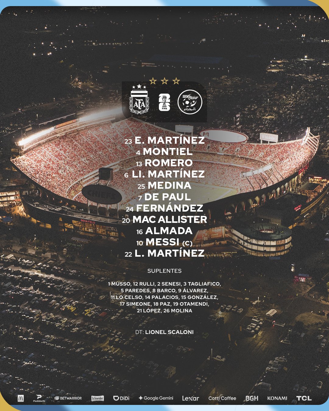
Final Score | 7.48
Austria
Austria steps away from high-intensity sports themes entirely to deliver a highly artistic, vintage lifestyle aesthetic that embraces brutalist minimalism.
Clarity & Readability | 7.5/10
The typography is beautifully vintage, though the muted, desaturated golden-brown font on a textured cream paper background offers slightly lower contrast, which could cause readability issues on small screens in bright sunlight
Layout & Information Hierarchy | 6.0/10
While the centre-aligned player list looks incredibly sleek, the complete omission of a substitutes bench from this primary graphic significantly hurts its functional layout completeness, triggering a standard penalty
Esthetics & Visual Design | 8.5/10
Pure sophistication. The subtle canvas/paper grain texture, elegant vintage typography and spacious layout give it a highly artistic, premium feel that resembles a high-end fashion or lifestyle print
Authenticity & Brand Identity | 7.0/10
The minimalist approach only uses Austria’s signature vibrant red in the “11”, teams and match info. While extremely classy, the desaturated palette loses some of the traditional, fiery energy of the national team identity
Rememberability & Creativity | 8.0/10
Austria deserves immense credit for taking a massive creative risk. Channeling a clean, retro brutalist lifestyle print is incredibly memorable and stands out instantly in a sea of high-contrast sports graphics
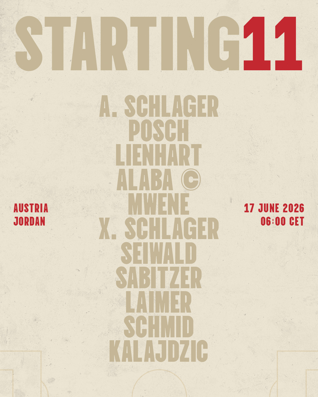
Final Score | 7.30
Group J Analysis
Algeria takes a commanding group victory, combining sharp, premium golden geometry and flawless data layout. Jordan secures a solid second-place finish, rewarded for an incredibly clean, mirrored bilingual presentation. Argentina lands in third, using majestic aerial photography that builds massive atmosphere but slightly compromises readability, while Austria’s highly creative, retro-minimalist design settles in fourth due to a missing bench list.
GROUP K
Group K presents an incredible showcase of modern tournament design.
Colombia
Colombia delivers an absolute visual triumph, bringing an unmatched, high-energy concept to the group stage that perfectly balances creative bravery with complete information density.
Clarity & Readability | 8.5/10
Brilliant contrast. Setting bright yellow typography and numbers against a rich, patterned navy blue background ensures exceptional legibility. The massive yellow outline squad numbers layered dynamically behind each player’s portrait look spectacular and add incredible depth
Layout & Information Hierarchy | 8.5/10
A masterclass in space optimisation. Despite the tight grid, the layout cleanly fits 11 starters, a dedicated portrait card for manager Néstor Lorenzo, and highlights captain James Rodríguez with a neat crest asset. Crucially, the subs bench is labelled by a prominent, high-contrast yellow footer bar, keeping the data complete and highly scannable
Esthetics / Visual Design | 9.0/10 Visually sensational. Cropping the player portraits into extreme close-ups of half their faces creates a unique, powerful aesthetic. The studio lighting is razor-sharp, the expressions are full of character and the subtle wavy textures in the background panels add a premium level of polish
Authenticity / Brand Identity | 9.0/10
Drenched in Colombian pride. The signature yellow, blue and red colour scheme is handled with immense confidence, and the elegant, script-styled “Con Orgullo Colombiano” banner in the top-right anchors the emotional soul of the nation
Rememberability / Creativity | 9.0/10 An incredibly bold and memorable concept. Stepping away from standard, static corporate headshots to present a grid of high-intensity, split-face portraits is a massive creative win that stands out instantly on any social media feed
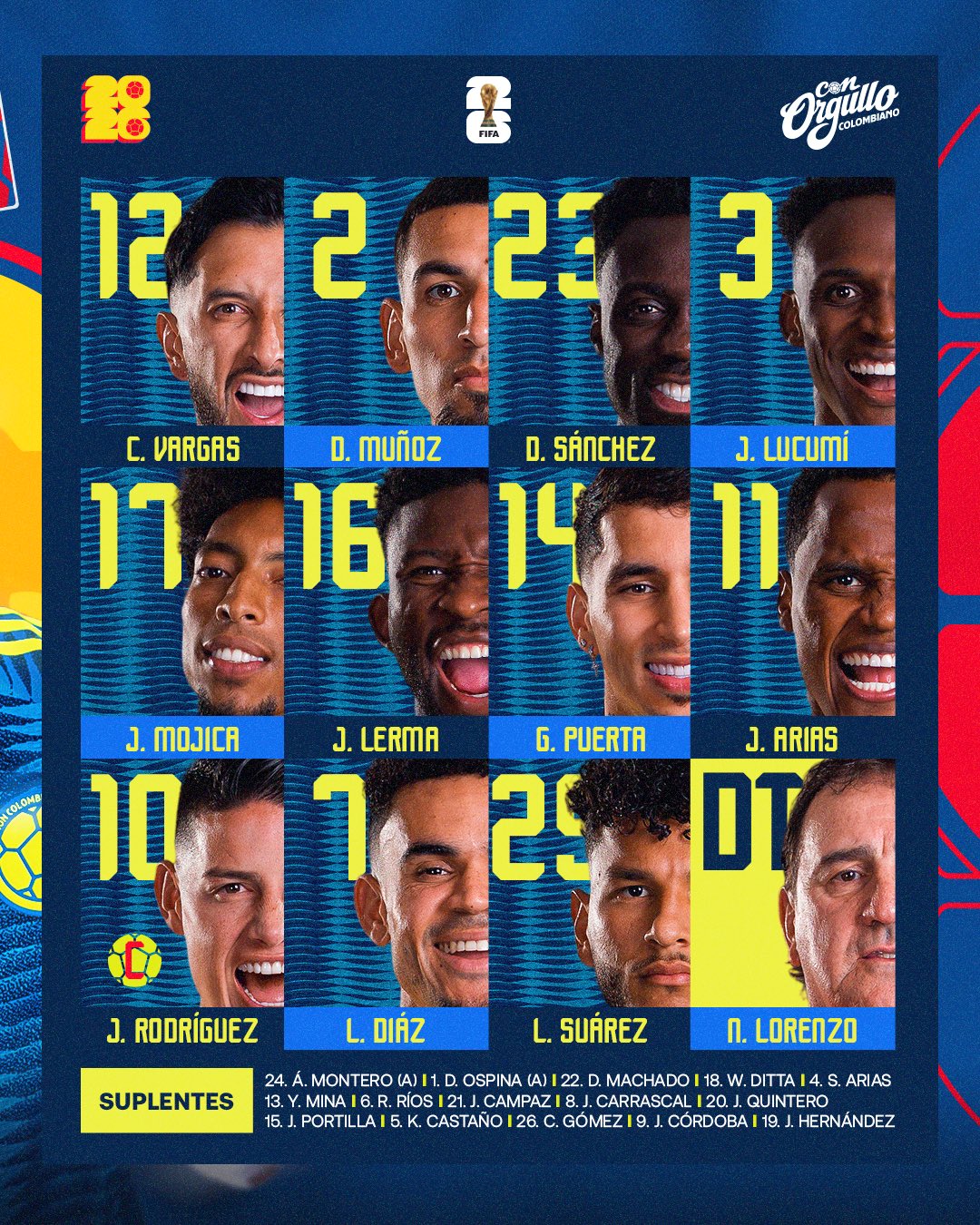
Final Score | 8.73
Portugal
Portugal brings a highly polished, elegant, and deeply nationalistic card grid, but they suffer a heavy layout penalty for a key structural omission.
Clarity & Readability | 7.0/10
While the massive white squad numbers provide exceptional clarity, the decision to rotate the player names 90 degrees vertically along the left edge of each card introduces a slight readability hurdle, requiring viewers to tilt their heads to scan the lineup quickly
Layout & Information Hierarchy | 6.0/10
The visual grid of cards is beautifully balanced, cleanly presenting the 11 starters and a massive, elegant FPF crest in the top-left slot. However, the complete omission of a substitutes bench from this primary matchday graphic significantly hurts its operational completeness, triggering a standard layout penalty
Esthetics / Visual Design | 8.5/10
Extremely refined and premium. The deep, rich crimson background is accented by elegant dark red and forest green wave motifs along the borders. The player portrait cutouts feature beautifully uniform, soft studio lighting that looks incredibly professional
Authenticity / Brand Identity | 8.5/10
The iconic colours of the Portuguese flag dominate the canvas. The addition of the classic, metallic gold border framing and the traditional FPF styling ensures this design feels deeply rooted in Portugal’s footballing heritage
Rememberability / Creativity | 7.0/10
A very handsome, highly polished iteration of a digital card template. The subtle wave patterns and bold, layered numbers behind the players’ heads look great, though it stays within relatively familiar structural boundaries
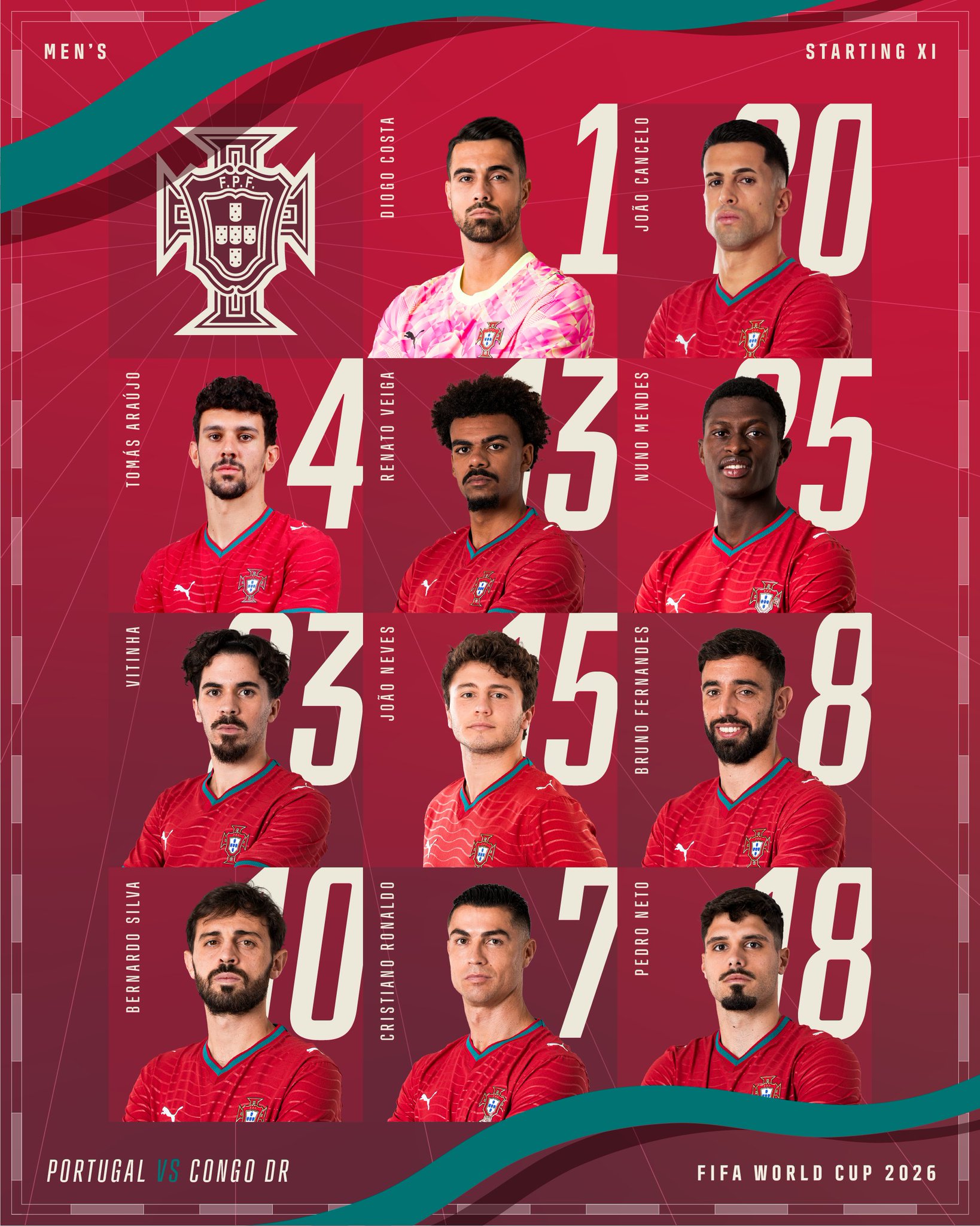
Final Score | 7.28
Congo
Congo DR delivers a highly vibrant, clean, and modern template that does its basic operational job well, but it shares the same critical layout omission as Portugal.
Clarity & Readability | 8.5/10
Legibility is top-tier. Using a clean, bold, white sans-serif font for both player names and numbers against bright, independent blue cards offers spectacular contrast. The text can be read effortlessly on any mobile screen
Layout & Information Hierarchy | 6.0/10
The symmetry of the player blocks is highly organised and the right-hand panel cleanly displays the match matchup details, flags, venue and kickoff times. However, like Portugal, the graphic completely leaves off the substitutes list, which severely limits its ultimate layout score
Esthetics / Visual Design | 7.0/10
Very tidy and professional, though it lacks the intricate texture work, cinematic lighting, or premium layered details seen in Colombia’s entry. The blue gradient blocks feel slightly flat in comparison
Authenticity / Brand Identity | 8.0/10
The vibrant blue and red accents of the national flag completely own the canvas, and the Umbro partnership branding is integrated cleanly at the footer alongside the FECOFA crest
Rememberability / Creativity | 5.5/10
A solid, reliable and functional roster sheet, but it sticks strictly to a traditional, safe sports grid formula
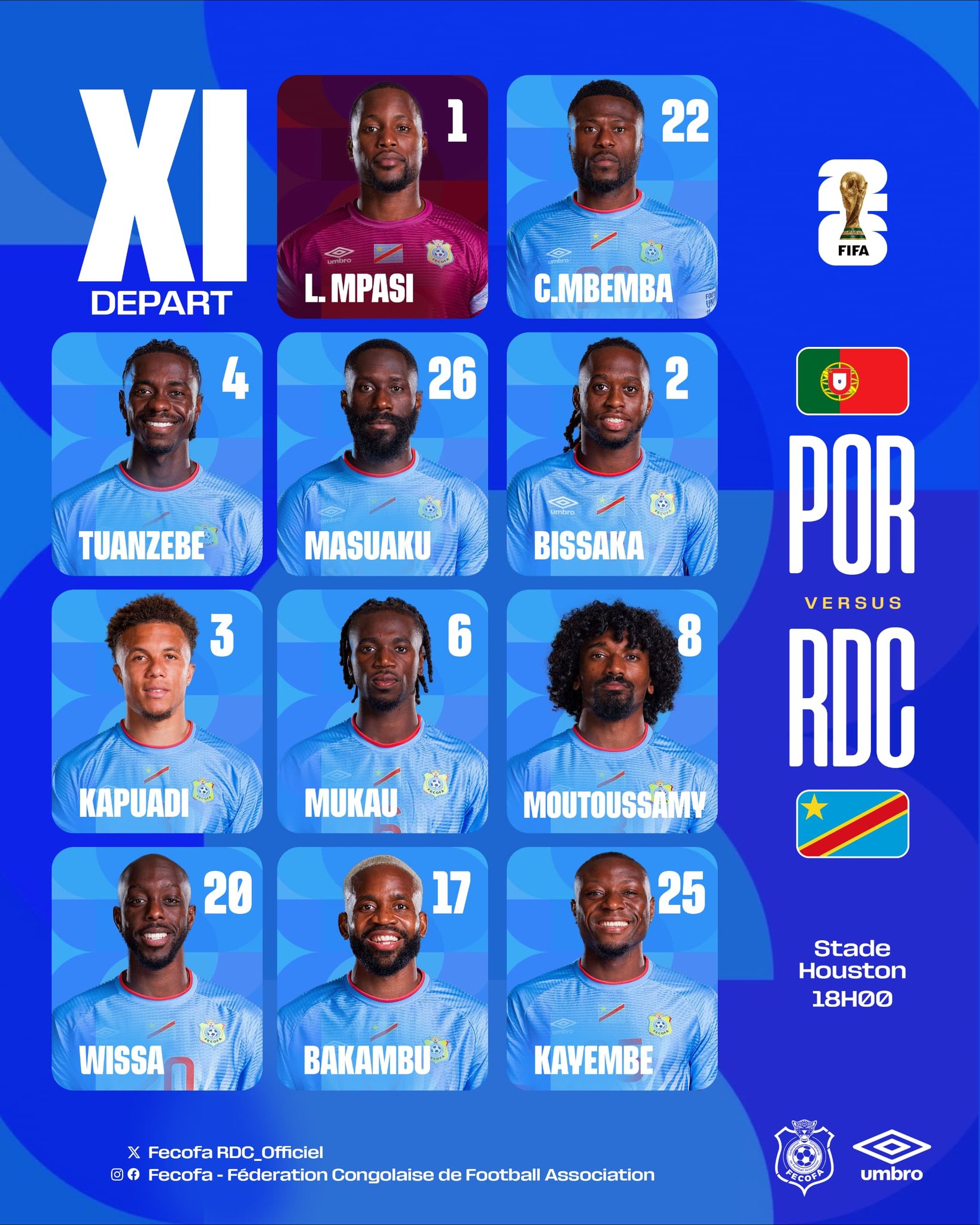
Final Score | 7.20
4th | Uzbekistan
Unfortunately, I couldn’t find a lineup graphic for Uzbekistan
Final Score | 0.0
Group Analysis
Colombia claims a sensational victory in Group K, utilising an incredibly bold, high-energy split-face portrait grid and flawless layout completeness to edge out the competition. Portugal finishes in second place with an extremely polished and elegant crimson card design, while Congo takes a close third with a highly readable, vibrant blue grid—both dropping significant points due to the complete lack of a substitutes bench on their primary graphics. Uzbekistan anchors the group in fourth.
GROUP L
Group L delivers an absolute masterclass in visual variety to close out our tournament stage.
Croatia
Croatia has thrown out the textbook entirely, treating their starting eleven announcement as a classified state secret. It is a work of pure thematic genius.
Clarity & Readability | 8.0/10
Typewriter-style monospace typography delivers a raw, historic feel. Contrast against the aged manila background is strong, though the heavily weathered paper grain introduces a minor legibility drag compared to pure digital canvases
Layout & Information Hierarchy | 8.0/10
The document is structurally organised like an official military or intelligence record. Zlatko Dalić’s signature is stamped with an “APPROVED” seal at the bottom left, the team details are logged neatly in the upper header, and the subs bench sits inside a rustic, aligned text block
Esthetics / Visual Design | 9.0/10
A triumph of texture and tone. The weathered paper grain, ink bleeds, distressed edges and faded state stamps are executed with flawless attention to detail. Joško Gvardiol is integrated perfectly, pointing proudly to the crest on his kit
Authenticity / Brand Identity | 8.5/10
Deeply patriotic without relying on loud, basic colour washes. Incorporating the Croatian checker pattern through Gvardiol’s kit and utilizing vintage government stamps (“VATRENI OBITELJ”) infuses the sheet with intense national pride
Rememberability / Creativity | 9.0/10
To turn a standard matchday team sheet into a leaked espionage file is an incredibly original and memorable design risk that pays off spectacularly, sitting just behind the absolute top tier of the tournament’s creative benchmarks
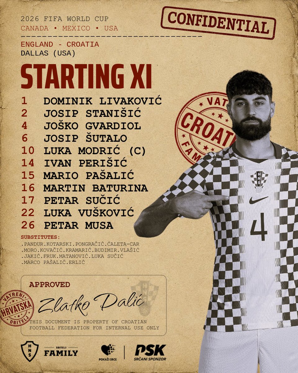
Final Score | 8.38
England
The Three Lions deliver a highly polished, broadcast-ready graphic that radiates modern elite sports branding and premium commercial production.
Clarity & Readability | 8.5/10
The high-contrast, condensed white italic typography pops beautifully against the dark background. Sizing is balanced, and the font is clean enough to scan effortlessly on any device
Layout & Information Hierarchy | 8.0/10
The asymmetrical layout handles information with absolute poise. It frames a close-up portrait of Anthony Gordon on the left while organising the starting lineup on the right. The subs are aligned neatly along the footer, and the commercial partner integration is kept small and non-intrusive
Esthetics / Visual Design | 9.0/10
Slick and exceptionally high-budget. The deep royal navy blue canvas features subtle vector textures and a beautiful, giant grayscale watermark of the three lions crest. The studio lighting on Gordon is flawless
Authenticity / Brand Identity | 8.5/10
The classic navy and white palette instantly screams England. The custom typography and clean, modern elements align perfectly with the modern, high-fashion identity of the FA
Rememberability / Creativity | 6.5/10
While it sits on a traditional list-based foundation, the elite textures, atmospheric depth and visual polish elevate it well above basic roster layouts
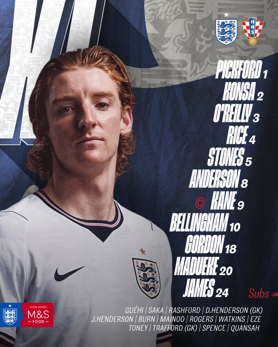
Final Score | 8.28
Ghana
Ghana brings an incredibly vibrant, bold, and energetic concept that leverages unique structural splits and stunning tribal textiles.
Clarity & Readability | 8.0/10
While the rotated names require a bit of head-tilting to read on mobile, the high-contrast, massive white-on-black squad numbers anchoring the base of each column offer brilliant, instant numeric legibility that anchors the entire sheet
Layout & Information Hierarchy | 8.5/10
An exceptionally organised column layout. Aligning the 11 vertical columns across the horizontal canvas keeps the entire squad in perfect equilibrium. The tournament header is clean and spacious, and Jordan Ayew is cleanly highlighted with a gold captain’s asset
Esthetics / Visual Design | 9.0/10
Breathtaking visual depth. The rich, golden yellow background features an intricate, gorgeous Kente fabric weave pattern that adds incredible texture. The warm, uniform lighting on the player portraits makes the entire graphic feel immensely premium
Authenticity / Brand Identity | 9.5/10
An elite celebration of the Black Stars. The combination of vibrant gold, national flag colours and the kit’s explicit black stars stamped on each player’s chest creates an unmatched, culturally rich connection to the Ghanaian nation
Rememberability / Creativity | 9.0/10
Utilising a vertical column slit design with full-body player portraits is a brilliant, highly distinctive departure from the standard crop templates used by most countries, making it one of the absolute creative peaks of the group stage

Final Score | 8.65
Panama
Panama delivers a clean, classic, and highly orderly template that does its basic operational job with great poise, though it plays it a bit safe.
Clarity & Readability | 8.5/10
Flawless contrast. Putting bold white lettering inside rich red player portrait cards against a light cream background makes this lineup incredibly easy to read and scan on the go
Layout & Information Hierarchy | 8.0/10
Highly symmetrical and balanced. The matchup flags and venue details frame the header cleanly, while the head coach, Thomas Christiansen and the substitutes bench occupy dedicated, aligned spaces at the bottom
Esthetics / Visual Design | 7.0/10
Very neat and professional, though it lacks the intricate texture work, cinematic lighting, or premium editorial layers seen in its Group L competitors. The blocks and background feel slightly flat
Authenticity / Brand Identity | 7.5/10
The national red and white dominate the cards, and the crest sits proudly in the upper corner. However, the vast cream background canvas misses out on incorporating unique national symbols or textures
Rememberability / Creativity | 6.0/10
It relies on a very conventional, straightforward card grid. It functions beautifully as an announcement sheet but takes very few creative risks
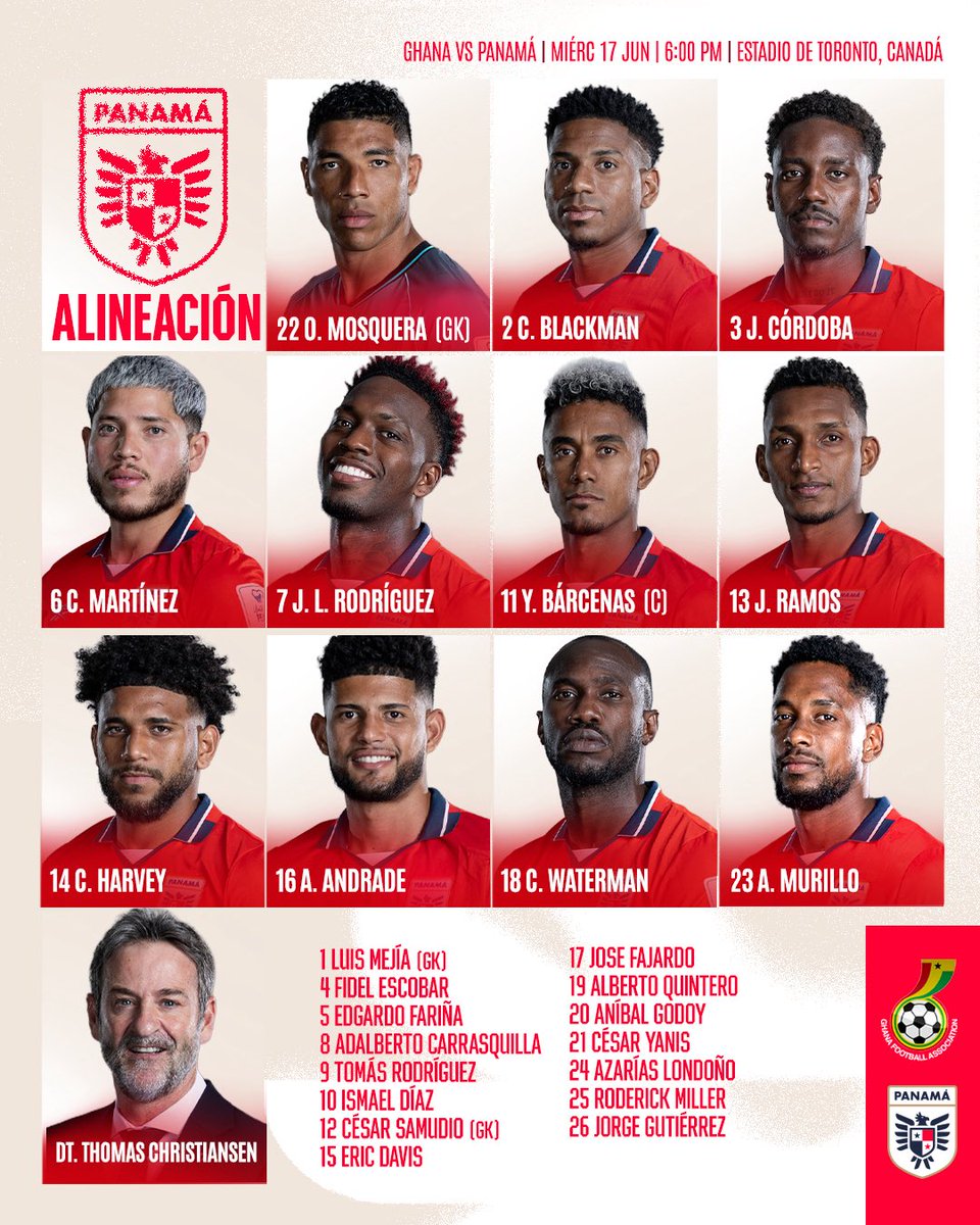
Final Score | 7.68
Group L Analysis
Ghana claims a sensational victory in Group L, combining a bold vertical slit-column layout with a stunning, culturally rich Kente fabric background to edge out the competition. Croatia takes a phenomenal second place, relying on its brilliantly executed, deeply nostalgic intelligence dossier concept. England finishes in a strong third place with an incredibly clean, high-budget commercial design, while Panama anchors our final group with a highly functional and readable card template.
The Final Leaderboard | World Cup Starting XI Graphics Recap
The group stage of the tournament has delivered an absolute masterclass in sports design. Over the course of 24 matches, national federations threw out generic corporate templates, elevating team sheets from basic text announcements into genuine, culture-rich works of art.
To determine the definitive champions of matchday art, we evaluated every graphic under the strict, weighted CLEAR Score formula:
CLEAR Score =
Clarity x 0.30) +
Layout x 0.25 +
Esthetics x 0.20 +
Authenticity x 0.15 +
Rememberability x 0.10
Below is the official Top 10 leaderboard representing the tournament’s absolute creative peak.
The Top 10 Starting XI Graphics
| Rank | Country | Group | Key Theme / Style | CLEAR Score |
|---|---|---|---|---|
| 1st | Belgium | Group G | Sun-Drenched Desert Road Signpost | 8.78 |
| 2nd | Colombia | Group K | Split-Face Portrait Grid | 8.73 |
| 3rd | Algeria | Group J | Slanted Golden Geometry | 8.68 |
| 4th | Ghana | Group L | Vertical Kente Fabric Columns | 8.65 |
| 5th | Japan | Group F | Hyper-Legible Corporate Grid | 8.63 |
| 6th | Uruguay | Group H | Translucent Tactical Glass Tiers | 8.58 |
| 7th | Netherlands | Group F | Chiaroscuro Cinematic Neon | 8.58 |
| 8th | Senegal | Group I | Minimalist Editorial Magazine | 8.53 |
| 9th | Croatia | Group L | Classified Espionage Dossier | 8.38 |
| 10th | Germany | Group E | Clean Asymmetric Editorial | 8.35 |
Sports Design Masterclass | What Works & What Scores High
Analysing dozens of international lineups reveals clear, actionable lessons for modern sports designers. If you want to build graphics that capture attention, convey critical data, and build immense brand value, focus on these four core design pillars:
1. The Power of “Environmental Storytelling”
The graphics that achieved the highest creative scores (like Belgium’s Mojave desert signpost or Croatia’s intelligence dossier) completely abandoned standard digital templates. Instead, they built tangible, real-world environments.
- Why it works | It transforms a functional text list into an immersive experience. Placing weathered, rusted metal signposts in a sun-drenched landscape or simulating aged, coffee-stained paper with typewriter fonts instantly sparks the viewer’s imagination and makes the post highly shareable.
- The Design Lesson | Don’t just place player cutouts over a generic stadium background. Ask yourself: What is the larger narrative of this match, this location, or this team’s history, and how can we build a physical world around that theme?
2. Creating Depth with Backdrop Typography
A massive trend among the top-tier graphics (seen with Colombia, Algeria, and Senegal) was layering large, high-contrast numbers directly behind the players’ portraits.
- Why it works | It solves one of the hardest challenges in sports layout—how to add visual depth without cluttering the canvas. Pushing massive outline numbers behind the subject’s head creates distinct foreground, middleground, and background layers. It makes the player portrait pop off the screen while keeping the essential text (the player’s name and actual number) perfectly legible.
- The Design Lesson | Use layering to your advantage. A flat grid of headshots feels stale; overlapping text, silhouettes, and numbers in a 3D-like stack instantly elevates the premium feel of the graphic.
3. Authentic Cultural Textures over Generic Templates
The most successful designs celebrated national identity by weaving local culture directly into the canvas. Ghana integrated intricate, stunning yellow Kente fabric weaves into their columns; Curaçao leaned into their national colour palette to build dynamic neon light pillars; Norway captured the cold, clean minimalism of Scandinavia.
- Why it works | Fans connect deeply with cultural heritage. A design that feels uniquely and proudly local builds a far more powerful emotional bond than a polished, but ultimately generic, broadcast template.
- The Design Lesson | Look beyond the primary team badge. Pull textures from historic jerseys, national fabrics, architecture, geographical topography, or local art movements to ground your design in genuine authenticity.
4. Operational Completeness is Non-Negotiable
Sports design is, first and foremost, an exercise in communication. Several beautiful, high-budget designs took massive hits in our overall standings due to basic functional omissions. Specifically, leaving off the substitutes bench or omitting shirt numbers from the primary matchday graphic severely limits the graphic’s real-world utility.
- Why it works | Supporters scan these graphics to answer key matchday questions: Who is playing? What number are they wearing? Who is on the bench? A design can be museum-worthy, but if it fails to deliver basic data quickly on a mobile screen, it fails as a starting lineup graphic.
- The Design Lesson | Always balance art with operational utility. Lock down your information hierarchy—starting eleven, shirt numbers, captain markers, substitutes bench, match details, and kickoff times—before you start designing. The best graphics on earth (like Japan’s pristine corporate grid) achieve greatness simply by executing these fundamentals flawlessly.