Matchday is more than just the game and the Starting XI is an important element. While the quality and polish might not always match the top tiers, there’s a certain grit and authenticity to the clubs’ social media game that’s all its own.
These graphics aren’t just a list of names; they’re a vibe check for the club’s brand, getting supporters fired up.
Matchday is more than just the game—it’s about the entire build-up, and the starting XI graphic is a big deal. When it comes to this league, expectations are sky-high for every part of a club’s social media game.
These graphics aren’t just a list of names; they’re a vibe check for the club’s brand, getting supporters fired up.
Just to be clear, I’m definitely not a professional graphic designer, so this is all based on my personal opinion. What I like and what just feels right to me. I’m looking for the ones that make me feel connected to the club and get me excited for kick-off.
Let’s dive in and see who’s winning the off-pitch style battle in this raw and competitive league.
Alloa Athletic

The graphic’s composition is unique as it doesn’t feature a player portrait but instead uses a wide-angle view of a football pitch. This provides a clear, tactical view of the team’s formation, which is a key strength. The typography is a simple sans-serif font, which is easy to read.
Legibility is excellent. The white text for the lineup list provides a strong contrast against the dark overlay on the graphic. The formation graphic is also clear, with player names positioned correctly on the pitch. The colour scheme is bright, using Alloa’s signature black and gold to frame the information. This gives the graphic a distinct and recognizable look.
The overall design is highly functional and provides information in a different, more tactical way than the other graphics. However, as a design taken directly from a live stream, it has a lower production quality compared to dedicated social media graphics. While effective for its purpose, it lacks the polish and flair of a bespoke graphic.
Score: 5/10
Cove Rangers
The graphic’s composition features a wide shot of a stadium instead of a player portrait. This provides a functional backdrop but lacks the visual dynamism of a graphic with a player. The typography is a straightforward sans-serif font, clear and easy to read.
Legibility is very high, with white text standing out clearly against the blurred, overcast stadium background. The overall color scheme is neutral and functional, which is effective but not particularly striking. The design is simple and to the point, clearly communicating the information without any distracting frills.
The design is practical and does what it needs to do, but it is not a standout graphic. The use of a simple, un-styled photograph as the background makes it feel very much like a basic match-day graphic rather than a polished social media piece. It is a solid, no-frills design.
Score: 7/10
East Fife
The graphic’s composition is bright and visually balanced. A high-quality portrait of a player occupies the left side, while the line-up information is neatly presented on the right. The player is smiling and approachable, which adds a friendly touch to the graphic. The typography is a simple, bold sans-serif font, which is highly legible. The club crests are clearly visible at the top, along with a secondary graphic for the Scottish League One branding. The use of numbers next to each player’s name is a good practice for clarity. The substitutes are listed in a clear, well-defined box.
The color palette is a vibrant mix of black and gold, which are East Fife’s team colors. This color scheme is applied effectively, creating a cohesive and brand-aligned design. The subtle, repeating texture in the background adds a touch of depth and detail without being distracting.
The design is professional and polished. It successfully balances a strong photographic element with clear and well-organized information. The overall aesthetic is modern and appealing, making it a very effective social media graphic. The design feels much more polished than what might be expected from a lower-league club.
Score: 7.5/10
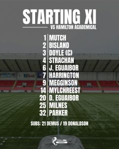
Hamilton Academical
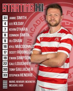
The graphic’s composition is bold and eye-catching, utilising a strong red and white colour scheme. A clear portrait of a player is featured on the right side, with the line-up information presented vertically on the left. A large, crest is subtly placed in the background, adding a unique branding element. The typography is a clean, modern sans-serif font that is easy to read. The player’s number is prominently displayed next to his name, which is a helpful feature. The substitutes are listed clearly at the bottom.
The color palette is derived directly from the club’s home kit, with a rich red and a clean white. The background features a subtle red-on-red pattern that adds a professional touch without cluttering the design. The overall look is professional and cohesive, aligning well with the club’s identity.
The design is strong and effective. It successfully balances the player portrait with the essential information. The use of the club’s colours and branding elements creates a very professional feel, and the graphic is well-suited for social media use.
Score: 7.5/10
Inverness Caledonian Thistle
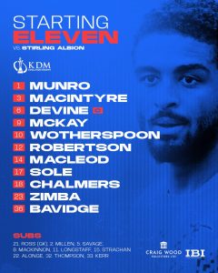
The graphic’s composition is clean and modern, featuring a strong blue color palette. A player is visible on the right side of the graphic, his image partially obscured for an artistic effect. This is a common design technique that adds visual interest. The text is placed on the left side, using a bold, sans-serif font that is easy to read. The title “STARTING ELEVEN” is a nice touch, as it differs from the common “STARTING XI”.
The colour palette is a striking blue, with hints of red used for highlighting elements like the player’s number and the title text. This creates a powerful contrast that makes the important information stand out. The background features a subtle, abstract pattern that gives the graphic a professional and high-quality feel. The inclusion of sponsor logos at the bottom is done cleanly and does not detract from the main content.
The design is strong and effective. It successfully uses a simple layout with a high-quality photo and effective typography to create a visually appealing graphic. The overall aesthetic is modern and professional, demonstrating a high level of design effort for a club in League One.
Score: 7.5/10
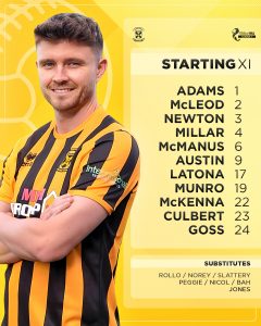
Kelty Hearts
The graphic’s composition is clean and simple. A cropped photo of a player is on the right side, with a large, stylized ‘XI’ dominating the top left corner. The player’s name and number are neatly listed vertically, using a clean, bold font that is highly legible, though the font colour used on the captain’s name may cause some legibility issues. The club crests and sponsor logos are clearly visible at the bottom.
The colour palette is primarily maroon, reflecting the club’s colours. The use of a subtle, darker tone of maroon in the background adds depth without being distracting. The large ‘XI’ graphic is eye-catching and creates a strong visual identity.
The design is functional and effective. It successfully conveys the necessary information in a clear and concise manner. While it lacks some of the artistic flair of other graphics, its simplicity is a strength, making it easy to read and understand. It feels professional and well-suited for social media use.
Score: 7/10
Montrose
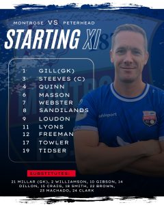
The graphic’s composition is eye-catching. The left side lists the players’ names and numbers, while the right side features a portrait of a player. The club colours—blue and white—dominate the graphic, with the addition of a dark gradients to make certain elements stand out.
The typography is a bold, clean sans-serif font that is easy to read against the busy background. The title “STARTING XI” is large and clear, though it appears slightly cluttered due to the placement of the “Montrose VS Peterhead” text. The list of substitutes is also easy to read and is set apart from the main line-up.
The design is bold and effective. It successfully integrates the player portrait with the key information. The graphic is high-quality and professional, with a good use of space and colour. The use of a subtle background pattern adds to the overall professional feel. The dark overlay on the player image is a subtle but effective design choice that helps to make the white text on the left stand out more, while also adding a touch of moodiness to the graphic.
Score: 7/10
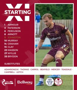
Peterhead
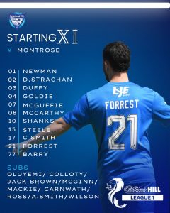
The graphic’s composition is a two-column layout. The left side features the starting eleven and substitutes, while the right side is dominated by a photo of a player. The club colours, blue and white, are the primary colourway, with a subtle wave pattern in the background.
The typography is a clean, sans-serif font that is highly legible against the background. The title “STARTING XI” is prominently displayed, and the players’ names and numbers are neatly arranged below. The substitute list is also easy to read and is clearly separated from the main lineup.
The design is straightforward and functional. It effectively presents all the necessary information in a clear and concise manner. The use of a player photo adds a personal touch and visual interest. The background pattern, while subtle, adds a sense of dynamism to the graphic. The club crest and sponsor logos are well-placed and do not clutter the design.
Score: 7/10
Queen of the South
The graphic’s composition is a unique grid-based layout, displaying small, cropped portraits of each player. However, a closer look reveals that the players’ heads have been photoshopped onto what appears to be the same generic body. This design choice, while an efficient way to present the starting eleven, makes the graphic feel less authentic and detracts from its overall professionalism. The club’s blue and white colors are prominently featured throughout the design, with a repeating pattern of white circles on a blue background that adds a subtle texture.
The typography is a serif font for the main “STARTING XI” title, which gives it a classic feel. The player names and numbers are in a sans-serif font below their respective photos, making them easy to read. The list of substitutes is also legible, although the font size is smaller.
The design is distinctive and stands out from other graphics we have reviewed. While the grid layout is a bold choice, the composite nature of the player images limits the visual impact and raises questions about authenticity. The overall design is clean and well-structured, but the use of a single body for multiple players is a significant drawback.
Score: 6/10
Stenhousemuir
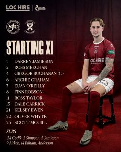
The graphic features a player sitting on a stool in the foreground, with the starting line-up and substitutes listed to his left. The club’s maroon and white colours are the primary colourway, with the background consisting of a textured, burgundy-coloured curtain. This gives the graphic a classic, studio-portrait feel.
The typography is a clean, sans-serif font for the player names and numbers. The “STARTING XI” title is bold and highly legible. The substitute list is clearly separated and easy to read. The use of both the club’s crest and a sponsor’s logo is well-executed without cluttering the design.
The design is unique and professional. The choice to use a seated player adds an interesting dynamic to the graphic, making it feel more like a personal portrait than a generic action shot. The lighting is well-controlled, and the shadows add a sense of depth. The background is simple yet effective, and the texture adds visual interest. The sponsor logos are seamlessly integrated into the design.
Score 8.5/10