Matchday is more than just the game—it’s about the entire build-up, and the starting XI graphic is a big deal. When it comes to this league, expectations are sky-high for every part of a club’s social media game.
These graphics aren’t just a list of names; they’re a vibe check for the club’s brand, getting supporters fired up.
Just to be clear, I’m definitely not a professional graphic designer, so this is all based on my personal opinion. What I like and what just feels right to me. I’m looking for the ones that make me feel connected to the club and get me excited for kick-off.
Let’s dive in and see who’s winning the off-pitch style battle, from the title contenders to the rest of the league.
Airdrie
The photography is good. The player is well-lit and in focus, although the background feels a little generic. The typography is a highlight, with a bold and clean font that is highly legible and easy to read against the backdrop. It’s a professional choice that works very well.
The legibility is a major strength. The simple, clean layout and strong font choice ensure that the information is conveyed clearly and quickly, which is the primary purpose of a graphic like this. The colourway and brand style are well executed. The use of red and white aligns perfectly with the club’s colours, and the subtle background pattern adds a bit of visual interest without cluttering the design. The text positioning is logical and clean, with players and numbers neatly aligned.
This graphic is a solid and well executed example of a line-up announcement. It’s clean, professional, and highly effective at its primary task of conveying information. It may not be as visually complex as some of the Premiership graphics, but it excels at what it needs to do
Score: 7/10
Arbroath
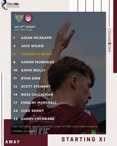
The photography is unique, capturing the player from behind with a raised hand, which adds a dynamic feel but sacrifices the direct eye contact of a traditional portrait. The focus on the player is clear, though the overall image feels a bit crowded by the surrounding design elements. The typography is a mixed bag; while the names and numbers are clear, there’s a lot of space between each line. The text for the substitutes is also very small, impacting overall legibility.
The colourway and brand style are consistent with the club’s maroon. The use of a simple black background with maroon and white lines is effective. However, the gaps between the names and the cluttered feel of the bottom of the graphic detract from its professional appearance. The inclusion of the “AWAY” text at the bottom is a nice addition but feels a bit disconnected from the main body.
This graphic is a decent attempt but falls short in a few key areas. The creative photography is a bold choice, but the inconsistent typography and cluttered layout impact the overall legibility and professionalism
Score: 6/10
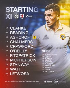
Ayr United
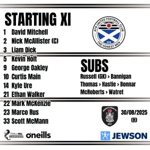
There is no player photography on this graphic, which is a significant omission that reduces its visual impact. The typography, while using a bold sans-serif font, is severely hampered by the thick black lines that run through the text. This feature detracts significantly from its legibility and makes the names difficult to read at a glance, which is a major design failure.
The legibility is poor due to the conflicting design choices. The stark contrast of the black text on the white background is undermined by the distracting black lines that cut across the names. The brand style is consistent, with the club’s crest and colours prominently featured. The overall design is minimal, but the stylistic choice to include the black lines undermines the entire purpose of the graphic. The text positioning is logical and clean, but this positive aspect is completely overshadowed by the poor typography choice.
This graphic is a prime example of how a stylistic choice can negatively impact a design’s core function. The attempt to create a bold aesthetic with the black lines has severely compromised legibility, making the graphic ineffective. While it gets the information across, it does so in a way that is confusing and poorly executed.
Score: 4/10
Dunfermline Athletic
The photography is good, with a clear and well lit photo of the player. The pose is standard and professional and the cropping is decent. The typography is a highlight, with a clean, bold sans-serif font that is highly legible. The use of a simple white font against the dark background is effective.
The legibility is strong due to the high contrast and clear font choice. The text is easy to read at a glance, with a nice separation between the player numbers and names. The colourway and brand style are well-executed, with the red and white colour scheme providing a cohesive feel. The fading effect on the left side of the graphic adds a nice dynamic element.
Overall, this graphic is a decent attempt that gets most of the basics right. The strong photography and typography are positives, but the there’s a lot going on on the right hand side between the player and the background which detract from its professionalism. It feels like a mix of clean design and a less-polished artistic flourish.
Score: 6.5/10
Greenock Morton
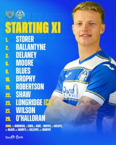
The photography is decent, with a well lit and clear photo of the player. The pose is a standard action shot and the cropping is effective. The typography is a mixed bag, with the “STARTING XI” and numbers in a bold, eye-catching yellow font, but the player names are in a much simpler, white font. The white names have good contrast against the blue background and are easy to read.
Legibility is generally good for the player names, which are a clean white against the blue background. However, the bright yellow numbers and “STARTING XI” text have less contrast, making them a little harder to read at a glance, though not a major issue. The colourway and brand style are consistent, with the club’s blue and white colours being the dominant feature. The fading effect in the background adds a nice touch of depth. The text positioning is straightforward and clean, with players and numbers neatly aligned.
This graphic is a solid attempt that gets most of the basics right. The good photography and clear, white typography for the names are positives. The choice of yellow for the numbers and title is a minor flaw in terms of contrast, but overall, it’s a functional and well-branded design.
Score: 6/10
Partick thistle
The photography is good, with a clear, in-focus image of the player in a dynamic, action-oriented pose. The typography is a highlight, using a clean, bold sans-serif font that is highly legible. The contrasting colours of the player numbers and names are effective and aid in readability. The yellow “C” for the captain’s armband is a nice touch.
The legibility is strong due to the high contrast and clear font choices. The names are easy to read at a glance. The colourway and brand style are well-executed, with a strong use of the club’s yellow, white, and red colours. The blurred background effect with the subtle swirl effect adds a professional and dynamic feel. The text positioning is straightforward, with the names and numbers aligned neatly down the left side.
This is a very strong graphic, particularly for a Championship team. It is well-executed with professional photography and effective typography. The branding is consistent and the overall impact is high.
Score: 8.5/10
Queens Park
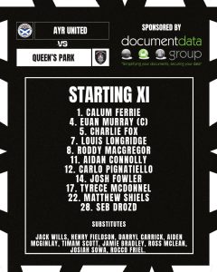
There is no player photography on this graphic. The focus is entirely on the text and sponsor logos, which results in a very safe and uninspired design. The typography, while clean and legible, is a very basic sans-serif font that lacks character. The white text on the dark background provides good contrast, but the overall presentation feels more like a basic spreadsheet than a dynamic sports graphic.
Legibility is the strongest point of this graphic, as the high contrast ensures all information is easy to read. However, the colourway and brand style are minimal and unadventurous, missing an opportunity to create a more engaging visual. The text positioning is logical but does nothing to elevate the design.
Overall, this is a very basic and uninspired graphic. While it succeeds in its primary function of displaying information clearly, it lacks any visual flair or creative spark. The absence of a player photo and a more dynamic design makes it feel like a missed opportunity.
Score: 5/10
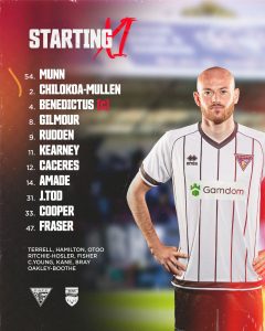
Raith Rovers
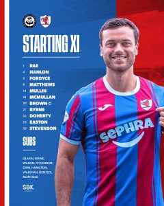
The photography is good, with a clear, well-lit image of the player that is in focus. The player’s expression is neutral, but the image is high-quality. The typography is a clean, bold sans-serif that is highly legible against the background. The text is all white, which provides good contrast and ensures the names are easy to read.
Legibility is strong due to the high contrast and simple font choice. The colourway and brand style are well-executed, with a strong, two-tone blue and red background that directly reflects the club’s away kit. The subtle background adds a dynamic element. The text positioning is straightforward, with the names and numbers aligned neatly down the left side.
This is a very strong graphic, especially for a Championship team. It is well-executed with professional photography and effective typography. The branding is consistent, and the overall impact is high.
Score: 8/10
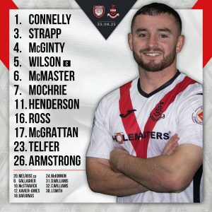
Ross County
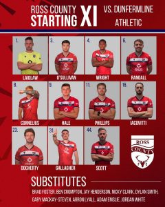
The photography is a significant change from other graphics, with 11 separate small images of the players. While this allows for individual player focus, the quality is inconsistent and the small size makes it difficult to see details. The typography is a simple, bold sans-serif that is clear and easy to read. However, the player names are placed below the images, which can feel a bit disconnected from the numbers at the top.
Legibility is generally good for the text, with white text on a dark background. However, the numbers are difficult to read in the small images. The colourway is effective and consistent with the club’s red, white, and blue away branding. The graphic has a grid-like layout, which is clean and organised, but lacks dynamic visual interest. The text positioning is straightforward and functional.
This graphic is a unique but flawed attempt. While it is well-organised and clearly branded, the use of individual small photos is not as impactful as a single large one. The inconsistent quality and lack of visual flair prevent it from being a top-tier design.
Score: 6/10
St Johnstone
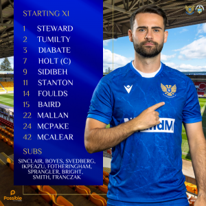
The graphic’s photography is a strong asset. It features a single, high-quality, well-lit image of a player, captured with a dynamic pose that adds a sense of energy. The typography is clear and modern, using a legible sans-serif font for player names and numbers. The player names are presented in a white font, providing excellent contrast against the dark background. The player’s name and team crest are effectively positioned, contributing to a professional and well-balanced layout.
Legibility is very good throughout the graphic. The combination of white text on a deep blue background ensures strong contrast, making all information easy to read. The colorway is well-executed, with a deep blue and yellow gradient that aligns with the club’s brand identity. The background features a stadium setting, which adds a nice thematic element and visual interest without being distracting.
Overall, this is a very strong and professional graphic. It is a well-designed piece of work that effectively uses photography, clear typography and a cohesive brand identity to create a compelling visual. It looks like something you would see from a top-tier European club.
Score: 8.5/10