Non-Matchday Graphics
Hospitality
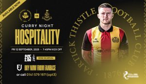
This graphic is a highly effective promotional piece for a specific event. Its core Functionality is to advertise a “Curry Night Hospitality” event, providing all the necessary details. The Photography of the player in the club’s jersey adds a personal and relatable touch, instantly connecting the event to the team. The strong Branding is clear with the use of the club crest, a bold yellow font for the event title, and a simple color palette. The Layout is clean and professional, with a central area for all the event details—date, time, price, and contact information. The use of a simple price callout makes the pricing clear. How it fits in the overall picture: This graphic shows the club’s ability to use its branding for specific, commercial events. It’s a slightly different template than the generic matchday hospitality graphic, demonstrating a versatile brand that can adapt to different needs and themes.
Hospitality v2
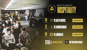
The “Matchday Hospitality” graphic is an excellent example of a detailed promotional piece. Its core Functionality is to provide fans with key information about upcoming hospitality packages, including dates, opponents, and pricing. The Photography effectively captures the welcoming atmosphere of the hospitality suite, showing people enjoying themselves, which serves as a powerful selling point. A subtle filter is applied to the photo, which perfectly aligns it with the club’s color palette. The Branding is strong and clear, prominently featuring the Partick Thistle crest. The fonts used for the text are easy to read and work well with the overall design. The Layout is well structured, dividing the space between the aspirational photo on the left and the clear list of matches and prices on the right. This makes the information easy to scan and digest. How it fits in the overall picture: This graphic showcases the club’s ability to create high quality, professional marketing materials that go beyond just match announcements, effectively promoting commercial aspects of the club to a wider audience.
League Cup Group Winners
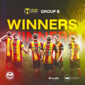
This graphic is a powerful celebration of a team achievement. Its core Functionality is to announce that the team has won its Premier Sports Cup group. The Photography of the players from behind, with their names and numbers visible, creates a powerful sense of unity and shared success. The bold yellow filter over the image makes the players’ red and yellow jerseys stand out. The Branding is loud and clear, with the large “WINNERS” text taking centre stage. The club crest and the Premier Sports Cup logo are also included, adding context and credibility. The Layout is simple but impactful, focusing entirely on the triumphant message. How it fits in the overall picture: This graphic is a prime example of a post match victory announcement. It uses the club’s visual language to evoke pride and celebration, reinforcing a winning mentality and building excitement among the fanbase.
International Call Up
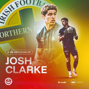
This graphic effectively celebrates a player’s achievement on the international stage. Its core Functionality is to announce that a player has been selected for their national team. The Photography of Josh Clarke is professional and well captured. The two poses, one a close up portrait and the other a dynamic action sho, are combined effectively to showcase the player. The graphic successfully blends Partick Thistle’s branding with that of the Northern Ireland u21 team. The club crest and the Northern Ireland Football Association logo are clearly displayed, showing a thoughtful approach to this mixed brand communication. The Layout is clean and impactful, with a large, bold heading for the player’s name and a clear note about the call up. How it fits in the overall picture: This piece demonstrates the club’s ability to create high quality graphics for special announcements that bring a sense of pride and prestige to the team and its fans. It shows that the club’s branding can extend to other organisations without losing its own identity.
Birthday
This graphic serves as a simple and heartfelt way to celebrate a player’s birthday. Its core Functionality is to honor an individual player. The Photography is excellent, capturing a genuine moment of happiness and celebration. The player’s expression is joyful and engaging, making the graphic feel personal and authentic. The Branding & Layout are consistent with the club’s standard for individual player graphics. It uses the familiar red/yellow gradient and the club crest, placing the focus squarely on the player. The simple, clean design ensures the message is direct and positive. How it fits in the overall picture: This graphic is part of the club’s regular social media calendar, showing that the club values its players as individuals and not just as part of the team. This kind of content helps to build a stronger connection between fans and players.
Milestone Appearances
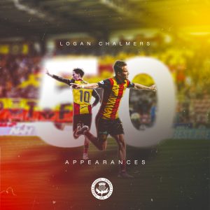
This graphic effectively celebrates a significant player milestone. Its core Functionality is to honour a player who has reached 50 appearances for the club. The Photography of the players is dynamic and celebratory. The use of a large, semi-transparent “50” as a background element is a very strong and clever visual anchor that makes the graphic instantly recognisable. The Branding is on point, with the club’s colors, crest and the player’s name clearly displayed. The overall design is professional and high quality. The Layout is well balanced, with the players as the focal point and the milestone text positioned clearly around them. How it fits in the overall picture: This piece demonstrates the club’s commitment to recognising individual achievements. It’s a key part of the social media content that celebrates players and their contributions, which helps to foster a sense of loyalty and appreciation among fans.
Match Mascots
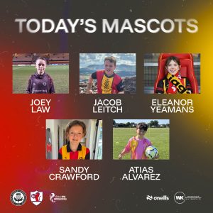
This graphic is a community focused piece that adds a personal touch to the matchday experience. Its core Functionality is to introduce the mascots for the day. The Photography is the most important element, as it features individual photos of the young mascots. The mix of candid shots and more posed photos gives the graphic an authentic and grassroots feel. The Branding is present through the use of the club crest and the color palette, but the overall style is less polished than the other graphics. The Layout is a simple and effective grid that neatly presents each mascot with their name. How it fits in the overall picture: This piece highlights the club’s connection to its community and fan base, showing a softer, more family friendly side of the brand. It adds variety to the graphic pack and demonstrates the club’s engagement with its youngest supporters.
Testimonial Dinner
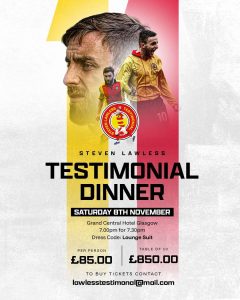
The “Testimonial Dinner” graphic is a comprehensive promotional poster for a special event. Its core Functionality is to provide all the necessary details for a ticketed event honoring a player. The Photography is a key element, featuring multiple images of Steven Lawless to highlight his career and importance to the club. The photos are well integrated into the design and fit the celebratory theme. The Branding is a mix of the club’s standard palette and a custom testimonial logo, which makes the event feel unique while still being connected to the club. The Layout is busy but functional, with key information like the date, time, and ticket prices clearly highlighted. How it fits in the overall picture: This piece shows the brand’s ability to handle special, one off events. It deviates from the usual templates to create something bespoke, which adds a sense of importance and individuality to the event.
Match Sponsor
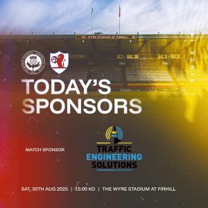
This graphic is a direct and professional way to acknowledge a matchday sponsor. Its core Functionality is to highlight the partnership between the club and a key sponsor. The Photography of the stadium serves as a perfect backdrop, directly linking the sponsor to the home of the club. The subtle red/yellow filter applied to the image effectively brands the photo without obscuring the details of the stadium. The Branding is clear and effective. The club crests are prominent and the sponsor’s logo is given a central position, making it the focal point. The Layout is clean, with the sponsor’s information clearly separated from the match details at the bottom. How it fits in the overall picture: This graphic is a core part of the club’s commercial and social media strategy. It’s a simple, high quality way to fulfill sponsorship obligations while maintaining a consistent visual brand.
New Signing
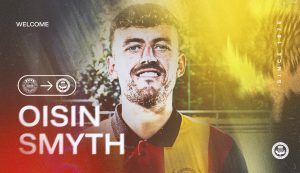
This graphic effectively announces a new player. Its core Functionality is to introduce a new signing to the fans. The Photography of the new player, Oisin Smyth, is well lit and professional. The portrait style photo makes the player the absolute central focus. A subtle red and yellow filter is applied, which helps to brand the photo and create a cohesive look. The Branding is strong, with the club crest and the familiar gradient background. The use of a simple icon to show the club transfer adds a modern, digital native touch. The Layout is clean and impactful, with the player’s name in a large, bold font that immediately draws attention. How it fits in the overall picture: This graphic is a crucial part of the club’s communication during the transfer window. Its polished and consistent design reinforces the club’s professional image and builds excitement among the fans.
Player of the Month
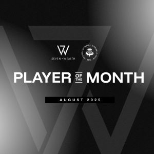
This graphic for “Player of the Month” has a distinct, more formal feel. Its core Functionality is to announce an award winner. It forgoes explicit Photography in favor of a strong typographic and abstract design. The Branding uses a monochrome palette, which sets it apart and gives it a sense of prestige. The club crest is present, along with the sponsor’s logo, which is well integrated. The sponsor’s logo as part of the background adds a sophisticated and modern touch. The Layout is simple and bold, with the large “PLAYER OF THE MONTH” text dominating the design. How it fits in the overall picture: This graphic shows the versatility of the club’s branding. It’s a great example of a template for special announcements that requires a more elegant feel than the matchday graphics.
Lotto
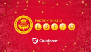
This graphic is a vibrant and fun promotional piece. Its core Functionality is to encourage fan participation in the club’s lotto. The Photography of the crowd with confetti creates a celebratory, exciting and communal atmosphere. The red filter ties the image perfectly into the club’s branding. The Branding is playful, with the “LOTTO” text creatively placed inside yellow circles that resemble lotter balls. The club crest and the Clubforce logo are also clearly displayed. The Layout is straightforward, with a focus on the key text and the celebratory background. How it fits in the overall picture: This graphic shows the club’s ability to create engaging, fun, and lighthearted content that is still firmly on brand. It adds a bit of personality and excitement to the club’s commercial promotions.
Season Tickets
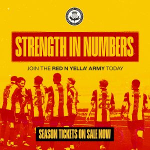
This graphic is a major promotional piece for the club. Its core Functionality is to drive season ticket sales. The Photography features a powerful image of the team, conveying a sense of unity and strength. The image is heavily filtered with the club’s colors, which gives it a gritty, impactful feel. The Branding is strong and powerful, with the distressed font for “STRENGTH IN NUMBERS” creating a compelling and emotional message. The bold red and yellow color palette is used intensely to make the graphic stand out. The Layout is straightforward, with the powerful message at the top and the clear call to action at the bottom. How it fits in the overall picture: This is a key example of how the club uses its branding for big campaigns. The design is bold and confident, which helps to convey a sense of passion and loyalty to the fans.
Player Sponsorship
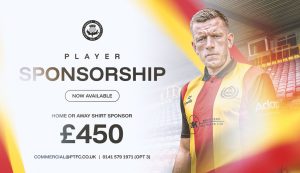
This graphic is a professional and clean promotional piece. Its core Functionality is to encourage businesses and fans to sponsor a player. The Photography of the player is professional and welllit, making the individual the central focus. The background features a subtle, blurred image of the stadium, which adds context without being distracting. The Branding is slightly softer than the in match graphics, using a more corporate palette with gradients of white, red and yellow. This gives it a professional and high quality feel. The Layout is clean and well structured, with the sponsorship information clearly laid out. How it fits in the overall picture: This graphic shows the club’s ability to use its branding for commercial purposes. It demonstrates a more sophisticated side of the brand that appeals to corporate partners while still being instantly recognisable to fans.
Playlist
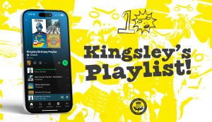
This graphic is a creative and unique piece of content that provides a fun, behind-the-scenes look at the club. Its core Functionality is to share a fun playlist with fans. The graphic forgoes traditional Photography in favor of a modern design that incorporates a smartphone screen showing the Spotify app. The ‘hand drawn’ and sketched elements in the background, along with the mascot “Kingsley,” give it a playful and casual feel. The Branding is present through the dominant use of the club’s yellow and the inclusion of the club crest, but it’s a departure from the usual polished templates. The Layout is engaging, with the phone on the left and a large, bold title on the right. How it fits in the overall picture: This graphic adds a bit of personality to the club’s social media feed. It shows that the brand can be fun and engaging, and it appeals to a younger, more digitally savvy audience.
Matchday Graphics
Matchday
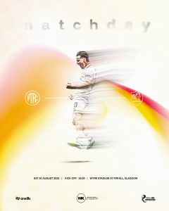
This graphic serves as a creative and dynamic pre-match announcement. Its core Functionality is to inform fans about the upcoming match. The Photography uses a motion blurred effect on the player, which gives the graphic a sense of speed, energy and anticipation. This is a clever way to represent the excitement of a match. The blurred red and yellow streams across the image are a key part of the Branding, making the colors an integral part of the design itself. The Layout is clean and minimalist, with the player as the central figure and all the essential match information neatly presented at the bottom. How it fits in the overall picture: This graphic stands out from the other templates due to its unique style. It shows that the club’s brand can be interpreted in creative and modern ways, making for a refreshing and engaging piece of content.
Starting XI
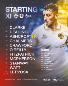
This graphic is a must have for every matchday. Its core Functionality is to announce the starting team and substitutes. The Photography of a player on the right side of the graphic adds a human element to what is otherwise a text heavy piece. The photo is consistent with the club’s styl, well-lit and action oriented. The Branding is strong, using the club’s colors, crest and sponsors’ logos. The font is clear and easy to read. The Layout is highly functional and well organised, with the starting lineup listed clearly on the left and the substitutes on the right. This makes the information easy to scan and digest. How it fits in the overall picture: This graphic is a crucial part of the pre-match social media content. It’s a reliable and expected piece of communication that gets fans excited and ready for the game.
Kick Off
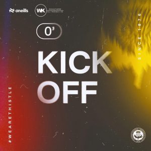
The “Kick Off” graphic is a simple and effective way to signal the start of a match. Its core Functionality is to inform fans that the game is underway. The large, central “KICK OFF” text and the 0′ timestamp are the immediate focal points, making the message instantly clear. Similar to the other in match graphics, it relies on a dynamic, blurred background instead of explicit Photography. The vibrant red and yellow gradient and the textured overlay create a sense of energy and anticipation. The Branding & Layout is perfectly aligned with the other in-match graphics, using the club’s crest, the “Since 1876” detail, and the “#WEARETHISTLE” hashtag. This consistency ensures the graphic is immediately recognisable as part of the club’s matchday suite. How it fits in the overall picture: As the very first in match graphic, it sets the tone for the entire matchday experience on social media. Its consistent design language with the “Half Time” and “Full Time” graphics creates a seamless visual story for the fan following the match online.
Half Time
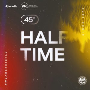
The “Half Time” graphic is a model of effective, minimalist design. Its core Functionality is to communicate a key moment in the match. The large, bold “HALF TIME” text and the 45′ timestamp are the central focus, ensuring this critical information is instantly legible, even on small screens. The graphic does not feature any explicit Photography, but instead uses a dynamic, blurred background with a vibrant red and yellow gradient that evokes the energy of the game. This serves as a strong, on brand backdrop without cluttering the message. The Branding & Layout is highly consistent with the rest of the matchday pack. It uses the familiar gradient, the “#WEARETHISTLE” hashtag and the club crest. This consistent layout builds a predictable and reliable visual system for fans. How it fits in the overall picture: This graphic is a fundamental piece of the in game social media content. Its simplicity and clarity set the standard for all live match updates, creating a cohesive visual narrative from “Kick Off” to “Full Time.”
Second Half
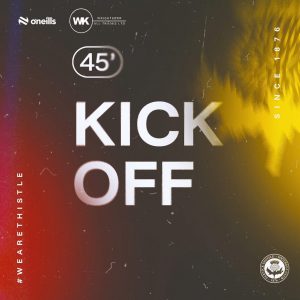
This graphic serves as a real time update, signaling the start of the second half. Its core Functionality is to inform fans that the game is resuming. The large, central “KICK OFF” text and the 45′ timestamp make the message instantly clear. There is no traditional Photography; instead, the graphic relies on the same dynamic, blurred background with a vibrant red and yellow gradient that evokes the energy of the game. The Branding & Layout is perfectly aligned with the other in-match graphics, using the club’s crest, the “Since 1876” detail, and the “#WEARETHISTLE” hashtag. This consistency ensures the graphic is immediately recognizable as part of the club’s matchday suite. How it fits in the overall picture: This graphic is a fundamental piece of the in game social media content. Its simplicity and clarity set the standard for all live match updates, creating a cohesive visual narrative from “Kick Off” to “Full Time.”
Goal
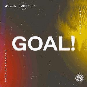
The “Goal” graphic is a key piece of live matchday content. Its core Functionality is to announce a goal has been scored, and its design effectively captures the excitement of that moment. The massive, central “GOAL!” text is dominant and makes the message unmissable. There is no traditional Photography; instead, the graphic relies on the same energetic, blurred, and textured red and yellow background seen in other matchday pieces, which perfectly conveys the excitement of the moment. The Branding & Layout is flawlessly consistent with the club’s social media style guide. The club crest, the “Since 1876” text, and the “#WEARETHISTLE” hashtag are all in their familiar positions. How it fits in the overall picture: This is a vital component of the in match social media suite. It’s an instant burst of branded excitement that fits perfectly within the cohesive visual story of a matchday, although it lacks the personality of player imagery.
Sub
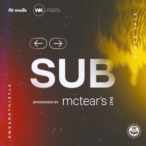
This graphic is a simple and effective in-match update. Its core Functionality is to announce a substitution. The large, central “SUB” text and the simple arrow icons make the message instantly clear. Like the other in-match graphics, it relies on a dynamic, blurred background instead of traditional Photography. The vibrant red and yellow gradient and the textured overlay create a sense of energy that is consistent across all live updates. The Branding is on point, with the club’s crest and sponsor’s logo clearly displayed. The Layout is functional and straightforward, with the large text dominating the screen, making the update easy to read at a glance. How it fits in the overall picture: This is a vital piece of the in match social media suite, providing quick and clear updates that contribute to the overall cohesive visual story of a matchday.
Full Time
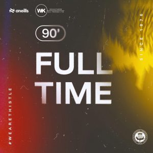
The “Full Time” graphic effectively concludes the live social media coverage of a match. Its core Functionalityis to announce the end of the game. The bold, large “FULL TIME” text and the 90′ timestamp are the central elements, providing a clear and final update. Similar to the other in match graphics, it forgoes explicit Photography in favor of a blurred, vibrant background that maintains the energetic feel of the game. The subtle texture overlay adds a gritty, authentic touch. The Branding & Layout is perfectly consistent with the rest of the matchday pack. The club crest, the “Since 1876” text, and the “#WEARETHISTLE” hashtag are all present, reinforcing the club’s identity. How it fits in the overall picture: This graphic provides a definitive end to the in match social media story, rounding out the set of graphics used for live updates. It completes the visual narrative that began with the “Kick Off” graphic.
Overall Collective Analysis
The collective graphic pack for Partick Thistle Football Club showcases a strong, consistent, and well-defined brand identity. The core of this identity is built around a vibrant red and yellow color palette, which is used effectively across nearly all graphics. This color scheme is not just a fill, but often applied as a dynamic gradient or a filter over photos, which creates a sense of energy and movement.
The use of a consistent font family for headings and body text, such as the bold, sans-serif font for major announcements, helps to unify the look. The club’s crest is a constant, reassuring presence on every single graphic, often accompanied by the “Since 1876” text, which reinforces the club’s history and heritage. The hashtag “#WEARETHISTLE” is also used consistently on in match graphics, helping to build a community and brand presence online.
Visual Style and Consistency:
The graphic pack successfully creates a unified visual style while allowing for flexibility based on the content. The “Matchday” and “in match” graphics [Kick Off, Half Time, Goal etc] are the strongest examples of this. They use a consistent template with a gritty, film like texture overlay and the dynamic red/yellow gradient, making them instantly recognisable.
Other graphics, like the “Player of the Month” and “Player Sponsorship” pieces, show a more refined, professional side of the brand, using cleaner backgrounds and a more subtle color application. This demonstrates the brand’s ability to adapt to different purpose, from high-energy match updates to more corporate or celebratory announcements, without losing its core identity.
Functionality and Layout:
The functionality of each graphic is clearly prioritised. The layouts are simple, clean and direct. Information is presented in a way that is easy to digest, whether it’s a team sheet, a hospitality package or a player announcement. Calls to action, like “ON SALE NOW” or contact information, are prominently displayed. The overall design language is highly professional, and the use of high quality photography elevates the entire pack.
Areas for Consideration:
While the brand is highly effective, a few graphics, such as the “Testimonial Dinner” and “Match Mascots,” are slightly less polished than the rest. The “Testimonial Dinner” graphic is information heavy and the mix of photo styles feels a little disjointed. The “Match Mascots” graphic, while charming, lacks the consistent polish and visual style of the in match graphics. However, this could be a conscious decision to make them feel more personal and less corporate, which is appropriate for the subject matter. The “Lotto” graphic is also a bit of a departure in terms of visual style, colurway and being more flat and two dimensional compared to the others.
Conclusion:
Overall, the Partick Thistle graphic pack is an excellent example of a cohesive and professional sports brand. It successfully uses a consistent visual languag, centered around its signature red/yellow gradient, strong typography, and high quality photography to create a unified and instantly recognisable identity. The club has developed a system of templates that allows for efficient content creation while maintaining a high standard of visual communication. This approach not only looks good but also effectively communicates with fans, promotes club events and builds a strong, modern brand presence.