Non Matchday Graphics
August Recap
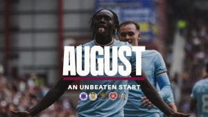
The “August Recap” graphic serves a clear and effective Functionality: to summarise the club’s on-pitch performance for the month. This provides a valuable, easy-to-digest update for fans. The Photography is a dynamic, high-quality action shot from the month, which effectively captures a key moment and players. This is a great way to tell a story through visuals. The Branding & Layout is consistent with the club’s visual identity, using the signature claret colour for the subtitle highlights. The layout is well organised, with the teams played listed clearly beneath the header. How it fits in the overall picture: This graphic extends the brand’s visual language beyond individual matchdays, creating a cohesive narrative of the club’s season and maintaining fan engagement through a retrospective lens.
Happy Birthday
The “Happy Birthday” graphic’s Functionality is to celebrate a player’s or club figure’s birthday, providing a personal and humanising touch to the club’s social media feed. The Photography is a clean, professional portrait of the individual. The photo is the main focus, which is appropriate for a celebratory message. The Branding & Layout is simple yet effective, using the club’s colours and fonts for the messaging and the individual’s name. The club crest is present to officially link the message to the club. How it fits in the overall picture:This graphic shows the breadth of the club’s content strategy. It fits within the brand’s wider picture by demonstrating a well rounded and fan focused approach that celebrates both on-pitch success and the people who make up the club.
International Start
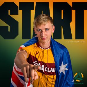
This graphic’s Functionality is to proudly announce a player’s international appearance, celebrating individual success while linking it back to the club. The Photography is a high-quality action shot of the player, chosen to highlight their talent and importance. The Branding & Layout is a clever mix of Motherwell’s brand identity with that of the national team. The graphic is unmistakably Motherwell, using its core colors and layout, while also prominently featuring the national team’s colour way. This dual-branding is handled seamlessly. How it fits in the overall picture: This piece fits perfectly by showcasing the club’s role as a developer of talent. It’s a positive, on brand graphic that extends the club’s narrative beyond domestic play to the global stage.
Manager Quote
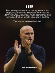
The Functionality of this graphic is to share official quotes or statements from the manager, providing fans with direct insight from a key club figure. The Photography is a professional, high quality portrait of the manager. This elevates the message and gives it a sense of authority and importance. The Branding & Layout is clean and professional. The quote is presented in a highly readable format, using the club’s fonts and colours. The layout places the manager’s photo as the main visual, with the quote overlaid cleanly, and his name is clearly labeled. How it fits in the overall picture: This graphic extends the club’s brand identity to official communication. It reinforces the professional image of the club and its leadership, fitting into the overall picture as a serious and polished content piece.
September Calendar
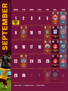
The “September Calendar” graphic’s Functionality is to provide a clear and organised list of the month’s fixtures for fans. It’s a highly practical and useful piece of content. Photography of players is used subtly but the main focus is the background that focuses on the information. The Branding & Layout is excellent. The calendar format is presented within the club’s brand guidelines, using the signature colors and typography. How it fits in the overall picture: This graphic shows the brand’s commitment to fan service and professional communication. It’s a perfect example of how the core brand style can be applied to a variety of content types beyond matchday graphics.
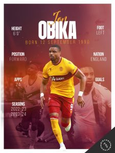
Team of the Week
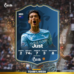
This graphic’s Functionality is to celebrate and recognise standout player performances after being included in the SPFL “Team of the Week” The Photography uses professional headshots of the selected player and is passing off as an EAFC graphic. The Branding & Layout is excellent and creative. The EAFC shield is used to arrange the players in a formation, which is a unique and highly on-brand application of the core visual motif. The graphic is well-labeled with player name and info. How it fits in the overall picture: This graphic is a fantastic example of adapting the brand’s core visual language for different content themes. It fits perfectly by celebrating player achievements in a creative and instantly recognisable format.
Tickets Sell Out
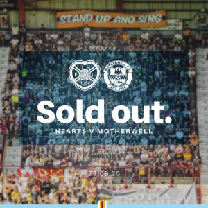
This graphic’s Functionality is to announce that tickets for a match have sold out. It serves a practical purpose while also generating a sense of excitement and high demand. The Photography is a vibrant, celebratory shot of fans in the stadium, which is an excellent choice as it puts the focus on the supporters and the community. The Branding & Layout is very strong. The “SOLD OUT” text is bold and prominent, using the club’s colours and fonts. The layout places this key message front and center over the celebratory photo. How it fits in the overall picture: This is a positive, promotional graphic that fits into the overall brand narrative of a successful, well-supported club. It creates a sense of community and buzz, reinforcing the brand’s connection to its fanbase.
Matchday Graphics
Matchday
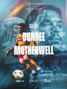
This graphic’s Functionality is to build anticipation and provide all key information for an upcoming match. It acts as the anchor for all pre-game content. The Photography is a high quality, dynamic action shots of a key player. The photo is vibrant and sets an energetic tone for the day. The Branding & Layout is one of the strongest in the pack. The bold “MATCHDAY” text uses the club’s font and colours, and the motif is used as a background or overlay. The layout is well structured, with the opponent, date and time clearly displayed. How it fits in the overall picture: This is a crucial, recurring piece of content that defines the visual tone for every home and away game. It serves as the perfect entry point into the matchday social media narrative.
Starting Lineup
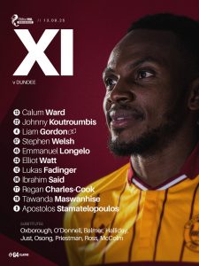
This graphic’s Functionality is to announce the starting eleven for the match in a clear, well-structured format. The Photography is a set of consistent, professional headshots of each player. The uniformity of the photos contributes to the polished feel of the graphic. The Branding & Layout is very strong. The player headshot is a brilliant and on-brand choice that reinforces the simplicity of the design. The layout is clean and organised, with player names and numbers clearly labeled. How it fits in the overall picture:This is a fundamental part of the matchday content. It logically follows the “Matchday” graphic, maintaining visual consistency and providing a key piece of information to fans before kickoff.
Kick Off
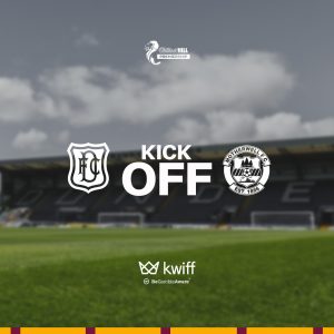
The “Kick Off” graphic has a highly focused Functionality: to signal the official start of a match. Its purpose is purely informative and serves as a transition from pre-match build-up to the live action. The graphic typically does not feature Photography of specific players, instead relying on a branded background or dynamic graphic elements. The Branding & Layout is minimalist but powerful. The phrase “KICK OFF” is the central focus, using the club’s bold typography and colours. The layout is clean and direct, with team crests and the match time included for context. How it fits in the overall picture: This is a key transitional graphic in the matchday sequence. Its simple and effective design ensures that even a basic update is fully on-brand and contributes to a professional, cohesive online presence.
Goal
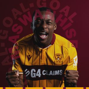
The “Goal” graphic has a single, impactful Functionality: to instantly celebrate a goal and identify the scorer. Its design is for maximum excitement and immediate impact. The Photography features a celebratory, high-energy action shot of the goalscorer, capturing a moment of raw emotion and triumph. The vibrant photo helps to amplify the excitement of the moment. The Branding & Layout is very strong. The word “GOAL” is a bold, branded element that uses the club’s distinct typography and colours. The player’s name is clearly overlaid, and the layout uses dynamic shapes to draw attention to the player. How it fits in the overall picture: This is a high energy centrepiece of the in-match graphics. It uses the established visual language to create a memorable and celebratory post that is crucial for live game updates.
Half Time
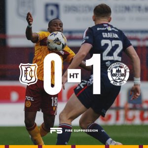
This graphic’s core Functionality is to provide a clean, simple and quick score update at the halfway point of the match. The graphic features action shot Photography. This keeps the focus on the information being communicated. The Branding & Layoutis highly consistent, using the club’s colors, crests, and typography for the “HT” title and the scoreline. The layout is minimalist and direct, ensuring the critical information is instantly legible. How it fits in the overall picture:This graphic acts as a functional and reliable checkpoint within the matchday sequence. Its clean and simple design ensures brand consistency without visual clutter, perfectly bridging the two halves of the game’s social media story.
Match Update

This graphic’s Functionality is to provide quick, simple, in-game updates. It is a highly versatile template for any information that needs to be communicated quickly, such as a score change or a key event. The graphic features matchday Photography and relays on the brand’s colours and visual elements to convey its message. The Branding & Layout is built on simplicity and clarity. The text is the primary focus, presented with branded footer that uses the club’s colours and a subtle pattern. How it fits in the overall picture: This graphic demonstrates the brand’s ability to be flexible and efficient. It’s a simple, functional piece that maintains visual consistency alongside text-based updates.
Sub
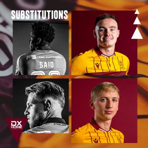
The “Sub” graphic’s Functionality is to announce a substitution during a match. It provides a quick and clear update to the game’s proceedings. The Photography consists of high-quality headshots of both the player coming on and the player coming off. The photos are a key element that helps fans quickly identify the players. The Branding & Layout is simple but effective. The players are identified with their names and numbers, and the “IN” and “OUT” text uses the club’s font and colours. The layout is clean and direct, prioritizing readability. How it fits in the overall picture: This graphic is a streamlined, in-game update that fits seamlessly into the matchday sequence. It demonstrates that even a small, functional change is handled with brand consistency and professionalism.
Full Time
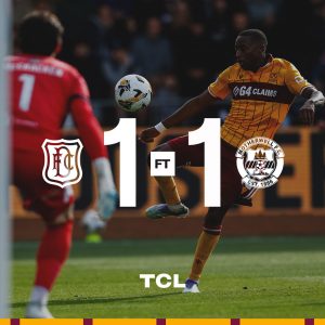
This graphic’s primary Functionality is to announce the final score of the match. It’s a critical piece of the in-game social media narrative. The Photography is a high-impact action shot from the match, chosen to convey the outcome and emotion of the game. The Branding & Layout is excellent, with the “FT” text prominently displayed in the club’s branded font. The final score is placed centrally and legibly, framed by the club’s crest and the opponent’s. The signature bottom motif is present as a subtle footer element. How it fits in the overall picture: It serves as the definitive conclusion to the matchday content sequence, carrying the established brand identity all the way to the final whistle and reinforcing the club’s professional online presence.
Overall Collective Analysis
The collective graphic pack for Motherwell FC showcases a strong, cohesive, and exceptionally well-defined brand identity. The core of this identity is built around the club’s signature claret and amber color palette, which is used effectively and consistently across nearly every graphic. This colour scheme is not just a simple fill, it is often incorporated into subtle overlays or dynamic backgrounds, creating a sense of energy that resonates with the on-pitch action.
The most defining element of the brand is the simplicity pf design in the majority of the graphics. This single visual thread unites all the content and makes the brand instantly recognisable. The consistent use of a clean, bold, sans-serif font family further unifies the look, while the club’s crest is a constant, reassuring presence on every graphic, reinforcing its official status.
Visual Style and Consistency
The graphic pack successfully creates a unified visual style while demonstrating impressive flexibility. The in-match graphics, such as “Matchday,” “Kick Off,” “Half Time,” and “Full Time,” are the strongest examples of this. They follow a consistent template that uses a dynamic blend of the club’s colours and high-quality photography, making them instantly identifiable to fans following the game live. Other graphics, like the “Manager Quote” and “International Start” pieces, show a more refined and professional side of the brand, using cleaner compositions that prioritise the subject matter while still retaining the core brand elements. This demonstrates the brand’s ability to adapt to different purposes, from high-energy match updates to more formal or celebratory announcements, without losing its core identity.
Functionality and Layout
The functionality of each graphic is clearly prioritised in the design. The layouts are clean, direct and purposeful. Information is presented in a way that is easy to digest, whether it’s a team sheet, a match score or a fixture list. Crucial details like opponent names, dates and times are always prominently displayed and easy to find. The overall design language is highly professional, and the consistent use of high-quality photography elevates the entire pack, ensuring that every piece of content meets a high standard of visual communication.
Conclusion
Overall, the Motherwell graphic pack is an excellent example of a cohesive and professional sports brand. It successfully uses a consistent visual language centred around its signature colours and strong typography, creating an instantly recognisable identity. The club has developed a system of templates that allows for efficient content creation while maintaining a high standard of visual communication. This approach not only looks good but also effectively communicates with fans, promotes club events, and builds a strong, modern brand presence.