After reviewing the creative output of all 42 SPFL clubs, it was an exciting challenge to select a standout from each league.
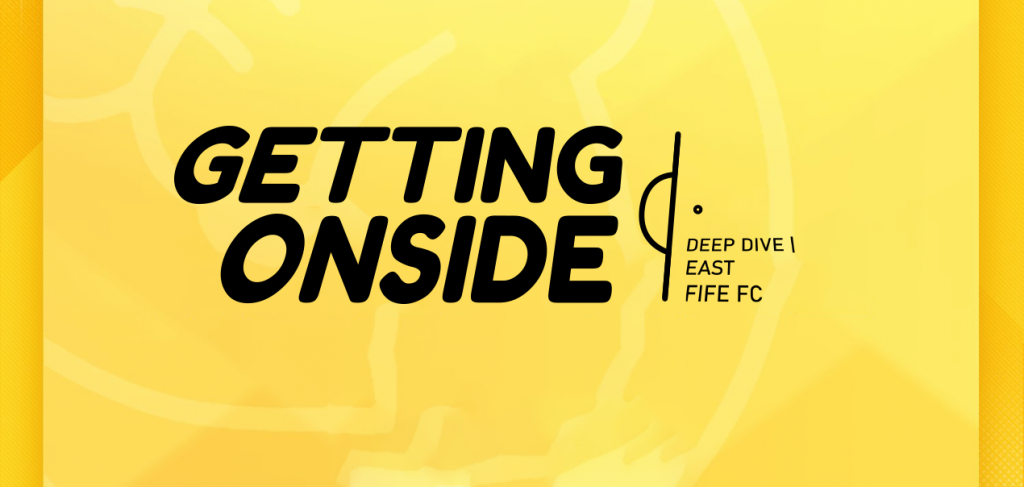
In League One, East Fife’s visual identity immediately commanded attention, proving that a club can build a brand that punches well above its weight. This deep dive will explore how the Fifers have built a cohesive and visually striking presence this season, from their dynamic matchday updates to their professional commercial announcements, setting a standard for creativity.
Non-Matchday Graphics
New Signing
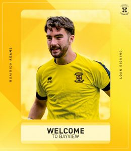
This graphic is designed to be a formal and welcoming announcement. Its Functionality is to introduce a new loan signing to the club. Photography is the central element of the design, with a well composed photo of the new player in the club’s kit. The image is framed by a bold, yellow frame that matches the club’s colours. The Branding & Layoutis clean and effective. The phrase “WELCOME TO BAYVIEW” is a perfect, friendly message, presented in the club’s signature bold sans-serif. The player’s name is placed vertically on the side, a stylish and modern touch. The overall layout is minimal, allowing the player photo to be the main focus. How it fits in the overall picture: This graphic is a key part of the club’s official announcements. It uses the brand’s visual identity to create a moment of excitement and welcome for new players, reinforcing the club as a professional and welcoming organisation.
Q&A Session
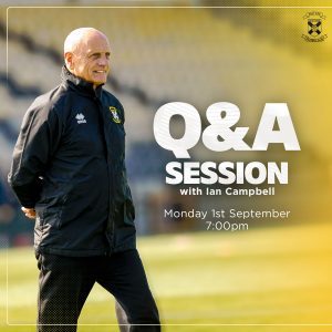
This graphic effectively promotes an off field event with a personal touch. Its main Functionality is to announce a Q&A session, clearly communicating the speaker (Ian Campbell), date and time. The use of a professional Photography shot is a key element here; the image of Ian Campbell on the pitch adds authenticity and a human connection to the event. The photo is well integrated, taking up the left side of the graphic and drawing the viewer’s eye. The Branding & Layout is clean and well structured, with the large, white “Q&A SESSION” text overlaid on the image, making it pop. The date and time are placed below in a legible font, albeit, the light font style may prove difficult to read against the selected background. The East Fife crest is consistently placed in the top right corner. How it fits in the overall picture: This graphic demonstrates the brand’s versatility. It shows that the club can apply its core visual identity, especially the clear, concise typograph, to promotional content that isn’t directly related to a match, helping to build a consistent brand for both on, and off, field activities.
Kit Sponsor
This graphic’s primary Functionality is to announce the training kit sponsor. The design is straightforward and prioritises the sponsor’s branding. It does not use any Photography of players, instead focusing entirely on the sponsor’s logo. This is a smart choice, as it gives the sponsor the full spotlight. The Branding & Layout is simple and direct, using a light yellow background to frame the “BIG SMASH” logo. The 2025/26 season information is clearly stated above the logo, providing all necessary context. The East Fife crest is prominently positioned, but in a supporting role, signifying the partnership. How it fits in the overall picture: This piece demonstrates how the club’s brand identity can be adapted for commercial use. By maintaining the club’s colour scheme and clear, functional design principles, it promotes a new partnership in a way that feels professional and integrated with the overall brand.
Programme
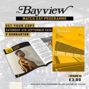
This graphic’s Functionality is to promote the sale of the matchday programme. It is a visually rich and dynamic piece of content. It features a great use of Photography and graphic design, with a photo of the programme itself and a player interview page from within it. This dual image approach effectively shows the product from both the outside and inside, giving fans a clear idea of what they are buying. The Branding & Layout is more complex than the single purpose graphics. The title “The Bayview” uses an elegant script font that gives the programme its own identity, while the other text maintains the club’s standard sans-serif font, creating a nice contrast. How it fits in the overall picture: This graphic demonstrates the brand’s ability to create more detailed and visually interesting promotional content. It effectively links the digital brand to the physical matchday experience, highlighting a key revenue stream while maintaining the club’s overall aesthetic.
Hospitality
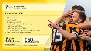
This graphic’s Functionality is to promote the matchday hospitality packages. The information is clearly listed with bullet points and two distinct price points for different types of fans. The Photography is a powerful element of the design; the image of players celebrating adds an emotional, aspirational quality to the offering. It’s not just a package, but an opportunity to be part of the club’s winning moments. The Branding & Layout is well executed, with a clean division between the informational text on the left and the engaging photo on the right. The league logo is prominent and the pricing is clearly displayed in separate boxes, making the information easy to scan. How it fits in the overall picture: This piece highlights the club’s commercial side and its ability to market premium experiences. It shows that the brand can use its visual language to sell products and services in a way that is both professional and emotionally appealing to fans.
Supporter’s Bus
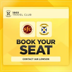
This graphic is a straightforward and functional piece of communication. Its Functionality is to promote a supporter’s bus for an away match. It is a very simple design and does not feature any Photography. It uses the club crests of both teams to clearly indicate the opponent, which is a key piece of information. The most prominent element is the large, bold “BOOK YOUR SEAT,” which serves as a strong call to action. The Branding & Layout is clean and symmetrical, with the two club crests placed side-by-side. The contact information is clearly listed at the bottom. How it fits in the overall picture: This graphic demonstrates the brand’s ability to create targeted communications for specific fan groups. It uses the core brand elements of clear typography and consistent colour scheme to create a professional and easy-to-understand announcement.
Lotto
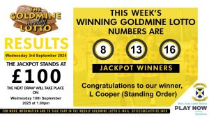
The “Lotto” graphic is an example of a more complex informational graphic. Its Functionality is to announce the winning lottery numbers, the jackpot amount, and the next draw date. The graphic uses a small amount of Photography in the background, showing some players, which adds a subtle but positive visual element. The Branding & Layout is well structured, with a clear hierarchy of information. The winning numbers are highlighted within circles, making them easy to spot. The jackpot amount is a prominent feature and all the relevant details are neatly organised in separate sections. The design effectively uses the yellow and black colours to differentiate sections without cluttering the graphic. How it fits in the overall picture: This graphic shows the brand’s ability to handle multi-faceted information. It proves that the club can apply its professional design principles to a wide range of content, from match results to commercial activities, reinforcing a consistent brand identity across all platforms.
Matchday Graphics
Next Match
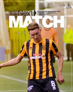
This graphic is designed to build excitement for the upcoming game. Its Functionality is to announce the next match and provide the key details. The use of an action packed Photography shot is a key element, creating a sense of energy and anticipation. The player is in motion, which makes the graphic feel dynamic and alive. The Branding & Layout is well executed, with a large, bold “NEXT MATCH” text overlaid on the photo. The match details are placed in a semi-transparent box, which helps them stand out without fully covering the image. The consistent yellow and black colour scheme and the presence of the club crest tie it back to the overall brand. How it fits in the overall picture: This graphic is a strong promotional tool that uses the brand’s visual language to look forward. It shows that the club can create content that is not only informative but also emotionally engaging and exciting for fans.
Matchday
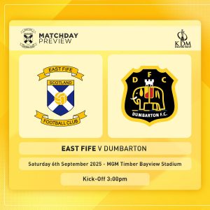
This graphic is a classic match preview. Its Functionality is to build anticipation for an upcoming match by clearly displaying the two competing teams. It does not use any Photography and instead focuses on the two club crests, which are the central element of the design. The symmetrical layout, with one crest on each side, is a standard and effective design choice for this type of graphic. The date, location, and kick-off time are clearly listed below in a clean sans-serif font. The Branding & Layout is consistent with the overall pack, using the yellow background and the same font for the event details. How it fits in the overall picture: This is a standard but essential piece of the matchday build-up. Its simple, clean design prepares fans for the game and works in a sequence with other pre-match content like the “Next Match” and “Matchday Info” graphics.
Matchday version 2
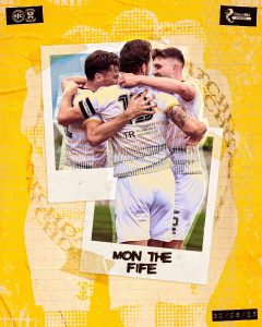
This graphic is a great example of a more artistic, non-functional piece of content designed for social media engagement. Its Functionality is to capture and celebrate a moment from a previous match. It is driven almost entirely by Photography, using two Polaroid-style photos of players celebrating. The use of a crumpled paper background effect gives it a retro, authentic and personal feel, as if it’s a cherished scrapbook memory. The phrase “MON THE FIFE” is a great piece of fan-centric language that makes the content feel more intimate and real. The Branding & Layout is different from the other graphics, but it still maintains the club’s yellow and black colour palette and includes the crests discreetly. How it fits in the overall picture: This graphic adds an emotional and artistic dimension to the brand’s visual identity. It shows the club is capable of creating diverse content that connects with fans on a deeper level, moving beyond simple information delivery to evoke a sense of community and shared passion.
Matchday Info
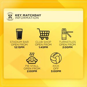
This graphic is designed for fan convenience and provides a clear and concise overview of key matchday timings. Its main Functionality is to inform supporters about when different parts of the stadium open. It does not use Photography, instead relying on a series of simple, elegant icons (a beer glass, a shopping cart, a turnstile, a pie, and a football) to represent each location. This is an excellent design choice as it makes the information universally understandable and easy to scan. The Branding & Layout is clean and well structured, with each icon and its corresponding time clearly laid out. The consistent typography and the yellow background ensure it fits perfectly within the brand. How it fits in the overall picture: This is a fantastic example of a practical, fan-first graphic. It shows that the club’s brand is not just about big moments, but also about providing helpful, everyday information in a professional and accessible manner.
Starting XI
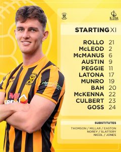
This graphic’s Functionality is to present the starting lineup for the match. It uses a combination of Photography and text, with a player photo on the left side and the full list of players on the right. This layout is a great design choice as it adds a human element to the otherwise data-heavy list. The Branding & Layout is clean and well structured. The names are presented in a bold, easy-to-read font, with the player numbers alongside them. The substitutes are listed in a smaller, separate box, which is a good way to organise the information. The background is consistent with the rest of the pack, and the club crest and competition sponsor logo are appropriately placed. How it fits in the overall picture: This is an essential matchday graphic. Its clean design and effective use of a player photo make it highly functional and engaging, solidifying the brand’s professional approach to live content.
Kick Off
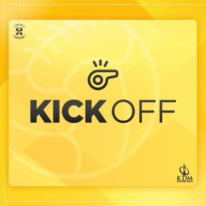
The “Kick Off” graphic serves as the starting point for the matchday visual story. Its primary Functionality is to announce the start of the game. Similar to the score updates, the graphic forgoes Photography in favour of a clean, text-based approach. The phrase “KICK OFF” is presented in the same impactful, large sans-serif font used for “Goal!” and “Full Time,” immediately signalling a significant moment. The visual Branding & Layout is identical to the other in-game graphics, featuring the same yellow background and a whistle icon. This strong visual repetition links all the key match moments together, providing a consistent user experience. How it fits in the overall picture: This graphic establishes the beginning of the matchday sequence. By using a consistent style and iconography, it works in tandem with the “Half Time,” “Subs,” and “Full Time” graphics to create a unified and professional looking live-match content stream.
Half Time
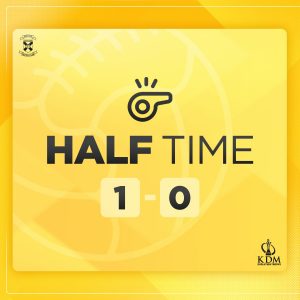
The “Half Time” graphic is a model of effective, minimalist design. Its core Functionality is to communicate the current match score as clearly and quickly as possible. The large, bold score is a central focus, ensuring this critical information is instantly legible, even on small screens. The graphic does not feature any Photography, as this would be unnecessary and could clutter the simple, direct message. Instead, it relies on clean typography and a single, relevant icon, a whistle, which is a clever piece of visual shorthand for the referee’s signal. The Branding & Layout is highly consistent with the rest of the matchday pack. It uses the familiar East Fife yellow background with the subtle football pattern, and the club crest and KDM Evolution Trophy logos are positioned discreetly in the corners. This consistent layout builds a predictable and reliable visual system for fans. How it fits in the overall picture: This graphic is a fundamental piece of the in-game social media content. Its simplicity and clarity set the standard for all live match updates, creating a cohesive visual narrative from “Kick Off” to “Full Time.”
Half Time Draw
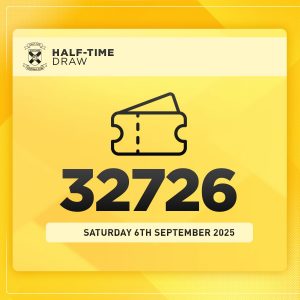
This graphic is designed for a simple, live match update. Its primary Functionality is to announce the winning number for the half-time draw. It features no Photography, as the focus is solely on the number itself. The “32726” is the central and most prominent element, rendered in a large, bold font that is highly readable from a distance on a mobile phone screen. A simple icon of two tickets adds a visual cue that immediately communicates the graphic’s purpose. The Branding & Layout is perfectly aligned with the other minimalist matchday graphics, using the same yellow background and clear typography. How it fits in the overall picture: This graphic reinforces the brand’s consistent style for all aspects of the matchday experience, from the game itself to the fan activities, showing a unified approach to all communications.
Subs
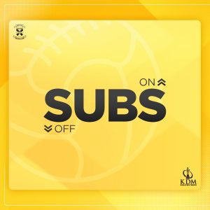
This graphic’s Functionality is to announce a substitution during the game. It is a highly minimalist and functional design. It does not use Photography in order to keep the message clean and direct. The large, central text “SUBS” is highly readable, and the small “ON” and “OFF” with arrows clearly indicates the direction of the change. This is a very efficient use of visual hierarchy. The Branding & Layout is consistent with the in game graphics, featuring the familiar yellow background, and the club and sponsor logos. The lack of clutter ensures the message gets across instantly. How it fits in the overall picture: This graphic is a key piece of the live matchday content. Its design is perfectly aligned with the “Kick Off,” “Half Time,” and “Full Time” graphics, creating a seamless and professional looking live feed of game events.
Goal
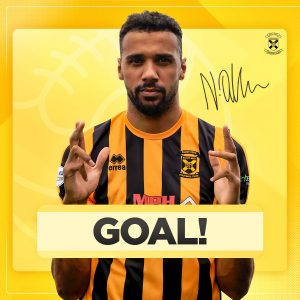
The “Goal!” graphic is designed to be a moment of celebration and is arguably one of the most impactful pieces in the set. Its core Functionality is to announce a goal, which it does with dramatic flair. The use of Photography is crucial and is the primary focus of the design, with a player celebrating directly into the camera. The player’s jubilant pose creates an emotional and exciting connection with fans. The large, bold “GOAL!” text, rendered in a strong, sans-serif font, is overlaid in a yellow bar at the bottom, creating a sense of a formal announcement. The Branding & Layout is clean and allows the photo to dominate while still including key brand elements like the club crest and the player’s signature. The layout is simple yet powerful, effectively balancing visual excitement with clear communication. How it fits in the overall picture: This graphic is a high-point in the matchday visual sequence. It is designed to be shared and celebrated, reinforcing the club’s identity as a source of excitement and success, and it works in powerful contrast to the simpler score update graphics.
Attendance
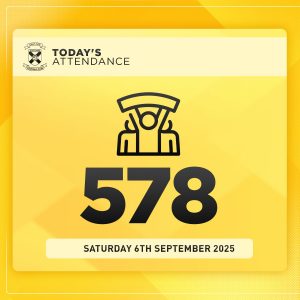
The “Attendance” graphic’s primary Functionality is to communicate the number of spectators at the game. Like the score updates, it avoids Photography and relies on a clean, icon based design. The large, bold number “578” is the main focus, making the data instantly readable. A simple, celebratory icon of three fans is used as a visual element, which adds a subtle, positive touch to the statistic. The Branding & Layout is consistent with the minimalist matchday graphics, with the club crest and date clearly positioned. The yellow gradient background ties it to the rest of the pack. How it fits in the overall picture: This graphic is another recurring and essential component of the matchday wrap up. Its simple design reinforces the brand’s commitment to transparent and professional communication of key match statistics.
Full Time
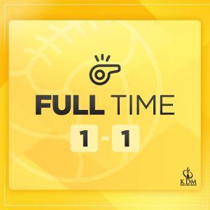
The “Full Time” graphic is the final official update in the matchday sequence. Its core Functionality is to announce the final score of the match. The large 1-1 score is the central element, ensuring the final result is immediately clear. Just like the “Half Time” and “Kick Off” graphics, it uses no Photography, relying on a clean and functional design. The visual Branding & Layout is identical to the other in-game updates, with the consistent yellow background, the whistle icon, and the club and sponsor crests. This high level of visual consistency is key to its success. How it fits in the overall picture: This graphic provides a conclusive and official end to the live match updates. Its predictable layout and design make it a reliable and professional looking piece of content that reinforces the brand’s identity at the conclusion of every game.
Final Thoughts
East Fife has created an exceptionally strong and professional graphic pack that successfully balances brand identity with functional design. The most significant finding is the unwavering consistency across all pieces. The core elements, the vibrant yellow and black colour palette, the prominent use of a subtle background pattern, and a cohesive typographical hierarchy, are present in every graphic. This ensures that whether a fan is seeing a score update, a new signing announcement or a commercial promotion, the content is instantly and unmistakably East Fife.
The pack demonstrates a remarkable ability to adapt its style to different communication needs. For live match content, the designs are minimalist and highly functional, using large, bold fonts and simple icons like the whistle to convey information at a glance. In contrast, for celebratory or promotional graphics like the Q&A Session or Hospitality message, the brand effectively uses compelling player photography to evoke emotion and human connection. This strategic use of both data driven and emotional content shows a sophisticated understanding of fan engagement. The layouts are clean and well structured, always prioritising the most important information without becoming cluttered.
Overall, this graphic pack is a powerful asset for the club. It not only communicates essential information clearly but also builds a consistent, modern and professional visual identity that extends far beyond the pitch. The brand’s versatility, consistency and a strong balance between form and function make it highly effective for both on field and off field communications.