Matchday is more than just the game. While the quality and polish from the club’s in League 2 might not always match the top tiers, there’s a certain grit and authenticity to the clubs’ social media game that’s all its own.
These graphics aren’t just a list of names; they’re a vibe check for the club’s brand, getting supporters fired up.
Just to be clear, I’m definitely not a professional graphic designer, so this is all based on my personal opinion. What I like and what just feels right to me. I’m looking for the ones that make me feel connected to the club and get me excited for kick-off.
Let’s dive in and see who’s winning the off-pitch style battle in this raw and competitive league.
Annan Athletic
The graphic is set on a blurred photo of a football pitch, giving it an authentic, match-day feel. The team’s sponsors and badges are prominently displayed at the top of the graphic, above the bold “STARTING XI” title. The list of players and their numbers is a key focus, and is presented clearly in a legible sans-serif font. The names are listed in a single column, with the substitutes listed below in a separate, smaller section.
The design is straightforward and functional, effectively conveying the necessary information without unnecessary frills. The blurred background is a nice touch, giving the graphic a sense of depth and context. The typography is simple and effective, ensuring all information is easy to read. The club crests are well-placed, and do not distract from the main information. The overall design is a little generic, but it is clear and does its job well.
Score | 6.5/10
Clyde
The graphic features a player in the foreground, with the team’s starting lineup listed to his left. The club’s crest is prominently displayed at the top, along with the crest of their opponents, Elgin City. The red and white colour scheme is consistent with the team’s branding, and the use of the club crest in the background adds a nice textured layer, though the dark gradient in the opposing corners are detract from the main image.
The typography is a bold, sans-serif font for the player numbers and names, which are presented clearly against a strong red background. The “STARTING XI” title is also bold and highly legible. The substitute list is easy to read, and the sponsor logos are well-integrated at the bottom without cluttering the design.
The design is visually striking, using a vibrant colour palette and bold typography to create an impactful graphic. The player’s image is a little generic, but the overall design is professional and well-executed. The use of a strong red colour block to frame the player information is a good design choice, ensuring the key details are easy to read. The sponsor logos are well-placed, and the overall layout is clean and effective.
Score | 7/10
Dumbarton

The graphic features a bold, sans-serif font for the player names and numbers against a striking tartan background. The “STARTING XI” and “SUBS” titles are also in a bold, sans-serif font, and are easy to read. The team’s crests are prominently displayed at the bottom of the graphic, and the overall colour scheme is yellow and black, consistent with the team’s branding.
While the design is unique and visually impactful, with the tartan pattern adding a strong sense of identity, it lacks the modern polish and clean aesthetic seen in other graphics.
The layout is clean and logical, with the players listed in two columns, which makes the information easy to scan and read. However, the use of a simple, bold font is a little generic and doesn’t fully capture the brand’s potential.
Score | 6/10
East Kilbride
The graphic presents a unique grid-based layout, with individual player portraits neatly arranged into the team’s formation. This approach is highly effective for showing the entire team at once. The player names are clearly displayed underneath each portrait in a simple, readable font. The club crests are at the top, along with the sponsor logos, and the substitutes are listed below the main grid.
The design is very modern and clean, utilising a muted background with subtle patterns that do not detract from the main content. The consistent use of headshots in a grid format provides a professional and uniform appearance. The typography is simple and effective, ensuring all information is easy to read. The sponsor logos are integrated well without cluttering the design.
Overall, the graphic is a fantastic example of a clean, modern, and highly functional lineup display. The grid layout is a refreshing change from the more common full-body player shot, and it works exceptionally well. The graphic is well-executed and reflects a high level of professionalism.
Score | 8/10
Edinburgh City
The graphic is a straightforward and clean design, featuring a single player on the right and the lineup on the left. The background has a subtle texture and pattern, which adds a bit of visual interest without being distracting. The club crests and sponsor logos are well-placed at the top and bottom of the graphic.
The typography is clean and bold, making the player names and numbers highly legible. The “STARTING XI” text is large and stands out, clearly communicating the purpose of the graphic. The player’s image is a high-quality studio portrait, which gives the graphic a professional feel. The overall layout is balanced and easy to follow. The simplicity ensures the focus remains on the essential information, the line-up.
Overall, this is a very solid and effective graphic. It’s clean, professional and gets the job done without any unnecessary frills. The design is a strong representation of the club’s brand.
Score | 7.5/10
Elgin City
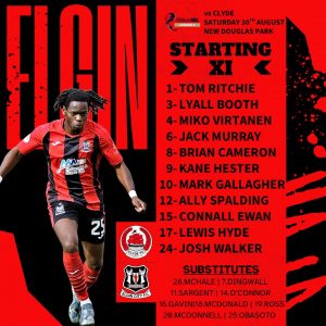
The graphic is a modern and dynamic design, featuring a prominent player photo on the left side of the screen. The background is a mix of solid red and black with a subtle, swirling pattern in a lighter tone, which adds a sense of movement. The team’s crests are placed at the bottom.
The typography is a key feature of this design. The “ELGIN” text is large, bold, and placed vertically on the left, immediately identifying the club. The player list has black text over a dark red background which makes for difficult reading. The subs list at the bottom is more difficult to read due to the smaller font size. The single player image on the left is a good choice, as it’s a dynamic, in-action shot rather than a static studio portrait.
The overall colour scheme is vibrant and aligns with the club’s away colours, creating a strong brand identity. The layout is well-balanced, with the player on one side and the information on the other, creating a visually appealing, albeit difficult to read.
Score | 6.5/10
Forfar Athletic
The graphic presents a minimalistic and elegant design. The color palette is a soft, sky-blue background with white typography and crests, creating a clean and calm aesthetic. The player names are listed with large, stylish typography that makes a strong visual statement. The numbers are smaller and located on the side, which is a unique approach.
The design relies heavily on its typography and subtle background gradients. The lack of player photos gives it a different feel from the other graphics we’ve reviewed. This choice puts all the emphasis on the text and the overall visual style. The club crests and partner logos are placed neatly on the right side of the screen, blending in with the minimalist feel. The text for the substitutes is smaller but still legible. The only negative is the effect of the white text on the light background.
A notable feature is the artistic and flowing font used for the player names, which gives the graphic a sophisticated and premium look. The design is bold in its simplicity and successfully delivers the necessary information with a high degree of style.
Score | 8.5/10
The Spartans

The Spartans graphic is a bold and dynamic design, featuring a player in a strong, athletic pose. The background is a vibrant red with a subtle, stylized, and modern brush-stroke pattern, which gives it a powerful and energetic feel. The graphic utilizes a two-column layout, with the player on the left and the player list on the right.
The typography is large, bold, and clear. The “STARTING XI” title is prominently displayed with the number “XI” highlighted in a separate red font, a strong design choice. The player names and numbers are easy to read and are set against a subtle, dark background that ensures excellent contrast. The player numbers being red on a dark background is a poor design choice and hinders legibility. There’s no clear space around the club’s logo at the top of the page and he use of the sponsor logos at the bottom looks out of place.
The overall design is effective and visually engaging, conveying a sense of energy and professionalism. The dynamic pose of the player and the bold typography work well together to create a powerful graphic. However, the sponsor logo and number colour lets the whole design down.
Score | 7/10
Stirling Albion

The Stirling Albion graphic is a straightforward and simple design that places a strong emphasis on typography and a clean background. The prominent use of a deep red color with a subtle, lighter red watermark of a football creates a classic but somewhat uninspired look. The central layout of the information is clean and easy to follow.
The typography is clear and legible. The “STARTING XI” title is a larger, more stylized font that stands out, while the player numbers and names are in a clear, sans-serif font. The layout, with the number to the left and the name to the right, is a classic and effective way to present the information. The subs list at the bottom is also well-organized and easy to read.
The choice to use only a solid colour background with a subtle design, rather than a player photo or stadium shot, results in a design that is clean but lacks the visual dynamism seen in other graphics. This is a no-frills approach that is functional but could be considered boring due to its simplicity and lack of creative flair.
Score | 6/10
Stranraer

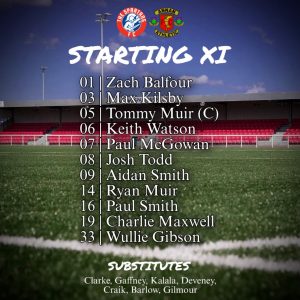
The Stranraer graphic is a strong example of a classic, text-based lineup reveal. The design is simple and elegant, focusing on clarity and legibility. The use of a vibrant, gradient-filled background of the football pitch creates a classic, traditional feel. The two club crests are well-placed at the top and integrate well with the graphic.
The typography is a key strength of this design. The “STARTING XI” title is a larger, bold font that stands out, while the player names and numbers are in a clear, legible sans-serif font. The layout, with the number to the left and the name to the right, is a classic and effective way to present the information. The subs list at the bottom is also well-organized and easy to read.
The overall design is effective and visually engaging, conveying a sense of energy and professionalism. The strong typography and the bold use of colour work well together to create a powerful graphic, although it does lack some overall flair.
Score | 6.5/10