Matchday is more than just the game—it’s about the entire build-up, and the starting XI graphic is a big deal. When it comes to this league, expectations are sky-high for every part of a club’s social media game.
These graphics aren’t just a list of names; they’re a vibe check for the club’s brand, getting supporters fired up.
Just to be clear, I’m definitely not a professional graphic designer, so this is all based on my personal opinion. What I like and what just feels right to me. I’m looking for the ones that make me feel connected to the club and get me excited for kick-off.
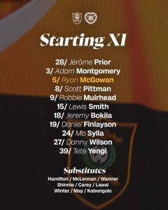
Aberdeen
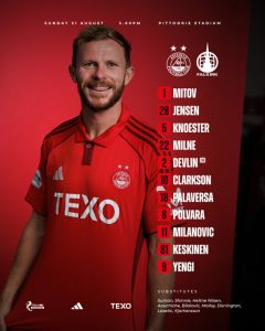
The photography is a clear, professional shot of the player, effectively showcasing the team kit. The player’s expression, with his tongue slightly out, gives the image a less formal or serious feel compared to other graphics. While the main text is legible with a clean font, the typography has several issues. The date and venue information at the top is very small and difficult to read, and the list of substitutes at the bottom is presented in cramped lines that severely impacts its legibility.
From a colour and brand perspective, the graphic is consistent, using Aberdeen’s classic red and white colour palette. The solid red background is simple but lacks any visual depth or texture. This makes the overall design appear somewhat flat. While the text is positioned logically to the right of the player, the spacing between the numbers and the player names is inconsistent. The large player image dominates the composition, making the textual information feel secondary and a bit of an afterthought.
This is a functional graphic that successfully conveys the necessary information. However, it falls short in several areas of design polish. The player’s expression, the poor legibility of the smaller text, and the overall lack of visual dynamism prevent it from standing out.
Score: 7/10
Celtic
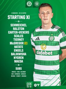
The photography is a clear, professional shot of the player that effectively showcases the team kit. The pose is classic and contributes to a clean, focused look. The typography uses a clean, modern typeface that is largely legible. The text for the match details at the very top is on the smaller side, but still readable. Furthermore, while the substitutes are listed in three rows in a much smaller font.
From a colour and brand perspective, the graphic is highly successful. It uses a strong, rich green and white colour scheme that is instantly recognisable as Celtic’s brand. The subtle pinstripe background adds a nice texture without distracting from the main content. The overall style is modern and minimalist, creating a sense of professionalism and brand consistency. The text is positioned neatly to the left of the player, providing a clean and organised layout. Player numbers are omitted, which reduces practical utility.
This graphic is a strong example of functional design. It effectively communicates the necessary information with a high degree of brand consistency. While there are some small areas for refinement, such as the text spacing, omission of squad numbers and a more dynamic pose, it remains a highly effective and professional design.
Score: 8.5/10
Dundee
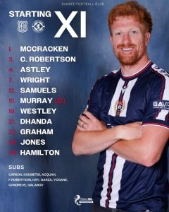
The photography is professional and clear, capturing the player in a neutral pose that showcases the kit. While the image is high quality, it lacks the strong visual impact and dynamic feel of some other graphics. The typography is generally legible, with a clean and simple font choice for the player names. However, the prominent “XI” feels disproportionately large and slightly disconnected from the “STARTING” text. Furthermore, the single line format for the substitutes list at the bottom significantly hinders legibility, making it a weak point of the design.
From a colour and brand perspective, the graphic effectively uses Dundee FC’s dark blue and white colours. The grunge background is a nice touch that adds visual interest without being overly distracting. However, the bright red used for the player numbers feels somewhat disconnected from the rest of the colour palette, creating a slight visual clash. While the text is positioned logically, with the player names to the left of the image, the overall layout feels less refined and cohesive than other examples. The large space between the numbers and the names, coupled with the slightly awkward placement of the “STARTING XI,” makes the design feel less polished.
This is a functional graphic that successfully conveys the necessary information, but it has several notable design flaws. The choices in typography and text layout, as well as the minor colour inconsistencies, prevent it from achieving a top-tier score.
Score: 7/10
Dundee United
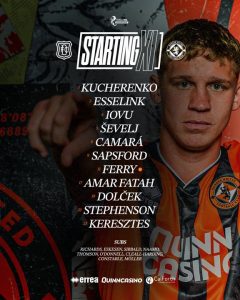
The photography is a strong point, with the player captured in a dynamic pose that adds a sense of energy and movement to the graphic. The lighting and focus are professional, and the player’s gaze draws the viewer in. The typography is clean and modern, with good use of different sizes to create a clear hierarchy. The main player list is very legible, and the font choice works well. The list of substitutes is concise and maintains readability.
From a colour and brand perspective, the graphic is excellent. It features a bold, dark colour palette with hints of orange that aligns perfectly with the Dundee United brand. The background, which appears to be a mural or textured wall, adds significant visual interest and depth, making the graphic feel more dynamic than a simple flat colour. The text is positioned neatly over the player’s outstretched arm and shoulder, providing a unique and energetic composition. This integration of the player and the text creates a cohesive and impactful design.
This is a highly effective graphic that uses strong photography and a dynamic layout to stand out. It successfully communicates the necessary information while maintaining a high level of visual engagement and brand consistency. It is a well executed and professional design with very few areas for improvement.
Score: 9/10
Falkirk
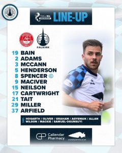
The photography is a point of contention for this graphic. While the image is crisp and well-lit, the player is awkwardly cropped on the left, which looks unprofessional and feels incomplete. It gives the impression that the photo should not be used in this graphic. The typography is a key strength of this design. The bold, all-caps “LINE-UP” title creates a strong visual anchor, while the clean sans-serif font used for the player names is highly legible. The number beside each name adds an extra layer of clarity.
The colourway and brand style are very effective. The background features a subtle, light blue and white pattern that is both visually interesting and a clear nod to the club’s colours. The bold blue banner for the title stands out nicely and creates a strong header. The overall style is clean, modern, and professional, aligning well with a contemporary sports brand. The text positioning is excellent, with the list of players and their numbers clearly organised in a single column to the left of the player, making it very easy to read at a glance.
This is a highly functional graphic that is let down by the poor cropping of the player photo. While the typography and brand elements are very strong, the awkward photography undermines the professional feel of the overall design.
Score: 6.5/10
Heart of Midlothian
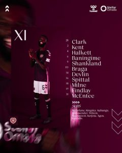
The photography is excellent, with a well-lit image of the player in a dynamic pose, which adds a lot of personality to the graphic. The player is well centred and framed within the design. The typography, however, is a notable weakness. The serif font and thickness choice is difficult to read against the dark, textured background, and the number sizing is too small. This significantly impacts the legibility, which is a fundamental requirement of a line-up graphic.
The colourway and brand style are a strong point, featuring a deep maroon colour that is a core part of the club’s identity. The use of a subtle, darker texture and light accents creates a sophisticated and professional feel. The overall visual style is sleek and modern. However, the text positioning is problematic. While the player list is neatly aligned, the placement of the “XI” is a bit awkward and doesn’t seem to integrate well with the rest of the design. The placement of Hummel and Stellar Omada at the top is also a bit cluttered.
This graphic has a very strong visual style and effective use of brand colours and photography. However, these positives are undermined by the poor typography and cluttered text layout, which compromises its primary function of clearly communicating the line-up.
Score: 7/10
Hibernian
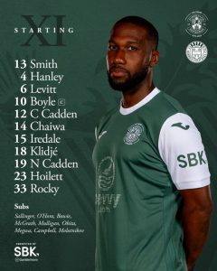
The photography is professional, featuring a player in a strong, confident pose. The lighting is good and the player is the clear focal point of the image. The typography is a highlight of this design. The use of a classic serif font for the names adds a touch of elegance and gravitas and it is highly legible against the dark background. The numbers beside each name are also clear and easy to read.
The colourway and brand style are very well executed. The deep green background, which is the club’s signature colour, is rich and visually appealing. The use of a subtle pattern in the background adds depth without being distracting. The overall style is sophisticated and professional, reflecting the club’s brand identity effectively. The text positioning is also strong, with the “STARTING XI” title and the player list aligned neatly to the left, which creates a clean, balanced composition.
This is a very strong graphic that excels in its use of typography, colour, and overall brand style. It is a well designed piece of content that is both visually appealing and highly functional.
Score: 8.5/10
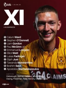
Kilmarnock
The photography is good. The player is well-lit and in a clear pose, which effectively makes him the focal point of the image. The typography is clean and legible, using a simple sans-serif font for both the names and numbers. This makes the lineup very easy to read at a glance, fulfilling the graphic’s primary purpose.
The colourway and brand style are well executed. The club’s blue and white stripes are prominent and immediately recognisable. The textured, slightly distressed background adds a modern, gritty feel that works well with the overall design without being distracting. The use of a simple black gradient for the sponsors and subs adds a nice contrast. The text positioning is straightforward and effective, with the player list and numbers neatly aligned to the left, which creates a clean and easy-to-follow layout.
This is a very solid graphic that is both visually appealing and highly functional. It’s let down slightly by a lack of creative flair compared to other designs, but it is clear and effective.
Score: 7.5/10
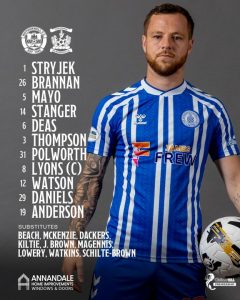
Livingston
The photography is a major issue. There is no clear, focused image of a player. Instead, the background is a blurred, close up of the club badge on a kit. This choice is confusing and fundamentally undermines the purpose of a graphic that should showcase the team. The typography is also a major weakness. While the serif font choice is classic, the mix of italicised and normal styles makes it extremely difficult to read, and the virgule after the player’s number adds to problem.
The colourway and brand style are effective, with the club’s signature yellow and black used cohesively. However, the text positioning is a significant weakness. The player list is placed awkwardly over the blurred background, further hindering legibility. The “Starting XI” title and “Substitutes” heading also feel disjointed from the rest of the text.
This graphic fails its primary purpose due to poor typography and the absence of a clear player image. It is overly stylised and prioritises a visual aesthetic that sacrifices functionality and clarity
Score: 6/10
Motherwell
The photography is good. The player is front and center and in focus, with good lighting that highlights him against the background. The typography is a strong point. The choice of font is clean, modern and highly legible. The numbers are bolded and stand out clearly, making it easy to identify players.
The colourway and brand style are well executed. The club’s claret and amber colours are prominent and create a strong brand presence. The subtle diagonal lines in the background are a nice touch that adds a bit of visual interest without being distracting. The use of a simple, clean “XI” in a separate block at the top adds a modern, minimalist feel to the graphic. The text positioning is straightforward and effective, with the names and numbers aligned to the left in a neat column.
This is a very strong graphic. The design is clean, professional and highly effective at its primary purpose: providing clear, legible information. The use of space is well managed, and the overall aesthetic is modern and slick
Score: 8.5/10
Rangers

The photography is excellent. The player is the central focus, well-lit and the portrait shot gives the image a strong, professional feel. The background adds a nice visual texture without being distracting. The typography is clean and highly legible, using a bold, sans-serif font that is easy to read. The numbers are a good size and stand out clearly from the names.
The colourway and brand style are well executed, with a strong emphasis on the club’s iconic royal blue. The vertical red stripe on the left side adds a dynamic element that ties into the team colours. The overall design is modern and clean, with a sense of energy conveyed by the subtle motion blur in the background. The text positioning is straightforward and effective, with the names and numbers aligned in a neat, easy-to-scan column.
Overall, this is a very strong and professional graphic. It is aesthetically pleasing while also being highly functional, delivering the necessary information clearly and concisely. It is a great example of a well executed line-up graphic
Score: 9/10
St Mirren
The photography is excellent. The player is the main subject, well lit, and the image is in sharp focus. The use of a moody, textured background adds a professional and contemporary feel to the graphic. The typography is a strong point. The font is clean, modern, and highly legible, with a clear distinction between the numbers and names. The style of the “Starting XI” title, while a bit stylised, is still easy to read.
The colourway and brand style are effective. The graphic utilises a dark palette with a grunge effect, which aligns with the club’s kit and creates a strong, cohesive brand identity. The text positioning is neat and organized, with the player list arranged in a clear, easy-to-scan column. The inclusion of the club badges and sponsors at the bottom is well-managed, keeping the focus on the main information.
Overall, this is a well designed and highly effective graphic. It is visually appealing and communicates the necessary information clearly and concisely. The design feels modern and professional, and it is a great example of a well executed line-up graphic
Score: 8.5/10