After reviewing the creative output of all 42 SPFL clubs, it was an exciting challenge to select a standout from each league.
In League Two, Forfar Athletic’s digital presence immediately caught my eye, setting a new standard for a club of its size. This deep dive will explore how the club has built a cohesive and visually striking brand identity this season, from its matchday updates to its commercial announcements, showcasing a level of creativity that punches well above its weight.
Non-Matchday Graphics
Club Statement
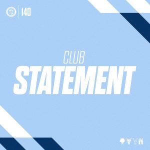
This graphic is built for clear, formal communication, designed to deliver a serious and official message from the club. It uses a subtle, baby blue eyes shade of blue as the background which doesn’t distract from the important text. For typography, it uses the large, bold sans-serif font for “CLUB STATEMENT” to signal its importance.
The overall layout is clean and professional, with the brand’s colors and crest present to ensure the statement is instantly recognisable. This piece shows the brand’s ability to pivot from the energetic style of matchday updates to a more formal, serious tone, proving its versatility for a full spectrum of communications.
Fixture Schedule
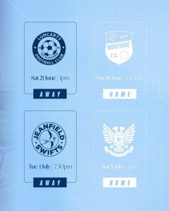
This graphic’s function is to serve as a practical, easy-to-read reference for fans to follow the season, using a highly functional table layout for quick scanning of information. No photography is used in this graphic, as the focus is purely on the information. The typography combines a mix of the two main fonts for the “FIXTURES” heading, with individual fixture details in a simple, clear font that maximizes readability, though white text and colour overlays can make it difficult to read. Its layout is a series of stacked boxes, using the brand’s blue and white colors to provide structure and a clean aesthetic. This graphic demonstrates the brand’s commitment to providing fans with useful, well-organised information, complementing the more dynamic matchday graphics with a static, long-term resource.
Signing Announcement
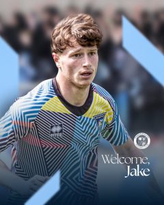
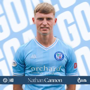
The primary function of this graphic is to announce a new player signing, designed to create excitement and formally welcome the new addition. The photo of the new player, Jake, is a dynamic portrait that gives a personal feel to the signing. The typography uses a serif for “Welcome” and an elegant serif for the player’s name, a powerful combination for a celebratory but official tone. Anchored by the club crest and featuring the brand’s consistent colours and angular shapes, this is a great example of how the brand adapts to different types of news while maintaining its core identity.
Season Tickets
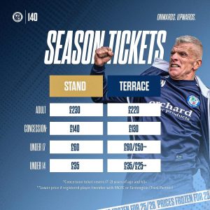
This graphic’s primary function is to clearly and concisely display season ticket prices and information, with its table format proving highly effective for easy data comparison and readability. The image incorporates a dynamic photo the manager in a passionate, celebratory pose, adding a human and emotional element that conveys the energy and spirit of being part of the club, aligning well with an “Onwards. Upwards.” motto. For typography, the prominent “SEASON TICKETS” heading utilizes the same large, bold sans-serif font found in matchday graphics, immediately drawing attention, while the pricing details are presented in a clean, legible sans-serif font to prioritise clarity. The branding and layout are consistently structured with the club’s color scheme, using distinct colored boxes for “STAND” and “TERRACE” to differentiate seating options, and clear footnotes provide essential details without cluttering the main information.
This graphic demonstrates the brand’s versatility for both matchday and business-related communications, effectively applying the established visual identity to commercial announcements and showcasing its adaptability across various content types, from fan engagement to pricing information.
MATCHDAY GRAPHICS
Preview
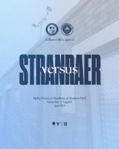
This is a pre-match announcement graphic, providing all essential information for an upcoming game as a functional “save the date.” No photography is used, other than a faded stadium picture as the background, as the focus is on the competing teams and match details. Team names are prominent and bold, while details are in a smaller, clear font to create a well-defined hierarchy. The layout is split into two halves with each team’s crest displayed, and it fits into the pre-match build-up, working with the “Matchday” graphic to get fans excited for the game and showing a professional approach to match promotion.
Matchday
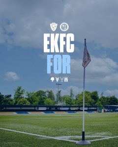
This graphic serves as a final reminder to fans that it is a matchday, building anticipation and acting as a call to action. The photo of the stadium adds a personal and authentic touch, connecting the digital graphic to the physical place of the game. The club names are abbreviated and the text is large, bold, and unmissable, while other details are clearly displayed. The use of the club’s colors, crest, and a photo of the stadium creates a strong sense of place and brand identity. This is an essential part of the matchday journey, serving as a strong lead-in to the in-game updates.
LineUp
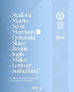
This graphic is a functional and clear way to present the starting lineup, prioritizing readability and ease of understanding for fans. No photography is used to keep the focus on the information itself, preventing clutter. The names are presented in a clean, legible font. The structured and organised layout subtly incorporates the brand’s elements. This is a professional and functional piece of the matchday puzzle, demonstrating that the club values clear communication.
Kick Off
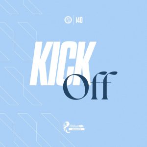
This graphic announces the start of the match and is a simple, high-impact piece designed to build anticipation. The words “KICK OFF” are presented in the bold, blocky sans-serif font and accompanying serif font. The layout is clean, with the text overlaid on the photo without obscuring the main action, and the club crest and league logo reinforce the brand. As the starting point of the matchday graphics sequence, it sets the tone for the rest of the updates and works as a seamless prelude to the in-game graphics.
Including the teams could be seen as an enhancement to this graphic, though at League Two level, having this level of support maybe difficult to achieve.
Half Time
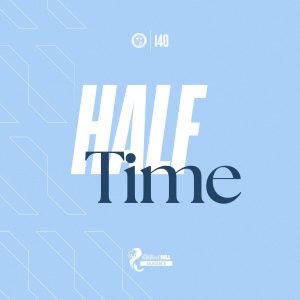
Serving as a simple and clear update on the score at halftime, this graphic also uses a dynamic, action-oriented photo of a player to keep the energy high during the break. The “HALF TIME” text uses the same elements as “KICK OFF”. The layout is identical to the “Full Time” graphic, creating strong visual continuity between the two match updates. This piece fits into the matchday series by helping to maintain the rhythm of the game on social media and making the club’s updates predictable and easy for fans to follow.
An enhancement to this graphic could be including the current scores and teams, though, as above, resource could present this.
Second Half
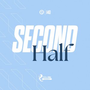
This graphic signals the start of the second half of the game as a quick and effective update. No photography is used, which keeps the focus on the text and design elements, and the same fonts is used for “SECOND HALF” as the other in-game updates. The graphic features the angular, geometric lines that are a staple of the brand’s visual identity, keeping it on-brand. It fits perfectly into the matchday sequence, bridging the “Half Time” and “Full Time” graphics and showing that the club has a complete and well-thought-out plan for every stage of a match’s digital coverage.
Goal Gif & Goal
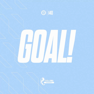
These are celebratory graphics designed to immediately announce a goal, with the gif adding a layer of dynamism with its quick-fire animation. The still “Goal” graphic uses a photo of the goal scorer, which personalises the event for fans. The large, repeating “GOAL” text is the hero of these graphics, with a bold, slightly chaotic style that conveys excitement. The layout repeats “GOAL” text in the background to create a powerful branded moment. These are the climax of the in-game experience and are designed to be shared widely, embodying the brand’s energetic side and working seamlessly with other matchday updates.
Subs
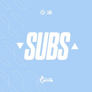
This graphic’s sole purpose is to announce a substitution during a match as a quick, clear update for social media. No photography is used, which is an effective choice for a rapid-fire update that prioritises speed and clarity. The “SUBS” text is in the large, bold font, making it unmissable, while the layout uses the same clean background with geometric lines and the club crest. This graphic shows a high level of detail in the club’s communication strategy, ensuring even minor in-game events are covered with a professional, on-brand graphic.
Similar to before, with extra resources, players names could be included, though that would sacrifice the rapid-fire nature of the match update.
Full Time
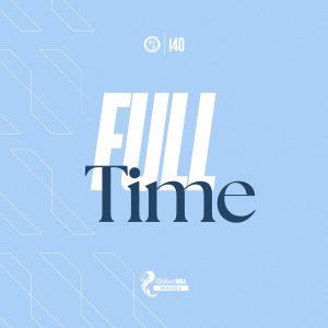
This graphic’s sole purpose is to announce the final score of a match as an instant update for social media. The typography repeats the style used for “KICK OFF”, “HALF TIME” & “SECOND HALF”, ensuring the information is easily seen. The layout is simple but impactful. As a core part of the matchday set, it works in tandem with other in-game graphics to provide a comprehensive, real-time visual record of the match.
Again, with extra resource, full time score and perhaps scorers could also be included.
Final Thoughts
Forfar Athletic has developed a highly professional, cohesive and adaptable brand style for this season. The visual identity is strong and consistent across all communications, from matchday updates to official club statements and commercial announcements. This consistency is a key strength, ensuring that every piece of content is instantly recognisable as coming from the club.
The brand’s core elements—a defined colour palette of light and dark blues, a consistent use of sans-serif and serif font styles, and recurring geometric background patterns, are masterfully integrated into every graphic. This creates a unified aesthetic that is both modern and clean. The strategic use of two main fonts provides a clear visual hierarchy: a bold, attention-grabbing font for major announcements and a cleaner, more readable font for details. This dual approach allows the brand to be both energetic and informative.
Functionally, the design system is a success. Each graphic is meticulously tailored to its purpose, whether it’s a quick social media update, a detailed schedule, or a celebratory announcement. The decision to use dynamic photography for key moments (like goals and signings) and to omit it for more straightforward updates (like “Second Half” or “Subs”) shows a thoughtful and effective approach to visual communication. The brand is built for clarity and impact, making it easy for fans to consume information at a glance.
Forfar Athletic’s brand style for this season is a prime example of a professional and well-executed digital identity. It successfully balances a modern aesthetic with clear functionality, creating a comprehensive and professional presence that serves the needs of the club and its fans.
Very smart – however you should consider accessibility in your reviews.
Some of the white on pale blue – especially smaller text is difficult to read for those with visual impairments. Good digital design should meet accessibility guidelines, as white on pale is often insufficient for readability and should typically be avoided for smaller text. This let’s these graphics down in some cases.
Thanks for your comment Neha.
We did mention in our review that the white overlays on the light background may prove difficult to read.
Fair comment though.